6 Aesthetic Samsung Watch Wallpaper Themes For Galaxy Wearables
Galaxy Watch owners change their watch face an average of once a week, yet most never venture beyond the dozen or so faces that ship with the device out of the box. That gap between what is available and what most people actually use is enormous, and it represents a genuine opportunity to transform a wrist-worn device into a personal style statement. The 6 aesthetic Samsung Watch wallpaper themes for Galaxy Wearables explored in this guide cover the full spectrum of visual styles trending in 2026, from stripped-back minimalism to fine-art-inspired masterpieces, giving every Galaxy Watch owner a clear path to a more expressive, personalized wearable experience.
Disclosure: This post contains affiliate links. As an Amazon Associate, we earn from qualifying purchases, and at no extra cost to you.
Key Takeaways
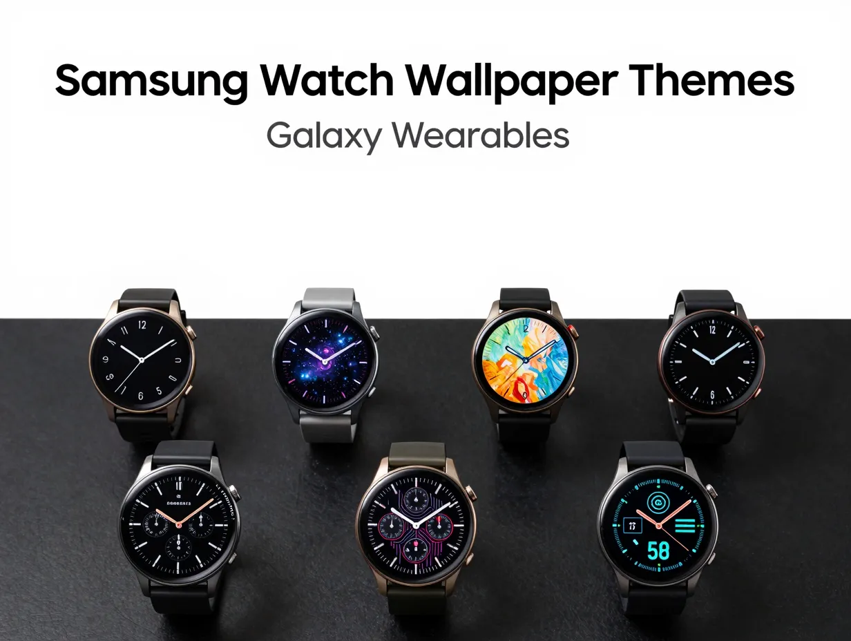
- The 6 aesthetic Samsung Watch wallpaper themes for Galaxy Wearables span minimalist, cosmic, fine art, retro analog, neon futuristic, and data-dense hybrid styles.
- Samsung’s Galaxy Wearable app and the Google Play Store are the primary official channels for downloading and applying new watch face themes on Wear OS 6+ devices.
- Battery efficiency is now a core design criterion alongside aesthetics, especially on AMOLED screens where dark backgrounds reduce power draw.
- Third-party developers using Google’s Watch Face Format have dramatically expanded the aesthetic range available beyond Samsung’s built-in catalog.
- Cohesive phone-plus-watch setups, where the watch face theme coordinates with a matching phone wallpaper, represent the most polished approach to Galaxy Wearable personalization.
Why Aesthetic Watch Faces Matter More Than Ever in 2026
A watch face is the first thing anyone sees when they glance at a Galaxy Watch. It communicates personality before a single word is spoken. In 2026, the stakes for that first impression are higher because Galaxy Watch hardware, particularly the Galaxy Watch 8, Galaxy Watch 9, and Galaxy Watch Ultra 2, delivers AMOLED displays sharp enough to render fine gradients, micro-typography, and photographic textures with genuine clarity. That display quality makes aesthetic choices consequential in a way they simply were not on earlier LCD-based wearables.
The ecosystem has matured to match. Samsung’s official support documentation confirms that watch face management is now deeply integrated with the Galaxy Wearable app and the Google Play Store, giving users a dedicated Play Store section specifically for Galaxy Watch faces [3]. Developers using Google’s Watch Face Format can publish designs that run on both Pixel and Galaxy devices, which has flooded the marketplace with visually distinctive options that go far beyond what any single manufacturer could produce in-house [6]. Design communities like Dribbble host roughly 330 Galaxy Watch concept designs tagged for the platform, covering pastel palettes, flat illustrations, and futuristic typography [7]. The result is a rich, competitive market where aesthetic quality is a genuine differentiator.
Understanding which broad theme categories exist, and what each one looks like in practice, helps owners make faster, more satisfying choices. The six themes below represent the dominant aesthetic directions that have emerged from community curation, developer releases, and Samsung’s own roadmap for 2026 [2][6][8].
The 6 Aesthetic Samsung Watch Wallpaper Themes For Galaxy Wearables
1. Minimalist Clean
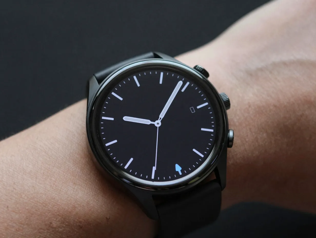
The minimalist theme strips the watch face down to its essential information: time, one or two complications, and nothing else. The visual language is defined by generous negative space, a restrained color palette of two or three tones, and typography that does the heavy lifting.
Why it works: On an AMOLED display, a predominantly black or near-black background is not just stylish, it is practical. Dark pixels on AMOLED panels consume significantly less power than bright ones, so a minimalist dark face extends battery life in a measurable way. This dual benefit of aesthetics and efficiency is a key reason minimalist designs consistently top community recommendation lists [1].
Signature visual elements:
- Single-weight sans-serif numerals, often in white or a muted accent color
- Hour and minute hands rendered as thin geometric lines rather than traditional sword or baton shapes
- Complications displayed as small, icon-only indicators rather than text labels
- Backgrounds in deep charcoal, pure black, or a single desaturated tone
Best for: Professionals, minimalism enthusiasts, and anyone who finds busy watch faces distracting during meetings or workouts.
Where to find them: The Galaxy Wearable app’s built-in gallery includes several minimalist options. Third-party developers on the Play Store have expanded this category considerably, with apps like Galaxy Watch Faces, Free Faces offering battery-efficient minimalist designs optimized for Wear OS 6+ devices [1].
A useful customization tip: after applying a minimalist face, use the Galaxy Wearable app to reduce the number of active complications to one or two. Fewer data points reinforce the clean aesthetic and keep the face from feeling cluttered as notifications accumulate.
2. Cosmic and Space-Themed
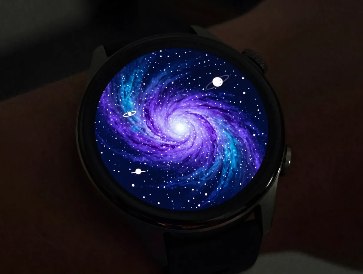
Space imagery has become one of the most popular aesthetic directions for Galaxy Watch backgrounds, and the hardware justifies the enthusiasm. The vivid AMOLED display renders deep-space blues, nebula purples, and star-field whites with a depth that genuinely mimics looking through a telescope.
Why it works: Cosmic themes occupy a sweet spot between artistic expression and technical plausibility. A watch face that looks like a window into the universe feels aspirational without being garish. Samsung itself has leaned into this direction: the ReS25 face ships with ten distinct “cosmos”-themed backgrounds, effectively functioning as a wallpaper pack baked into a single face [8]. That approach, multiple thematic backgrounds within one face, gives owners variety without requiring them to switch faces entirely.
Signature visual elements:
- Deep navy, midnight blue, or pure black base layers
- Nebula gradients in purple, teal, or amber rendered as background textures
- Star-field particle effects or static star maps
- Complications styled as orbital rings, satellite icons, or constellation markers
Best for: Science enthusiasts, night owls, and anyone who wants a watch face that sparks conversation.
Customization note: Many cosmic faces allow users to cycle through multiple background images from within the Galaxy Wearable app. Rotating between a star-field, a nebula close-up, and a planet-surface texture across the week keeps the theme feeling fresh without requiring a full face change.
“Multi-themed, art-style backgrounds such as cosmic or abstract motifs are an established pattern for aesthetic Samsung watch themes, effectively functioning as wallpaper packs baked into a single face.” [8]
3. Fine Art and Illustration-Inspired
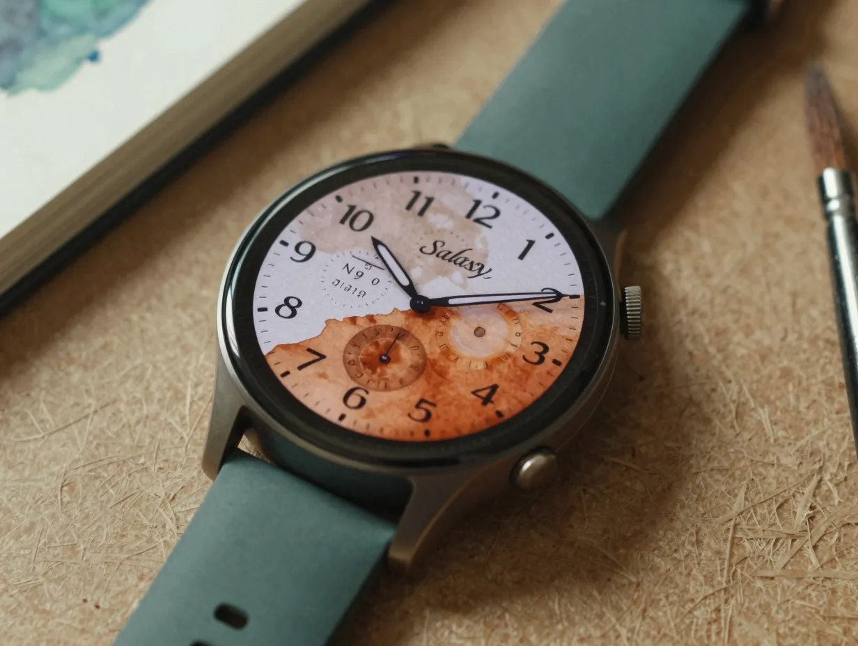
The fine art theme treats the watch face as a miniature canvas. Designs in this category draw on classical painting traditions, graphic illustration, and even street art to create faces that feel more like wearable gallery pieces than functional timekeeping tools.
Why it works: The DCS The Starry Night watch face on Google Play is a well-documented example of this approach, marketing itself as “timeless artistry” inspired by classic impressionist paintings [3]. It demonstrates that a watch face can merge iconic visual art with practical complications, showing the time, weather, and activity data, without sacrificing either function or beauty. The key design challenge is ensuring that data readability is not lost in the artistic background, and the best fine art faces solve this by placing complications over neutral zones or using semi-transparent overlays.
Signature visual elements:
- Painterly textures derived from impressionism, watercolor, or oil painting traditions
- Illustrative characters, botanical motifs, or architectural line drawings
- Hand-lettered or calligraphic typography for time display
- Rich, warm color palettes: ochre, burnt sienna, forest green, deep burgundy
Best for: Art lovers, creative professionals, and anyone who wants their wearable to reflect cultural interests.
Practical tip: Fine art faces with busy backgrounds can make complications hard to read in bright sunlight. Look for versions that offer a “simplified” or “always-on display” variant that reduces background complexity when the wrist is at rest.
4. Retro Analog
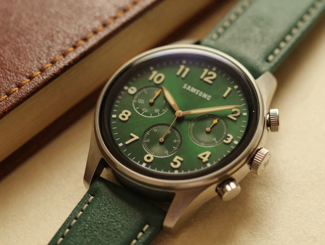
The retro analog theme revisits the visual language of mid-century mechanical watches, guilloché dials, applied indices, lume-tipped hands, and sub-dials, and recreates it digitally on a Galaxy Watch screen. The result is a face that looks like a vintage Swiss timepiece but runs on Wear OS 6.
Why it works: Analog faces have never gone out of fashion, but the retro analog category adds a layer of nostalgia and craft that purely modern designs lack. Android Authority’s coverage of the best Galaxy Watch faces highlights how third-party developers use Google’s Watch Face Format to build visually distinctive analog designs that run seamlessly on Galaxy hardware [6]. These faces often include period-accurate details, aged patina effects, faux-mechanical second-hand sweeps, and vintage color palettes, that reward close inspection.
Signature visual elements:
- Applied or printed hour indices rather than numerals
- Sub-dial complications styled as mechanical registers (chronograph counters, moon-phase windows)
- Warm color palettes: cream, racing green, navy, burgundy, or “tropical” brown
- Subtle texture effects mimicking lacquered dials, sunburst finishes, or brushed metal
Best for: Watch enthusiasts, professionals who prefer a classic look, and anyone transitioning from a traditional mechanical watch to a smartwatch.
Compatibility note: Retro analog faces are generally back-compatible across Galaxy Watch generations. Designs released for Galaxy Watch 8 and 9 typically run without issue on Galaxy Watch 7, 6, and 5, provided the device runs a compatible Wear OS version [9].
5. Neon and Futuristic
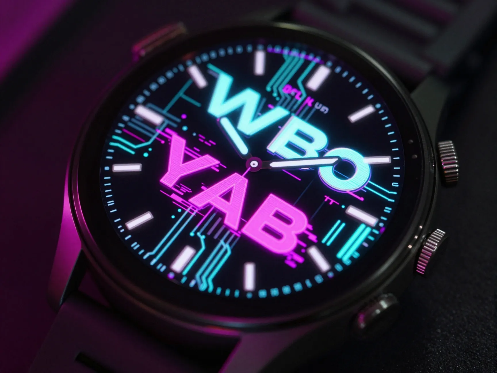
The neon futuristic theme sits at the opposite end of the aesthetic spectrum from retro analog. It draws on cyberpunk visual culture, HUD (heads-up display) interfaces, and generative art to create faces that look like they belong on a wrist in a science fiction film.
Why it works: This category has seen a surge of creative output from independent developers in 2026. An April 2026 video highlighting lesser-known Galaxy Watch faces specifically called out designs like MW33 and Forgecore as examples of “new vibe” aesthetics featuring bold color blocks, geometric patterns, and glitch-style graphics [14]. These faces feel more like wallpaper art than traditional watch dials, which is precisely their appeal to a younger, design-conscious audience. A June 2026 compilation of free faces for Galaxy Watch Ultra 2 and Watch 9 further showcased bold typography, colorful gradients, and playful layouts as defining characteristics of this trend [4].
Signature visual elements:
- Electric teal, magenta, neon green, or ultraviolet accent colors on dark backgrounds
- Geometric line work: hexagons, circuit-board traces, angular brackets
- Glitch effects, scan-line overlays, or pixelated texture elements
- Large, bold display typography, often condensed or extended sans-serif, for time readout
Best for: Gamers, tech enthusiasts, younger wearable users, and anyone who wants a face that makes a bold visual statement.
Battery consideration: Neon faces with large areas of bright color can draw more power on AMOLED displays than dark minimalist designs. Enabling the always-on display in a simplified mode, or using the Galaxy Wearable app to reduce screen brightness, helps offset this trade-off.
6. Data-Dense Digital Hybrid
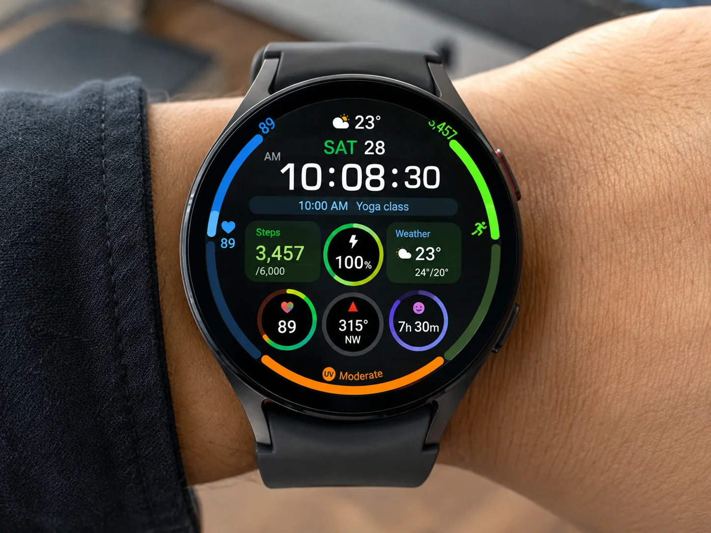
The data-dense hybrid theme prioritizes information density without sacrificing visual coherence. These faces pack time, health metrics, weather, calendar events, and activity progress into a single screen, arranged with enough design discipline that the result reads as a polished dashboard rather than a cluttered mess.
Why it works: Not every Galaxy Watch owner wants a face that looks like art. Many users, athletes, executives, productivity-focused individuals, want maximum information at a glance. The data-dense hybrid theme serves this need while still qualifying as “aesthetic” because the best examples apply strong typographic hierarchy, consistent color coding, and deliberate grid layouts to make the information visually organized. Video round-ups of the best Galaxy Watch faces in 2026 consistently include data-dense options alongside more decorative styles, confirming that this category has a large and loyal audience [2][5].
Signature visual elements:
- Multi-ring or multi-arc complication layouts showing health rings, battery, and weather simultaneously
- Color-coded data zones: one hue per data category for instant visual parsing
- Digital time display in a large, legible typeface with secondary analog hand overlay
- Compact icon-plus-value pairs for steps, heart rate, UV index, and calendar
Best for: Athletes, health-conscious users, productivity enthusiasts, and anyone who treats their Galaxy Watch primarily as a data tool.
Customization depth: The Galaxy Wearable app allows users to remap most complications on data-dense faces, replacing default slots with personally relevant metrics. Swapping a stock-ticker complication for a hydration reminder, for example, tailors the information density to individual priorities without changing the face’s overall aesthetic structure.
How to Apply and Customize These Themes on Galaxy Wearables
Applying any of the six aesthetic Samsung Watch wallpaper themes for Galaxy Wearables follows a consistent process regardless of which style is chosen. The Galaxy Wearable app, available on Android, serves as the central hub for face management and customization.
Step-by-step process:
- Open the Galaxy Wearable app on the paired Android phone.
- Tap “Watch Faces” to browse the built-in gallery or access the Play Store section dedicated to Galaxy Watch faces.
- Select a face from the gallery or search the Play Store for a specific theme category (e.g., “minimalist Galaxy Watch face” or “cosmic watch face Wear OS”).
- Tap “Install” for Play Store faces, then return to the Galaxy Wearable app and select the newly installed face.
- Tap “Customize” to adjust complications, color accents, and layout options specific to that face.
- Confirm the selection and the face syncs to the watch automatically over Bluetooth or Wi-Fi.
Practical customization tips:
| Setting | Recommendation |
|---|---|
| Complication count | Match to theme: 1-2 for minimalist, 6+ for data-dense |
| Background brightness | Lower for AMOLED battery savings on neon/art faces |
| Always-on display style | Use simplified variant to preserve battery on complex faces |
| Color accent | Coordinate with phone wallpaper for cohesive phone-plus-watch setup |
The concept of coordinating a watch face theme with a matching phone wallpaper has existed for several years in the Galaxy ecosystem [11], but the Galaxy Wearable app’s deeper integration with Wear OS in 2026 makes this coordination more seamless than ever. Choosing a cosmic watch face and pairing it with a matching space-themed phone wallpaper creates a unified aesthetic across both screens that feels intentional and polished.
Samsung is also investing in new built-in themes for upcoming Galaxy Watch 9 models, with leaked faces including Analog Balance, a balanced analog-digital hybrid with colorful yet restrained complications, pointing toward future default aesthetics that will coexist with the experimental third-party themes described above [15].
Choosing the Right Theme for Your Lifestyle
With six distinct aesthetic directions available, the decision ultimately comes down to three questions:
1. How much information do you need at a glance? If the answer is “as much as possible,” the data-dense hybrid theme is the logical choice. If the answer is “just the time,” minimalist clean is the better fit.
2. How important is battery life? Dark minimalist and retro analog faces are the most power-efficient choices on AMOLED displays. Neon futuristic and fine art faces with large bright areas draw more power and may require more frequent charging.
3. What does the face say about you? A retro analog face signals appreciation for craft and tradition. A cosmic face signals curiosity and a forward-looking mindset. A fine art face signals cultural engagement. The aesthetic choice is a form of self-expression, and the right answer is the one that feels authentic.
For users who struggle to commit to a single theme, the Galaxy Wearable app supports quick face-switching, and many faces in the cosmic and fine art categories ship with multiple background variants that provide variety within a single aesthetic framework [8].
Conclusion
The 6 aesthetic Samsung Watch wallpaper themes for Galaxy Wearables, minimalist clean, cosmic and space-themed, fine art and illustration-inspired, retro analog, neon futuristic, and data-dense digital hybrid, represent the full range of visual directions available to Galaxy Watch owners in 2026. Each theme has a distinct visual language, a specific audience, and practical trade-offs around battery life and information density that are worth understanding before committing to a new face.
Actionable next steps:
- Open the Galaxy Wearable app today and browse the Play Store’s dedicated Galaxy Watch face section to identify which of the six themes resonates most strongly.
- Install one face from each of the two or three most appealing categories and live with each for a few days before settling on a primary choice.
- Use the Galaxy Wearable app’s customization tools to fine-tune complications, color accents, and always-on display settings to match personal priorities.
- Consider pairing the chosen watch face with a coordinating phone wallpaper for a cohesive, polished aesthetic across both screens.
- Revisit the Play Store section quarterly, the Galaxy Watch face ecosystem is updated frequently, and new designs that fit these six themes appear regularly.
The watch face is the most visible, most personal element of any Galaxy Wearable. Choosing it deliberately, rather than defaulting to whatever shipped from the factory, is one of the simplest and most impactful ways to make a Galaxy Watch feel genuinely personal.
References
[1] Details – https://play.google.com/store/apps/details?id=com.watchland.studio.galaxy_watch_faces&hl=en_US
[2] Watch – https://www.youtube.com/watch?v=Z5SXpGxUFMU
[3] Best Samsung Galaxy Watch Faces 6555 – https://www.wareable.com/samsung/best-samsung-galaxy-watch-faces-6555
[4] Watch – https://www.youtube.com/watch?v=hZCQb1qaHLc
[5] Watch – https://www.youtube.com/watch?v=kavg1V51ZwE
[6] 10 Favorite Watch Faces Pixel Galaxy 3427976 – https://www.androidauthority.com/10-favorite-watch-faces-pixel-galaxy-3427976/
[7] Galaxy Watch – https://dribbble.com/tags/galaxy-watch
[8] Best Galaxy Watch 7 Series Faces 3475027 – https://www.androidauthority.com/best-galaxy-watch-7-series-faces-3475027/
[9] Watch – https://www.youtube.com/watch?v=MXGNg1C2s88&pp=ugUEEgJlbg==
[10] Watch – https://www.youtube.com/watch?v=0LFhZ8m5QzI