6 Apple Watch Design Secrets That Make It A Wearable Icon
Over 100 million people worldwide wear an Apple Watch on their wrist every day, yet most of them have no idea why the device feels so different from every other smartwatch on the market. The answer is not found in a single headline feature. It lives in a set of deliberate, layered design decisions that Apple has refined across more than a decade. Understanding the 6 Apple Watch design secrets that make it a wearable icon reveals a masterclass in how hardware restraint, software evolution, and emotional personalization can combine into something that transcends the category of “gadget” entirely.
Disclosure: This post contains affiliate links. As an Amazon Associate, we earn from qualifying purchases, and at no extra cost to you.
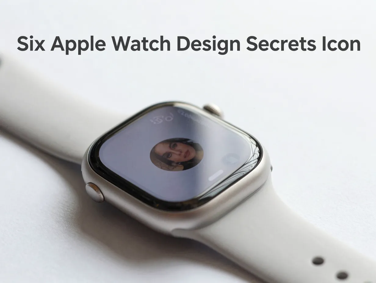
This article breaks down each of those secrets in detail, drawing on the latest design guidance, watchOS 26 developments, and the visual language that has made the Apple Watch the most recognized wearable silhouette on the planet.
Key Takeaways
- The Apple Watch achieves iconic status through external shape stability combined with continuous internal and material evolution, not radical redesigns.
- Liquid Glass, introduced as the core visual language of watchOS 26, adds perceptual depth and adaptability to the interface without sacrificing clarity.
- Icon design discipline, governed by strict grid, corner radius, and simplicity rules, keeps the watch face legible at a glance on a small screen.
- Subtle interaction micro-designs, such as wrist-flick gestures and ambient-aware audio, create a sense of intelligence that users feel but rarely consciously notice.
- Emotional personalization, particularly through features like the Photos watch face, is a calculated design strategy that drives long-term attachment to the product.
Why the Apple Watch Became an Icon Before Most People Noticed
The Apple Watch did not arrive as an instant icon. Early reviews in 2015 were skeptical. Critics questioned whether a smartwatch was a product category anyone truly needed. What changed was not a single breakthrough, it was the accumulation of design decisions that made the watch feel inevitable on the wrist. By 2026, the Apple Watch silhouette is so universally recognized that icon libraries across the web use it as the default shorthand for “smartwatch” [1][3][6]. That kind of visual dominance does not happen by accident.
The six secrets explored below are the architecture behind that dominance.
The 6 Apple Watch Design Secrets That Make It A Wearable Icon
1. The Stable Silhouette Strategy
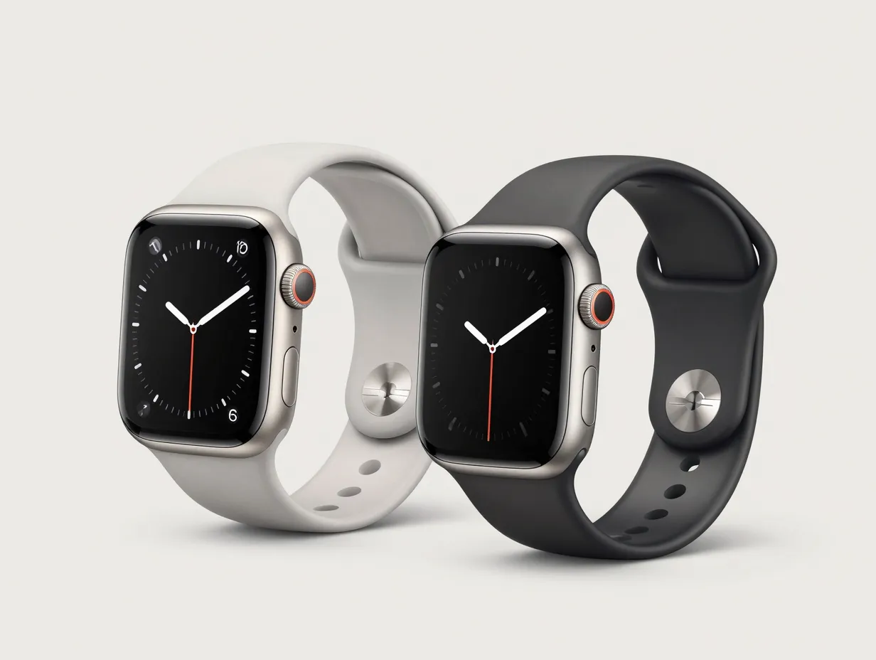
Apple made a counterintuitive choice early in the Apple Watch’s life: stop changing the shape. While competitors experimented with round dials, angular forms, and rotating bezels, Apple locked in the rectangular case with rounded corners and has defended it ever since. The Series 11 and Ultra 3 updates in 2025 and 2026 brought material refinements and subtle dimensional changes, but the fundamental silhouette remained consistent.
This stability is a design secret because it operates on a psychological level. Users who upgrade from a Series 6 to a Series 11 feel continuity, not obsolescence. Accessories, bands, and third-party cases from earlier generations often carry forward compatibility. More importantly, the silhouette became a visual shorthand, a shape that communicates “Apple Watch” before any logo or text is visible.
Expert analysis from 2025 and 2026 consistently describes Apple’s strategy as external shape stability with internal and material evolution. The case geometry stays recognizable while the materials shift, from aluminum to titanium to new alloy compositions, and the internal components shrink, improve, or reorganize entirely. This approach lets Apple iterate aggressively on performance without disrupting the brand equity stored in the shape itself.
“The most powerful design decisions are often the ones that say no to change.”, A principle that Apple Watch embodies more literally than almost any other consumer product.
2. Liquid Glass: The Visual Language That Changes Everything
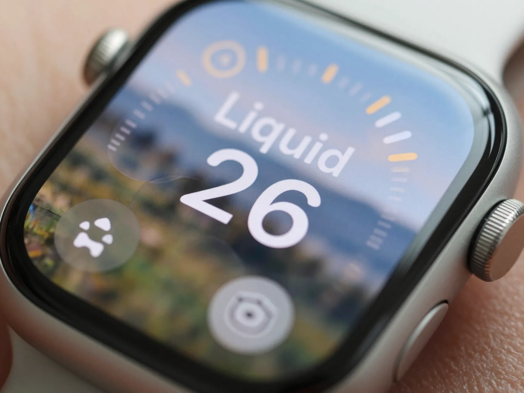
The introduction of Liquid Glass as the core visual language of watchOS 26 is one of the most significant design shifts in the Apple Watch’s history, and it is happening almost invisibly. Liquid Glass is not a color or a theme. It is a material metaphor: a translucent, refractive surface treatment that gives UI elements the appearance of depth, weight, and physical presence on screen.
On a device as small as the Apple Watch, this matters enormously. The watch face is roughly 1.9 inches of display. Every pixel has to earn its place. Liquid Glass achieves several things simultaneously:
- It creates visual hierarchy without relying on heavy borders or high-contrast fills.
- It allows background content to bleed through UI layers, maintaining context while foregrounding actions.
- It adapts to ambient light conditions, shifting its refraction behavior as the display brightness changes.
- It provides a cross-platform visual thread that connects watchOS 26 to iOS 26 and iPadOS 26, making the Apple ecosystem feel unified rather than fragmented.
Apple’s design resources for 2026 explicitly emphasize Liquid Glass materials as a cornerstone of cross-platform consistency [5][9]. Designers building apps for Apple Watch are now guided to use these materials in ways that feel native to the platform rather than ported from a phone interface.
The result is a watch face and app environment that feels alive, not static, even when the user is not actively interacting with it. That sense of liveliness is a key ingredient in why the Apple Watch feels premium in a way that specification sheets cannot fully explain.
3. Icon Design Discipline: The Grid Nobody Sees
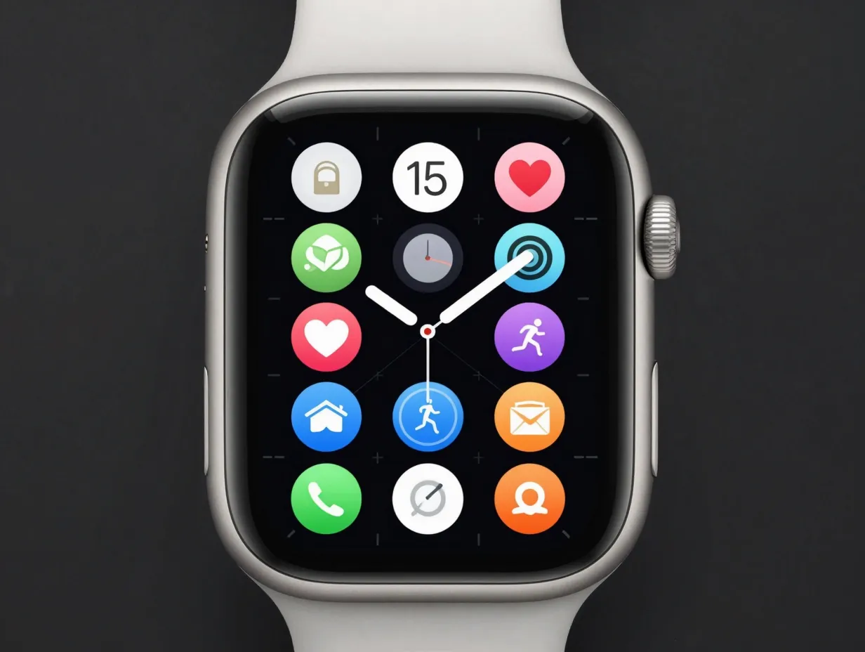
Every icon on the Apple Watch exists within a strict design system that most users never consciously register, but would immediately notice if it were violated. Apple’s official design guidance, updated in 2025, specifies precise rules for icon construction: corner radii, padding zones, visual weight distribution, and the principle of radical simplicity [4][5].
The Apple Watch icon grid is smaller and more demanding than its iPhone counterpart. A watch app icon must communicate its function at a glance, often at sizes below 40 pixels. This forces designers to strip away every element that is not essential. The result is a library of icons that are immediately readable, visually harmonious, and collectively reinforce the watch’s premium aesthetic.
Key icon design rules for Apple Watch (per official guidance):
- Use a single, bold visual metaphor, not a composition of multiple objects.
- Maintain consistent visual weight across the icon set to avoid any one app feeling heavier or lighter than its neighbors.
- Avoid text inside icons wherever possible; the watch face has no room for redundancy.
- Respect the corner radius system precisely, even slight deviations create visual dissonance in the app grid.
The Icon Composer tool, introduced by Apple and updated for 2026, allows developers to create unified icon materials that work consistently across Apple Watch, iPhone, and iPad [9]. This tool enforces the design rules programmatically, reducing the risk of icons that look correct on a large screen but break down at watch scale.
The broader designer community has recognized this discipline as a defining feature of the Apple Watch’s visual identity [7][8]. Icon libraries across the web, from Freepik to Icons8 to Dribbble, repeatedly use the same Apple Watch visual archetype precisely because the design system is so coherent and recognizable [1][6][7].
4. Interaction Micro-Designs: The Details You Feel, Not See
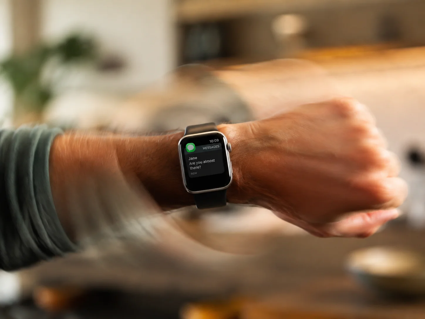
The fourth secret operates below the level of conscious perception. Apple Watch is filled with what designers call interaction micro-designs, small, precise decisions about how the device responds to human movement and context. These are not features listed on a spec sheet. They are the texture of the experience.
In watchOS 26, two micro-designs stand out as particularly significant:
Wrist-flick gestures have been refined to respond with greater contextual intelligence. The gesture that wakes the display, scrolls through notifications, or advances a workout summary is now calibrated to distinguish between intentional flicks and incidental wrist movements with higher accuracy. The result is a device that feels attentive rather than reactive, it responds when you mean it to, and stays quiet when you do not.
Ambient-aware audio adjusts the watch’s sound output based on environmental noise levels detected through the microphone. Notification tones, timer alerts, and Siri responses modulate in volume and frequency profile so they are audible in a quiet room without being jarring, and cut through background noise in a loud environment without requiring manual adjustment.
These micro-designs share a common design philosophy: the best interaction is the one the user does not have to think about. When a device handles context automatically and accurately, it stops feeling like a tool and starts feeling like an extension of the body. That shift in perception is central to why the Apple Watch generates the kind of loyalty that competitors find difficult to replicate.
5. Personalization as Emotional Architecture
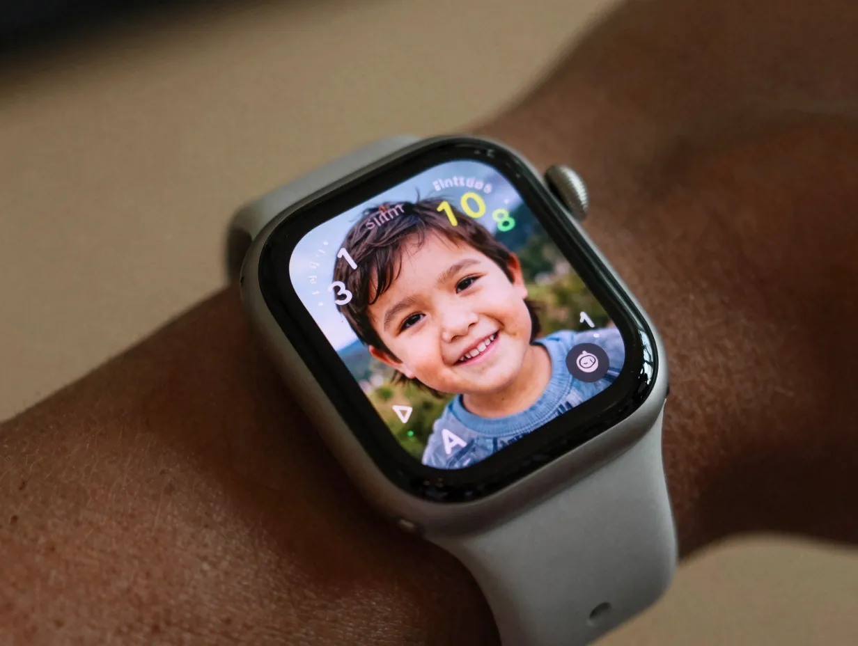
The fifth secret is perhaps the most underappreciated from a design strategy perspective. Apple Watch’s personalization system, particularly the Photos watch face, is not simply a customization feature. It is a deliberate mechanism for building emotional attachment between the user and the device.
The Photos watch face displays a user-selected image as the primary visual of the watch face. This sounds simple. The design depth is in the execution: the face uses on-device machine learning to identify the most visually compelling crop of the image, adjusts the time display color and weight to contrast with the image’s dominant palette, and updates the displayed photo throughout the day to surface different moments from the user’s library.
The effect is that the watch face becomes personally meaningful in a way that no competitor’s default interface achieves. A user who sees their child’s face, a travel photograph, or a pet every time they raise their wrist has formed an emotional association with the device that transcends utility.
This is a calculated design strategy, not a happy accident. Apple’s design team has long understood that emotional attachment drives retention, users who feel connected to their device upgrade more frequently, recommend it more enthusiastically, and are less susceptible to competitive alternatives. The Photos watch face is the most visible expression of this strategy, but the broader personalization system, band colors, complications, watch face styles, operates on the same principle.
6. Cross-Platform Visual Consistency: The Ecosystem Lock-In Nobody Calls Design
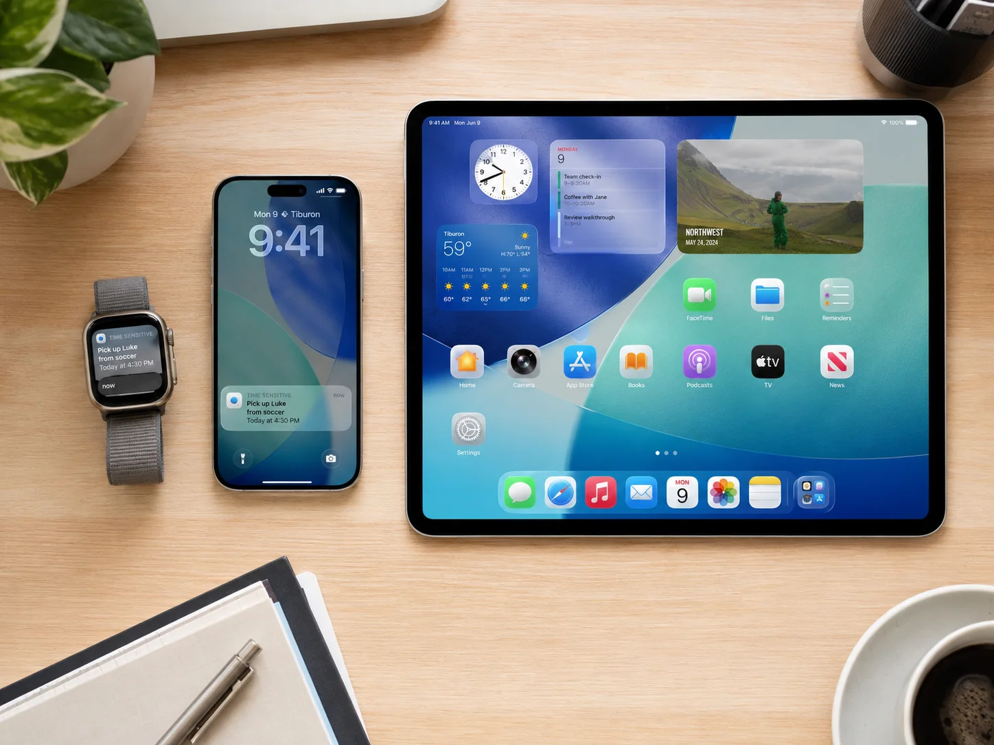
The sixth secret is the one that operates at the largest scale. Apple Watch does not exist as a standalone design object. It exists as a node in a visual and functional ecosystem that includes iPhone, iPad, Mac, and AirPods. The design secret is that cross-platform visual consistency, the shared language of icons, materials, gestures, and typography, makes the Apple Watch feel more powerful and more natural to anyone already inside the Apple ecosystem.
Apple’s design resources for 2026 make this explicit: the Liquid Glass material system, the icon geometry standards, and the interaction patterns are designed to be consistent across platforms while being optimized for each platform’s specific constraints [5][9]. A user who picks up their iPhone after glancing at their Apple Watch sees the same visual grammar. The cognitive load of switching between devices drops to near zero.
This consistency has a compounding effect on the watch’s iconic status. Because the Apple Watch shares its visual DNA with devices that billions of people use daily, the watch silhouette and interface patterns become familiar even to people who do not own one. The icon libraries that use the Apple Watch as their default smartwatch symbol [1][2][3][8][10] are not just reflecting the watch’s popularity, they are reinforcing it, embedding the silhouette deeper into the visual culture of technology.
Cross-platform consistency benefits at a glance:
| Design Element | Apple Watch | Cross-Platform Benefit |
|---|---|---|
| Liquid Glass material | Watch face and app UI depth | Unified feel across iOS 26 and iPadOS 26 |
| Icon grid system | App grid legibility at small scale | Icon Composer enforces consistency [9] |
| Gesture vocabulary | Wrist flick, crown scroll, tap | Mirrors swipe and scroll patterns on iPhone |
| Typography scale | Optimized for 1.9-inch display | Same typeface family as all Apple platforms |
| Personalization depth | Watch faces, bands, complications | Mirrors iPhone widget and wallpaper system |
What These 6 Apple Watch Design Secrets Reveal About the Future
The trajectory of these six design secrets points clearly toward where the Apple Watch is headed. Forward-looking analysis from 2025 and 2026 consistently predicts more software and material evolution than radical hardware redesign. The silhouette is locked in. The brand equity stored in that shape is too valuable to discard.
What will change is the depth and intelligence of the layers built on top of that stable foundation. Liquid Glass will likely become more adaptive, responding not just to ambient light but to the user’s activity state, time of day, and health metrics. Interaction micro-designs will grow more sophisticated as on-device processing power increases. Personalization will deepen as machine learning models become better at understanding what images, complications, and interface configurations resonate with individual users.
The icon design system will continue to tighten its cross-platform consistency, with tools like Icon Composer [9] playing a larger role in ensuring that the visual grammar of Apple Watch apps feels native regardless of which developer built them.
For designers, developers, and anyone who studies how products achieve cultural dominance, the Apple Watch is a case study worth examining closely. Its iconic status was not purchased with marketing spend alone. It was earned through the kind of disciplined, layered, long-term design thinking that this article has attempted to make visible.
Conclusion
The 6 Apple Watch design secrets that make it a wearable icon are not magic. They are the result of deliberate choices made consistently over many years: a stable silhouette that builds brand equity, a Liquid Glass visual language that adds depth without clutter, an icon design discipline that enforces legibility at every scale, interaction micro-designs that make the device feel intelligent, personalization features that create emotional attachment, and cross-platform consistency that makes the watch feel like a natural extension of a larger ecosystem.
Actionable next steps for designers and developers:
- Study Apple’s official design resources and updated guidance for watchOS 26 to understand how Liquid Glass materials should be applied in app interfaces [5].
- Use Icon Composer to build icons that meet Apple Watch’s strict grid and corner radius requirements from the start, not as an afterthought [9].
- Audit your app’s interaction patterns against the micro-design principles described in this article, ask whether each interaction requires conscious thought from the user, and eliminate friction wherever possible.
- Treat personalization as a retention strategy, not a cosmetic feature. Give users meaningful ways to make your app or watch face their own.
- Design for the ecosystem, not just the device. Ensure that your Apple Watch app shares visual and interaction DNA with your iPhone and iPad counterparts.
The Apple Watch will continue to evolve. The design principles behind its iconic status will not.
References
[1] Apple Watch – https://icons8.com/icons/set/apple-watch
[2] Apple Watch Style Small – https://icons8.com/icons/set/apple-watch–style-small
[3] Apple Watch – https://iconscout.com/icons/apple-watch
[4] Icons For Apple Watch The Definitive Guide 3d7f6d1b8016 – https://medium.com/iconfinder/icons-for-apple-watch-the-definitive-guide-3d7f6d1b8016
[5] Resources – https://developer.apple.com/design/resources/
[6] Apple Watch – https://www.freepik.com/icons/apple-watch
[7] Apple Watch – https://dribbble.com/tags/apple-watch
[8] Apple Watch – https://icons8.com/icon/22194/apple-watch
[9] Icon Composer – https://developer.apple.com/icon-composer/
[10] Apple Watch – https://iamvector.com/all-icons/apple-watch