6 Digital Watch Face Design Tips For A Modern, Readable Interface
Disclosure: This post contains affiliate links. As an Amazon Associate, we earn from qualifying purchases, and at no extra cost to you.
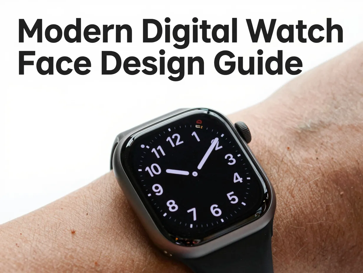
Smartwatch users glance at their wrists an average of 80 times per day, yet each glance lasts fewer than two seconds [1]. That razor-thin window of attention is the entire battlefield on which watch face design is won or lost. A cluttered, low-contrast, or poorly structured face does not just look bad, it fails its primary job. Applying the right 6 digital watch face design tips for a modern, readable interface can mean the difference between a face that users keep and one they discard within a week.
This guide breaks down six proven, research-backed design principles that cover everything from typography and contrast to battery optimization and safe-zone compliance. Whether designing for Wear OS, Samsung Galaxy Watch, or a custom embedded display, these tips translate directly into better user outcomes.
Key Takeaways
- Glanceability is the single most important metric: the time display must be readable in under two seconds without any interaction.
- Large, high-contrast, sans-serif numerals consistently outperform decorative or thin-stroke alternatives in real-world legibility tests.
- Limiting complications to three or fewer per face dramatically reduces cognitive load without sacrificing utility.
- Safe zones and bezel margins are non-negotiable technical constraints, not optional aesthetic choices.
- Battery-conscious design, ambient mode palettes, minimal animations, extends device life and earns long-term user loyalty.
Why Modern Watch Face Design Demands a New Approach
The smartwatch market has matured rapidly. By mid-2026, users expect their watch faces to function as precision instruments, not decorative screens. Early smartwatch faces borrowed heavily from analog clock aesthetics, but the constraints of a 40-45 mm AMOLED or LCD display, combined with always-on ambient modes and health complication data, demand a purpose-built visual language [4].
Research into wearable interface usability confirms that the primary failure mode of poorly designed watch faces is not aesthetic, it is functional. Users abandon faces because they cannot read the time quickly, not because the color palette is unattractive [7]. This shift in understanding has moved the field toward a design-first, data-second philosophy where every pixel must earn its place.
The 6 digital watch face design tips for a modern, readable interface outlined below are grounded in platform guidelines, usability research, and the preferences of active smartwatch communities [6]. They apply equally to professional designers and hobbyist creators working in tools like Facer, Samsung Watch Face Studio, or the Wear OS Watch Face Format.
1. Design for Ultra-Fast Glanceability
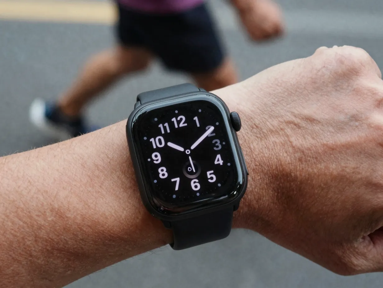
The foundational principle of every effective digital watch face is glanceability, the ability to extract key information in a single, sub-two-second glance without tapping, swiping, or tilting the wrist [1].
What glanceability actually means in practice:
- The current time must be the dominant visual element, larger and brighter than any other element on the face.
- Secondary data (date, step count, heart rate) should be readable in a second pass, not competing with the time for immediate attention.
- No animation, transition, or decorative element should obscure the time display at any point during its cycle.
A common mistake is treating the watch face like a miniature phone home screen. Phone interfaces are designed for sustained interaction; watch faces are designed for instant extraction [5]. Every design decision, font size, color, placement, animation speed, should be evaluated against one question: can a user read the time in under two seconds while walking?
Glanceability checklist:
| Design Element | Glanceability Standard |
|---|---|
| Time numeral size | Minimum 30% of display height |
| Primary color contrast | 4.5:1 ratio or higher |
| Animation on time display | None or sub-200ms |
| Number of focal points | One (the time) |
| Complication placement | Outside the central time zone |
Platform guidelines from Android’s Wear OS documentation reinforce this hierarchy explicitly, noting that the time should always be the most prominent element and that complications must not visually compete with it [4].
2. Use Large, Simple Numerals and Highly Legible Type
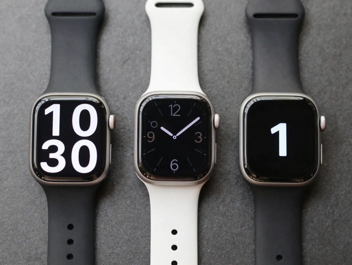
Typography is the most consequential design decision in any digital watch face. The numeral style chosen determines whether the face succeeds or fails at its core function [8].
The case against decorative fonts:
Thin-stroke serif typefaces, script numerals, and heavily stylized display fonts all share a common flaw: they degrade sharply at small sizes and under adverse lighting conditions. A numeral that looks elegant in a design tool at 200% zoom can become unreadable on a 1.4-inch display in direct sunlight [3].
The design community consensus, supported by user preference surveys, strongly favors:
- Bold or medium-weight sans-serif typefaces (e.g., Roboto, Inter, or purpose-built watch fonts)
- High x-height numerals that remain distinct at small sizes
- Generous letter spacing to prevent digit collision at large sizes
- Consistent stroke width across all numerals to aid pattern recognition
“Clean layouts, large digits, and consistent style are the three attributes users cite most often when asked what makes a watch face feel ‘good.'” [6]
Avoid these typographic pitfalls:
- Ultra-thin strokes (below 2px at native resolution) that disappear on AMOLED displays
- Numerals with ambiguous forms (certain stylized 1s that resemble 7s, or 6s that resemble 0s)
- Mixed typefaces within the same face (time in one font, complications in another)
- Overly compressed or condensed numerals that reduce horizontal legibility
For the time display specifically, a numeral height of at least 30-40% of the screen height is the widely accepted minimum for reliable glanceability [1]. Complications and secondary data can use smaller type, but should never drop below a size that requires the user to focus deliberately.
3. Maximize Contrast and Reduce Visual Noise
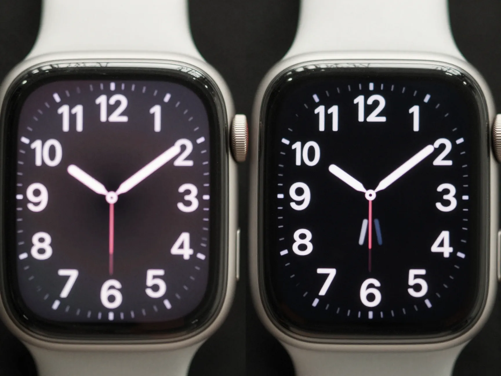
Contrast is not merely an aesthetic preference, it is a functional requirement with direct accessibility implications. The 6 digital watch face design tips for a modern, readable interface consistently return to contrast as a make-or-break variable [3].
Understanding contrast in the watch context:
Standard web accessibility guidelines (WCAG 2.1) recommend a minimum contrast ratio of 4.5:1 for normal text and 3:1 for large text. On a smartwatch display, where ambient light conditions vary from a dark bedroom to direct outdoor sunlight, these minimums are a floor, not a ceiling [3].
AMOLED displays have a unique characteristic that designers can exploit: true black pixels consume zero power. This means a black background is simultaneously the highest-contrast option and the most battery-efficient choice, a rare case where good design and good engineering align perfectly [4].
Reducing visual noise:
Visual noise refers to any element on the face that does not contribute to the user’s primary or secondary information needs. Common sources include:
- Decorative background textures that compete with numerals
- Thin grid lines or tick marks that add complexity without utility
- Gradient fills that reduce the effective contrast of overlaid text
- Multiple complication icons that create a cluttered midground between the background and the time display
A practical test: blur the watch face design to 20% opacity and check whether the time numerals are still the most visible elements. If any background element competes with the numerals at reduced opacity, it will compete even more aggressively under real-world glancing conditions [5].
Contrast across lighting conditions:
| Lighting Condition | Recommended Approach |
|---|---|
| Indoor ambient | Standard contrast, full color palette |
| Bright outdoor sunlight | Increased stroke weight, maximum contrast |
| Dim / nighttime | Reduced brightness, warm tones to preserve night vision |
| Always-on ambient mode | Grayscale or minimal color, black background |
4. Establish a Clear Information Hierarchy and Limit Complications
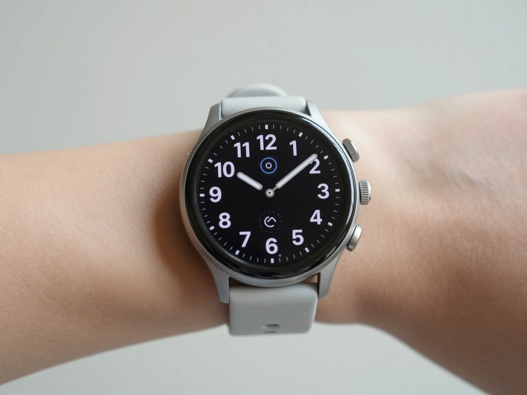
A complication, in watch terminology, is any display element beyond the time itself, date, weather, fitness metrics, notifications, and so on. The temptation to add complications is understandable; each one feels useful in isolation. But cumulative complexity is the primary driver of watch face abandonment [6].
The hierarchy principle:
Information on a watch face should be organized into three tiers:
- Primary: The current time, always the largest, highest-contrast element.
- Secondary: One or two complications the user checks regularly (date, battery, step count).
- Tertiary: Optional contextual data (weather, heart rate zone) that is present but does not demand attention.
Research into user behavior on wearable devices confirms that faces with more than three complications show measurably lower retention rates than faces with one or two [7]. The reason is cognitive: each additional element requires the brain to filter it out during a time-check glance, increasing the mental effort of what should be an automatic behavior.
Practical complication guidelines:
- Position complications at the cardinal points (12, 3, 6, 9 o’clock positions) or in a single bottom row, never overlapping the central time zone.
- Use icons rather than text labels for complications wherever the icon is universally recognizable (battery, steps, heart rate).
- Ensure each complication has sufficient tap target size (minimum 48×48 dp on Wear OS) even if the visual element appears smaller [4].
- Group related complications (health metrics together, utility metrics together) to create visual clusters that the eye can skip as a unit.
“The best complications are the ones the user forgets are there until they need them, invisible when irrelevant, clear when consulted.” [5]
5. Optimize for Different Lighting Conditions and User Abilities
A watch face that looks perfect in a design studio may be completely unreadable on a morning run or in a dimly lit restaurant. Designing for the full range of real-world conditions is not optional, it is the difference between a professional and an amateur result [3].
Always-on display (AOD) design:
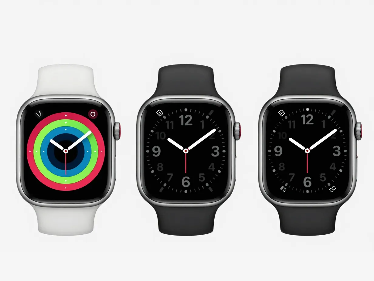
Most modern smartwatches support an always-on ambient mode that displays a simplified version of the watch face at reduced brightness to conserve battery. Designers must create a dedicated ambient variant of every face, not simply dim the active version [1].
Effective ambient mode design:
- Reduces the color palette to black, white, and one accent color at most
- Removes all animations and transitions
- Maintains the same spatial layout as the active face so the user’s eye knows where to look
- Uses outline-style or reduced-weight versions of numerals to minimize pixel illumination on AMOLED
Accessibility considerations:
Approximately 8% of men and 0.5% of women have some form of color vision deficiency [3]. Watch face designers should:
- Never rely on color alone to convey meaning (use shape, size, or position as secondary cues)
- Test designs in grayscale to verify that all elements remain distinguishable
- Avoid red-green color combinations for complication indicators
- Ensure that the time numerals remain readable against the background without requiring color perception
High-contrast and large-text modes:
Some platforms, including Wear OS, support system-level accessibility settings that increase contrast or enlarge text. Faces should be tested with these settings active to ensure they do not break the layout or cause text overflow [4].
6. Respect Bezels, Safe Zones, and Multi-Device Layouts
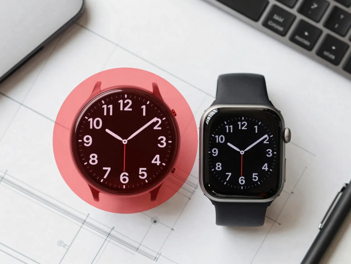
Every smartwatch display has physical or software-defined boundaries that constrain usable design space. Ignoring these constraints produces faces that look broken on real hardware, regardless of how polished they appear in a simulator [8].
Understanding safe zones:
Safe zones are the inset areas of the display where content is guaranteed to be fully visible, accounting for:
- Physical bezel width (varies significantly between watch models)
- Rounded corner radii on circular and squircle displays
- System UI overlays (status indicators, notification dots)
- Chin areas on some circular displays that clip the bottom of the screen
The standard recommendation is to keep all critical content, especially the time numerals, within a safe zone inset of at least 5-8% from each edge [4]. Decorative elements can extend to the edge, but no information-carrying element should risk being clipped.
Circular vs. rectangular displays:
The smartwatch market is split between circular displays (common on Wear OS devices and Garmin) and rectangular displays (Apple Watch, some Fitbit models). A face designed exclusively for one form factor will look awkward or broken on the other.
Best practices for multi-device compatibility:
- Design the core layout for the most constrained form factor first (typically circular)
- Use relative positioning (percentage-based coordinates) rather than absolute pixel values
- Test on both 40mm and 44mm (or equivalent) sizes, as the same face can feel crowded on a smaller dial
- Verify that complication tap targets remain accessible on all supported display sizes [1]
Bezel and crown interaction zones:
On devices with physical crowns or buttons, the right edge of the display is frequently obscured or accidentally activated. Avoid placing complications or interactive elements in the rightmost 10-15% of the display on such devices [8].
Multi-device layout testing checklist:
| Test Scenario | Pass Criteria |
|---|---|
| Circular 40mm display | No clipping, time fully visible |
| Rectangular display | Layout reflows without overflow |
| Ambient mode | Simplified face renders correctly |
| High-contrast system mode | All elements remain distinguishable |
| Large-text system mode | No text overflow or collision |
Applying the 6 Digital Watch Face Design Tips For A Modern, Readable Interface in Practice
Understanding these six principles individually is useful; applying them as an integrated system is where professional-quality results emerge. The tips are not independent checkboxes, they interact and reinforce each other.
A practical design workflow:
- Start with the time display. Set the numeral size, weight, and position before adding anything else. Every subsequent decision is subordinate to this element.
- Define the contrast framework. Choose background and foreground colors that meet the 4.5:1 minimum ratio in both active and ambient modes.
- Add complications one at a time. After each addition, perform the two-second glance test. Stop adding complications the moment the time becomes harder to read.
- Map safe zones on the canvas. Mark the inset boundaries before finalizing any element positions.
- Build the ambient variant. Reduce the active face to its essential elements using a minimal color palette.
- Test across devices and conditions. Use emulators for multiple display sizes and test in bright light, dim light, and with accessibility settings active.
Common mistakes and their fixes:
| Mistake | Fix |
|---|---|
| Time numeral too small | Increase to minimum 30% of display height |
| Background texture competing with numerals | Replace with solid or very subtle gradient |
| Too many complications | Remove all but the two most-used |
| No ambient mode variant | Build a dedicated simplified layout |
| Content clipped on circular display | Apply 8% safe zone inset to all content |
| Decorative font unreadable at size | Switch to bold sans-serif with high x-height |
The current direction of the field in mid-2026 is toward adaptive watch faces, designs that respond to context (time of day, activity, ambient light) by automatically adjusting layout, color, and visible complications [9]. Designers who master the foundational principles above will be well-positioned to implement adaptive logic, because adaptation requires a clear understanding of which elements are essential and which are contextual [10].
Conclusion
The 6 digital watch face design tips for a modern, readable interface covered in this guide, glanceability, legible typography, contrast and noise reduction, information hierarchy, accessibility optimization, and safe-zone compliance, form a complete framework for creating watch faces that users trust and keep.
Actionable next steps:
- Audit an existing watch face design against the two-second glance test. Time how long it takes to read the time under realistic conditions.
- Run a contrast ratio check on all text-background combinations using a free tool such as the WebAIM Contrast Checker.
- Remove every complication that is not checked at least once per hour during a typical day. Simplicity is not a compromise, it is the goal.
- Build or rebuild the ambient mode variant as a first-class design artifact, not an afterthought.
- Test the final design on the smallest supported display size and with system accessibility settings active before publishing.
Watch face design rewards discipline. The faces that users rate highest are almost never the most complex, they are the ones that make the time instantly readable, keep secondary information accessible without demanding attention, and look equally good in a boardroom and on a morning run. These six principles make that outcome achievable for any designer willing to apply them consistently.
References
[1] Watchfaces – https://iut-fbleau.fr/docs/android/design/wear/watchfaces.html
[2] How To Choose The Best Watch Face Styles For Your Smartwatch – https://www.alibaba.com/product-insights/how-to-choose-the-best-watch-face-styles-for-your-smartwatch.html
[3] Your Guide To Smartwatch Interface Design Designing For All – https://uxdesign.cc/your-guide-to-smartwatch-interface-design-designing-for-all-1a588a6a1181
[4] Watch Faces – https://developer.android.com/design/ui/wear/guides/m2-5/surfaces/watch-faces
[5] Designing User Friendly Smartwatch Interfaces – https://medium.com/orizon-design/designing-user-friendly-smartwatch-interfaces-b42bff4dde8f
[6] About Watch Faces Design Dear Creators 99 Of Your – https://www.reddit.com/r/GalaxyWatchFace/comments/1138yu8/about_watch_faces_design_dear_creators_99_of_your/
[7] PLOS ONE Watch Face Usability Study – https://journals.plos.org/plosone/article/file?id=10.1371/journal.pone.0327647&type=printable
[8] 10 Tips For Designing For Wearables And Watches – https://designshack.net/articles/graphics/10-tips-for-designing-for-wearables-and-watches/
[9] Clockoclock Watch Face Design Article – https://clockoclock.app/articles/static/article6.html
[10] Arxiv Wearable Interface Research – https://arxiv.org/html/2310.16185v2