8 iPhone App Organization Layout Ideas For Maximum Productivity
The average smartphone user taps, swipes, and types on their phone over 2,600 times per day, yet most people have never spent 20 minutes deliberately organizing the device that runs their professional and personal life. A chaotic home screen is not a minor inconvenience. It is a daily tax on attention, decision-making, and time. The good news is that the 8 iPhone app organization layout ideas for maximum productivity outlined in this guide are practical, research-backed, and implementable in a single afternoon.
Disclosure: This post contains affiliate links. As an Amazon Associate, we earn from qualifying purchases, and at no extra cost to you.
Whether the goal is to stop losing five minutes searching for an app, reduce the pull of social media during deep work, or simply feel less overwhelmed every time the phone is unlocked, these layout strategies deliver measurable results. Each idea draws on current best practices from productivity experts and iOS power users who have tested these systems in real workflows.
Key Takeaways
- Limiting home screens to two to four pages and using App Library for overflow dramatically reduces visual clutter and decision fatigue.
- Placing the most-used apps in the thumb-friendly bottom zone and dock cuts navigation time throughout the day.
- Linking separate home screen layouts to iOS Focus modes (Work, Personal, Deep Work) creates context-aware environments that protect attention.
- A single rotating widget stack for calendar, tasks, and weather replaces multiple cluttered widgets and surfaces only time-critical information.
- Monthly Screen Time reviews provide data-driven evidence for which apps deserve prime home screen real estate and which should be hidden or deleted.
The Foundation: Why Layout Strategy Matters for iPhone Productivity
Before diving into the 8 iPhone app organization layout ideas for maximum productivity, it helps to understand why layout decisions have such a large impact on output. Every time someone unlocks their phone and scans a disorganized grid of icons, the brain runs a small but real search process. Multiply that by dozens of daily unlocks and the cognitive overhead becomes significant.
Research in behavioral design consistently shows that friction shapes behavior. An app buried three swipes deep gets used less than one sitting in the dock. A social media icon on the first page invites mindless tapping. Conversely, a clean, intentional layout nudges users toward the tools they actually need. The strategies below are organized so that each one builds on the last, creating a layered system rather than a collection of isolated tips.
8 iPhone App Organization Layout Ideas For Maximum Productivity
1. Cap Your Home Screens at Two to Four Pages
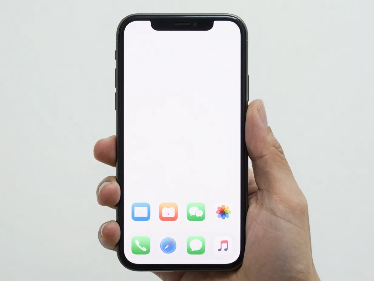
The single most impactful structural decision is limiting the total number of home screen pages. Multiple 2025-2026 productivity guides recommend a strict cap of no more than four pages, with the first reserved for the highest-priority tools and later pages serving increasingly specialized purposes [2]. One widely cited approach goes further, advocating a “single main page plus App Library” model where any app not opened in the past week is removed from visible home screens entirely [10].
The practical rule is straightforward: if an app does not earn its place on a visible page through regular use, it belongs in the App Library. iOS automatically organizes the App Library into categories, and Spotlight Search makes any app findable in under three seconds. There is no functional penalty for hiding rarely used apps, only a cognitive benefit from seeing less clutter every time the phone is unlocked [2][10].
Recommended page structure:
- Page 1: Daily essentials (messaging, email, calendar, notes, primary productivity app)
- Page 2: Work tools and secondary productivity apps
- Page 3 (optional): Health, finance, and lifestyle apps
- App Library: Everything else
2. Place High-Frequency Apps in the Thumb Sweet Spot
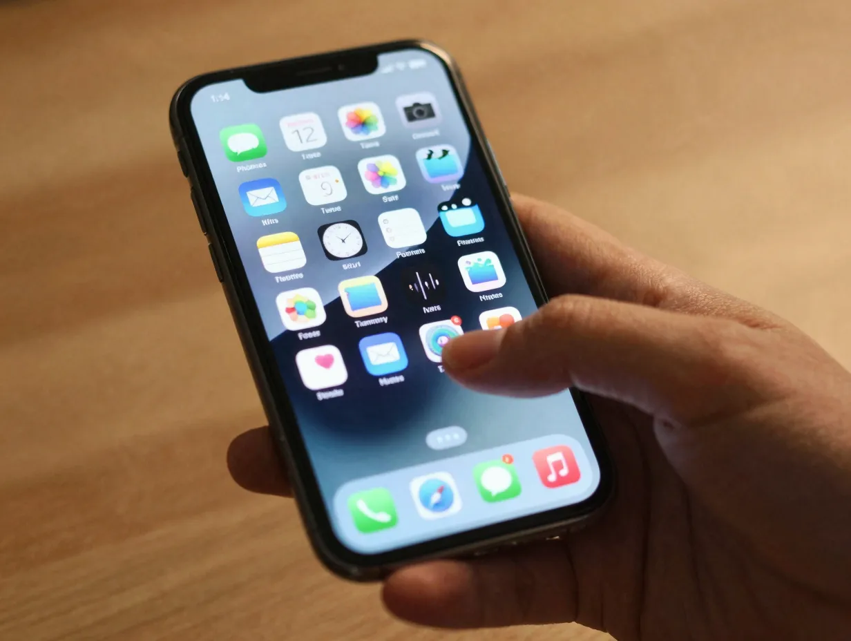
Ergonomics matter more than most people realize when setting up an iPhone layout. The bottom third of the screen, particularly the dock and the bottom two rows of the first page, is where the thumb naturally lands without requiring a grip shift. Productivity-focused home screen guides specifically advise placing the most-used apps (communications, calendar, notes, task manager) in this zone [2][6].
Asian Efficiency’s home screen setup guide puts it directly: place frequently accessed apps near the bottom of the screen where the thumb naturally reaches [6]. A related concept sometimes called the “12-app rule” holds that the dock plus the bottom grid of the first page should collectively cover every app a person touches before noon [10].
Dock recommendations (four slots):
- Phone or primary messaging app
- Email client
- Calendar
- Task manager or notes app
The top half of the screen is best reserved for a widget stack or left intentionally sparse. Reaching to the top of a large iPhone screen repeatedly throughout the day adds up to real physical effort and increases the chance of dropping the device.
3. Build Function-Based Folders and Keep Their Number Small
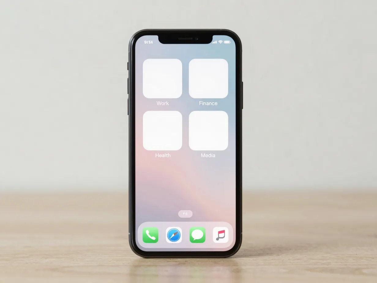
Folders are powerful organizational tools when used with discipline and counterproductive when used as a dumping ground. The key distinction is between generic folder names like “Utilities” or “Misc” and function-based labels that describe what the folder helps the user accomplish [2][5].
Effective folder names include: Work, Finance, Health, Networking, Media, and Travel. Each name signals a purpose rather than a category, which makes it easier to find apps intuitively and harder to let the folder become a junk drawer. Productivity layout guides recommend keeping the total number of visible folders to between three and five on the main screens [2][14].
Folder naming comparison:
| Generic Name (Avoid) | Function Name (Use) |
|---|---|
| Utilities | Work |
| Misc | Finance |
| Social | Networking |
| Fun | Health |
| Apps | Media |
SimplyMac’s layout tips suggest creating folders labeled Work, Finance, Health, and Social after first removing or hiding unused apps entirely [14]. The folder audit should happen before the naming exercise, not after.
4. Tie Different Layouts to iOS Focus Modes
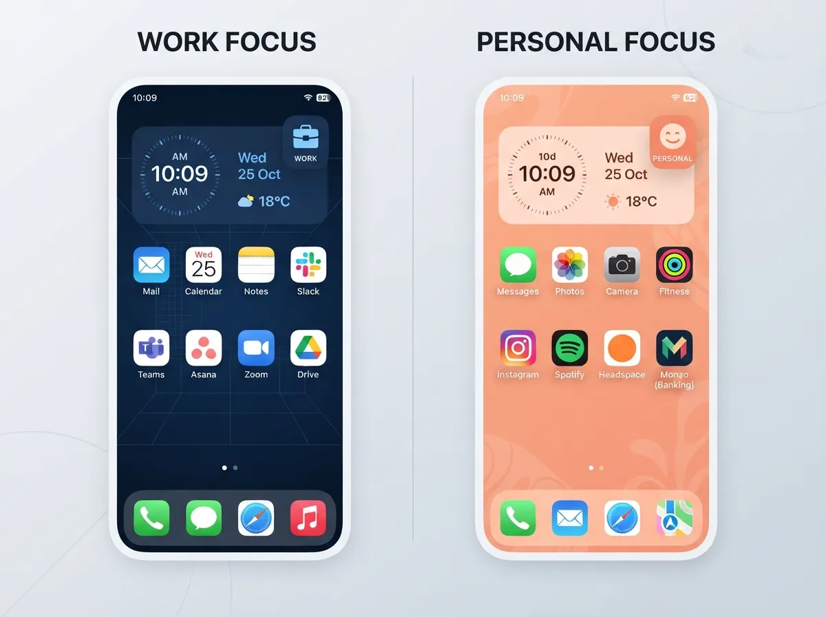
iOS Focus modes are one of the most underused productivity features available on the iPhone. The ability to link specific home screen configurations to Work, Personal, and Deep Work contexts means the phone can automatically show only the relevant apps for each part of the day [2][6][10].
A Work Focus configuration might display a page showing email, calendar, notes, a task manager, and a project management app while hiding social media, games, and streaming services entirely. When the workday ends and Personal Focus activates, the home screen reconfigures to show messaging apps, health tools, and entertainment options [6][10].
“Productive users link Focus modes to specific home screens so that work apps appear only during work hours while social media is hidden.” [6]
Setting this up requires three steps: create a Focus mode in Settings, assign a custom home screen page to that Focus, and schedule or automate when the Focus activates (by time, location, or app). A cross-platform productivity guide advises creating a Work Focus that allows only work apps and silences everything else [13]. Once configured, the system runs automatically without requiring any manual switching.
Focus mode layout matrix:
- Work Focus: Email, Calendar, Notes, Task Manager, Project App
- Personal Focus: Messages, Health, Banking, Entertainment folder
- Deep Work Focus: Notes, Timer, Reference apps only (all else hidden)
5. Use a Single Smart Widget Stack
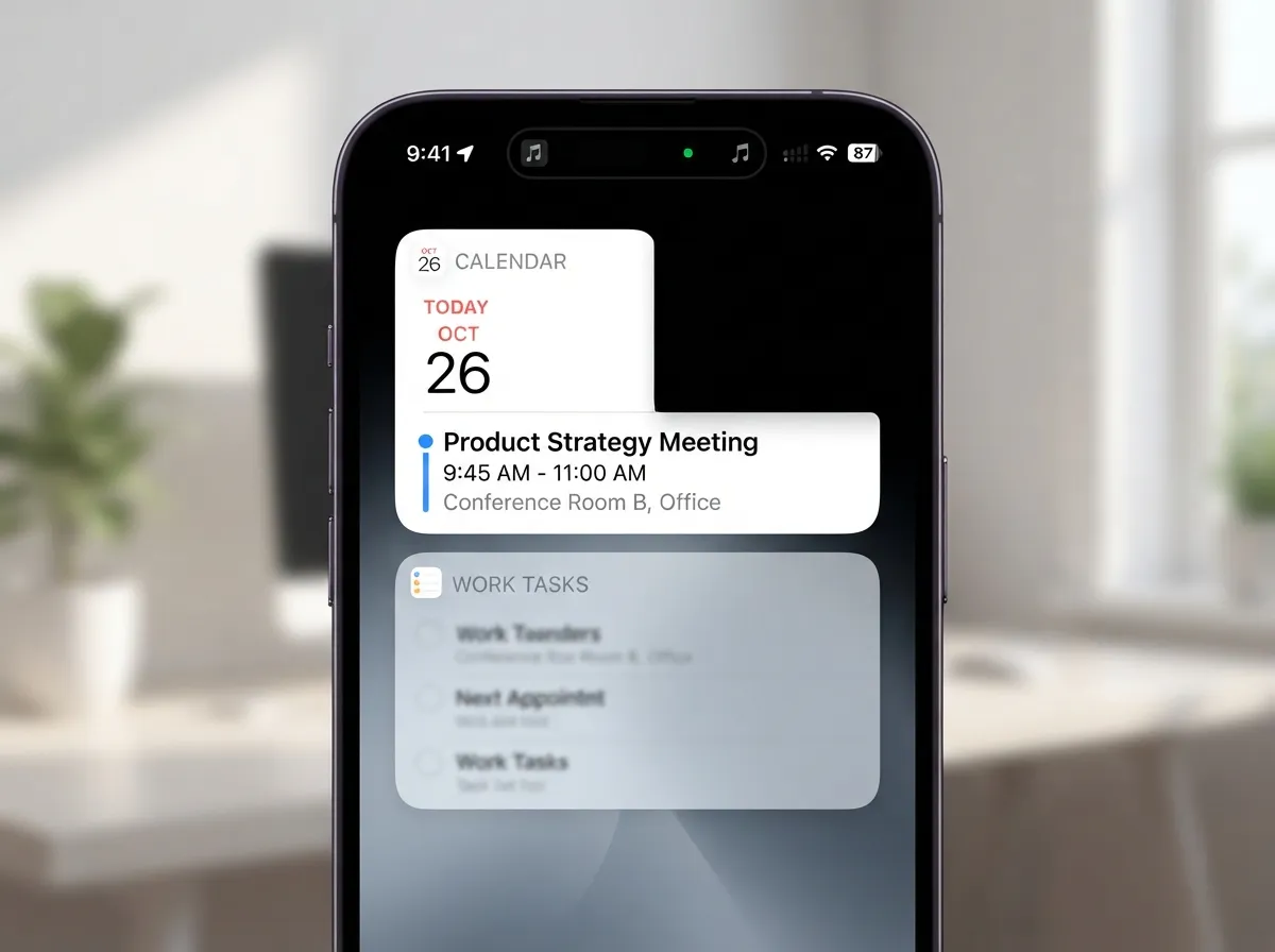
Widgets are useful when used sparingly and actively harmful to focus when overused. The current best practice is to replace multiple individual widgets with one adaptive widget stack that rotates through two to four cards based on time of day or manual swipe [2][5][10].
A well-configured widget stack for a productivity-focused user typically includes: a calendar showing the next appointment, a task list showing today’s top three priorities, a step count or activity ring, and a weather summary. This single stack surfaces time-sensitive information without requiring the user to open any app, which is the core value proposition [2][5].
The 2026 Alibaba layout article recommends a single stack for time-sensitive information specifically to avoid visual noise [2]. TroopMessenger’s productivity guide reinforces this by advising users to add only widgets that reduce app openings, so decisions and actions can happen directly from the home screen [5].
Widget stack configuration tips:
- Place the stack in the top half of Page 1 where it is visible but not in the thumb zone
- Limit the stack to four rotating cards maximum
- Use Smart Rotate to let iOS surface the most relevant card automatically
- Remove any widget that duplicates information already visible elsewhere
6. Create a Dedicated Productivity Hub Folder
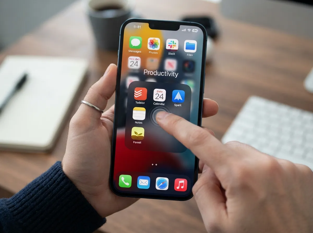
Beyond general function-based folders, one specific folder deserves a permanent spot on the first page or in the dock: a Productivity Hub. This folder consolidates the task manager, calendar, notes app, email client, and focus timer into a single one-tap destination [5].
The logic is straightforward. These five to seven apps represent the core planning and execution tools for most knowledge workers. Grouping them in one labeled folder means that starting a work session, reviewing priorities, or capturing a thought always begins with the same single tap. TroopMessenger proposes exactly this structure: a dedicated Productivity folder on the home screen for reaching core planning tools instantly [5].
Recommended Productivity Hub contents:
- Task manager (e.g., Things 3, Todoist, or OmniFocus)
- Calendar (native Calendar or Fantastical)
- Notes app (native Notes, Notion, or Obsidian)
- Email client (native Mail, Spark, or Superhuman)
- Focus timer (Forest, Be Focused, or Toggl)
- Reference or read-later app (Readwise, Instapaper)
Zapier’s app roundup and Flowlu’s 2026 productivity guide both identify these categories as the highest-value apps for knowledge workers, making them natural candidates for consolidated access [12][15]. The folder does not need to be large. Six to eight apps is the ideal range before it becomes unwieldy.
7. Aggressively Hide Social and Entertainment Apps
This strategy is the one most users resist and the one that delivers the most immediate productivity gains. Social media, gaming, and streaming apps placed on the first home screen page are not neutral. They are optimized by their developers to attract attention, and their placement in prime screen real estate makes them the path of least resistance during any idle moment [5][6][10].
The recommended approach is to remove these apps from all visible home screens and leave them accessible only through App Library or Spotlight Search. This creates a small but meaningful friction barrier. Instead of a reflexive tap on an icon, using a social app requires a deliberate search action, which breaks the automatic behavior loop [6][11].
Asian Efficiency explicitly recommends removing social media apps from the home screen to reduce distraction, leaving them only in App Library [6]. AppPicked’s 2026 layout guide supports moving entertainment and social apps off the first page to a secondary page that can be excluded entirely from Work Focus modes [10]. For users who want to go further, minimalist guides suggest bundling all social, gaming, and streaming apps into a single folder on a tertiary page that requires a deliberate gesture to access [11].
Distraction reduction checklist:
- Move all social media apps to App Library only
- Move all games to a single folder on the last page
- Remove streaming app icons from home screens (use App Library)
- Disable notification badges for all social and entertainment apps via Settings > Notifications
8. Prune Monthly Using Screen Time Data and Disable Notification Badges
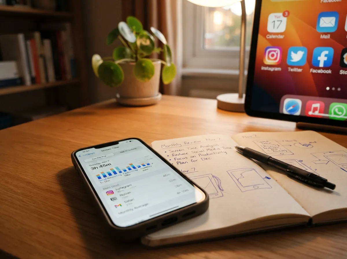
The final idea in this set of 8 iPhone app organization layout ideas for maximum productivity is the one that keeps the entire system healthy over time. A well-organized home screen degrades without maintenance. New apps get downloaded and placed carelessly, old apps accumulate, and notification badges multiply until the home screen resembles the disorganized state it started in.
The solution is a monthly five-minute review using Screen Time data. iOS Screen Time shows exactly which apps were opened, for how long, and how many notifications each one delivered. AppPicked’s 2026 guide recommends this specific routine: open Screen Time, identify any app not opened in the past 30 days, and move it off the home screen into App Library [10]. Asian Efficiency advises identifying the top ten most-used apps and ensuring only those occupy the primary home screen [6].
The second component of this strategy is notification badge management. Red number badges on app icons are a form of visual noise that increases cognitive load every time the home screen is visible. TroopMessenger’s 2026 guide advises turning off notification badges for non-essential apps via Settings > Notifications so that only truly urgent apps display counts [5]. Alibaba’s layout article pairs this with a recommendation to use consistent wallpapers and icon styles to reduce visual variety and mental stimulation from the home screen itself [2].
Monthly maintenance routine (5 minutes):
- Open Settings > Screen Time > See All Activity
- Identify apps with zero opens in the past 30 days
- Move those apps to App Library or delete them
- Review notification badge settings for any new apps installed
- Confirm Focus mode schedules are still accurate for current work patterns
Advanced Strategies: Shortcuts, Automation, and the Future of Context-Aware Layouts
For users who have implemented all eight ideas and want to go further, Siri Shortcuts and home screen automation represent the next level of optimization. Rather than tapping through multiple apps to complete a routine task, a single custom shortcut icon on the home screen can trigger a multi-step workflow: logging an expense, starting a focus timer, opening a project dashboard, or sending a templated message [5].
TroopMessenger recommends using Siri Shortcuts for repetitive multi-step actions so common workflows can be launched directly from an icon or widget [5]. A cross-platform productivity guide similarly advises keeping frequently used shortcuts near the dock as one-tap actions and avoiding cluttering the home screen with every available gadget [13].
Looking ahead, expert analysis suggests that as iOS continues to expand Focus Filters, widgets, and automation capabilities, future maximum-productivity layouts will rely increasingly on context-aware screens that reconfigure automatically based on time of day, location, or connected device. A commute screen, an office screen, and a home screen could each activate automatically without any user input [6][10]. Monthly data-driven pruning and dynamic folder visibility are expected to become standard practice for productivity-oriented iPhone users as these tools mature [6][10].
Conclusion
Implementing the 8 iPhone app organization layout ideas for maximum productivity does not require hours of effort or expensive apps. The core moves are structural: reduce visible pages, place high-use apps in the thumb zone, create function-based folders, link layouts to Focus modes, consolidate a widget stack, build a Productivity Hub folder, hide distracting apps, and maintain the system with monthly Screen Time reviews.
Actionable next steps to take today:
- Spend 20 minutes this week archiving every app not used in the past 30 days to App Library.
- Set up one Focus mode (start with Work) and assign a dedicated home screen page to it.
- Replace all individual widgets with a single four-card widget stack on Page 1.
- Create a Productivity Hub folder containing the five to seven core planning apps.
- Disable notification badges for every social and entertainment app via Settings > Notifications.
- Schedule a recurring five-minute monthly Screen Time review in the calendar.
The return on this investment is compounded daily. Every unlocked phone that shows a clean, intentional layout instead of a cluttered grid is a small decision removed, a distraction avoided, and a moment of focus preserved.
References
[1] Best Organization Apps For Iphone – https://vorby.com/blog/best-organization-apps-for-iphone
[2] How To Organize Your Iphone Home Screen For Maximum Productivity In 2025 – https://www.alibaba.com/product-insights/how-to-organize-your-iphone-home-screen-for-maximum-productivity-in-2025.html
[3] apps.apple – https://apps.apple.com/us/iphone/grouping/25244
[4] Best Iphone Productivity Apps 2026 – https://buildin.ai/blog/best-iphone-productivity-apps-2026
[5] Productivity Apps For Iphone – https://www.troopmessenger.com/blogs/productivity-apps-for-iphone
[6] Iphone Homescreens – https://www.asianefficiency.com/technology/iphone-homescreens/
[7] Iphone Home Screen Organize Gtd – https://news.macgasm.net/tips/iphone-home-screen-organize-gtd/
[8] Productivity Apps For Iphone – https://thebusinessdive.com/productivity-apps-for-iphone
[9] Best Iphone Productivity Apps – https://appblock.app/best-iphone-productivity-apps/
[10] Iphone Home Screen Organization Guide 2026 – https://apppicked.com/en/blog/iphone-home-screen-organization-guide-2026