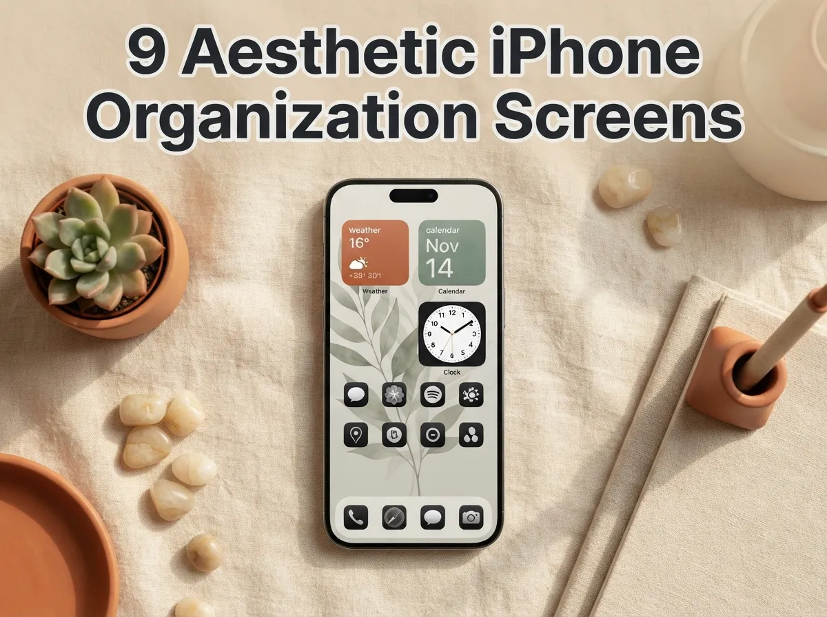
9 Aesthetic iPhone Organization Screens For A Visually Pleasing Setup
Over 1.4 billion people use an iPhone daily, yet research consistently shows that a cluttered, disorganized Home Screen increases cognitive load and reduces focus. The gap between a chaotic grid of mismatched icons and a thoughtfully designed, visually pleasing setup is not a matter of technical skill, it is a matter of knowing which aesthetic frameworks actually work. This guide to 9 Aesthetic iPhone Organization Screens For A Visually Pleasing Setup breaks down every major style, the design logic behind each one, and the exact steps to replicate them using iOS 26’s newest customization tools.
Disclosure: This post contains affiliate links. As an Amazon Associate, we earn from qualifying purchases, and at no extra cost to you.
Key Takeaways
- iOS 26 introduced native “Tinted” icon modes and a streamlined wallpaper picker accessible directly from the Home Screen, making aesthetic setups faster to build than ever before [1][3]
- Every high-quality aesthetic setup starts with a defined three-color palette before any icons or widgets are touched [2][5]
- Capping widgets at three per screen preserves visual hierarchy and tap accuracy [8]
- The most popular 2026 aesthetic category is warm earth tones, followed by Liquid Glass and minimal grayscale [6][8]
- A fully aesthetic, organized Home Screen can be built in 20 to 30 minutes using a structured, time-boxed workflow [2][6]
Why Aesthetic Organization Actually Matters
A beautiful iPhone screen is not purely decorative. When icons, widgets, and wallpapers follow a coherent visual system, the eye moves predictably from one element to the next, reducing the time spent hunting for apps and lowering daily decision fatigue. Design guides published in 2026 consistently frame aesthetic organization as a productivity tool, not just a style preference [2][5].
The foundation of any strong setup is a deliberate color palette. Best-practice guides recommend locking in three colors, a dominant (60%), a secondary (30%), and an accent (10%), before selecting a single icon or widget [2][5]. This 60/30/10 distribution mirrors the same rule used in interior design and graphic layout, and it is the single most reliable way to make a Home Screen feel intentional rather than accidental.
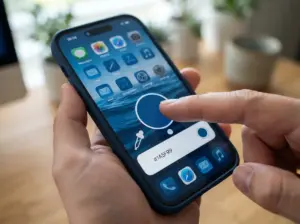
iOS 26 has made this process significantly more accessible. Users can now long-press an empty area of the Home Screen, tap Edit, and access a Customize panel that includes the new “Tinted” icon mode, which automatically matches app icon colors to the iPhone’s case or chosen wallpaper [1][3]. The wallpaper picker is also now accessible directly from the Home Screen without navigating into Settings, cutting setup time considerably [9].
The 9 Aesthetic iPhone Organization Screens For A Visually Pleasing Setup
The nine screen styles below represent the most widely adopted, visually coherent approaches documented across 2026 design guides, layout libraries, and creator tutorials. Each one is distinct in palette, density, and organizational logic.
1. Warm Earth Tones
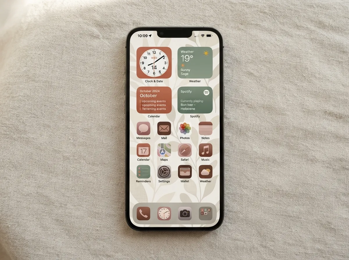
The warm earth-tone aesthetic is the most popular iPhone Home Screen style in 2026, combining cream, terracotta, sage, and dusty pink into a calming, cohesive layout [6]. The typical setup uses a soft landscape or abstract wallpaper in muted neutrals, four to six medium-density widgets in matching warm tones, and icon packs tinted to complement the palette.
Key setup elements:
- Wallpaper: muted botanical, linen texture, or soft gradient in cream or sand
- Widgets: clock, weather, and calendar in terracotta or sage frames
- Icons: tinted warm brown or dusty rose using iOS 26’s native Tinted mode [1]
- Dock: three to four apps in a frosted or semi-transparent dock
This aesthetic works well for users who want a screen that feels restful and personal without sacrificing readability. The warm tones reduce blue-light visual fatigue, making the setup easier on the eyes during evening use.
2. Liquid Glass
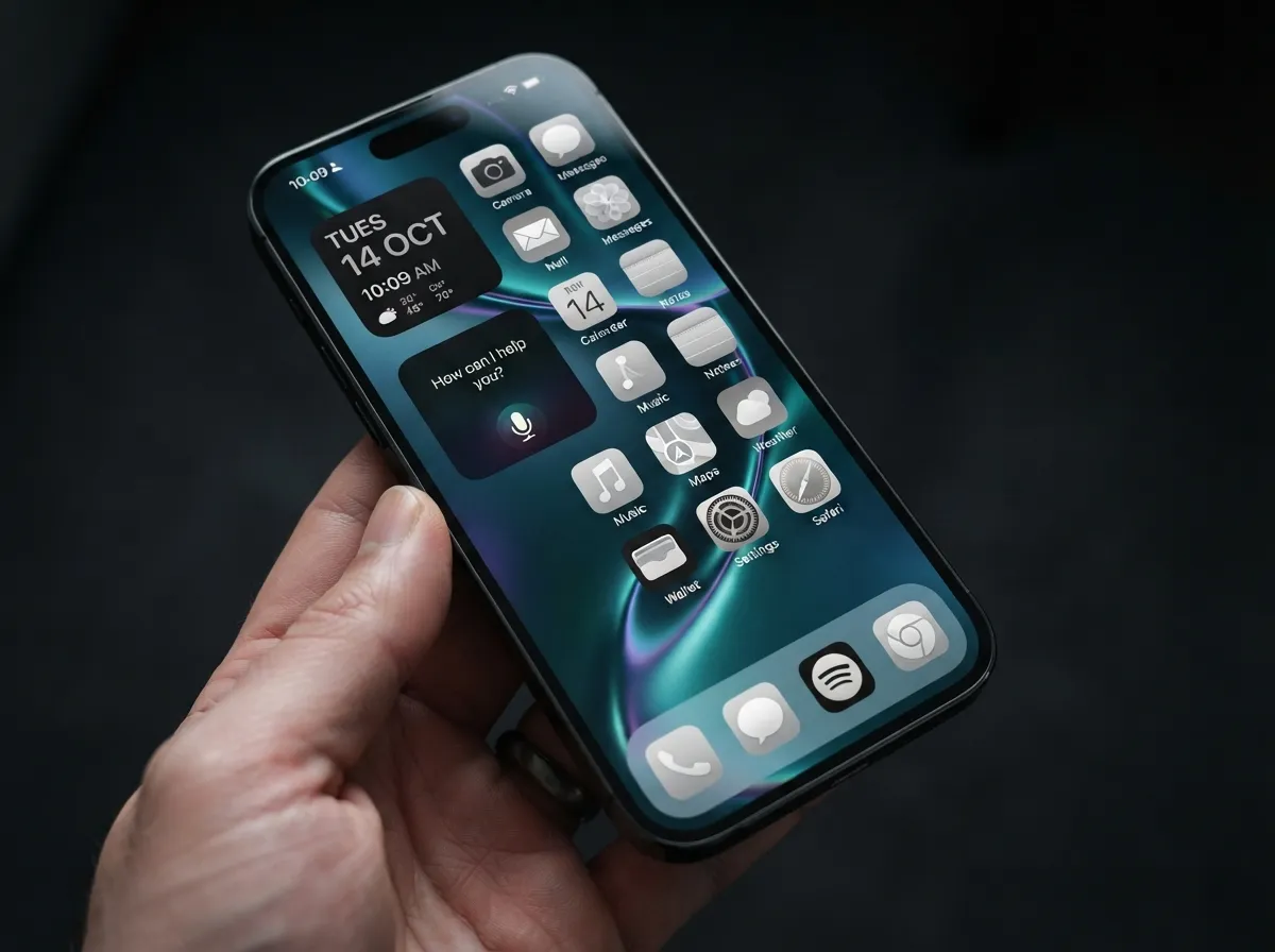
The Liquid Glass aesthetic emerged as a defining trend in mid-2026, built around semi-transparent elements, wallpaper bleed-through, and a monochrome icon pack [8]. The dock appears frosted, icons carry no more than twelve per page, and the wallpaper, typically a deep ocean, sky gradient, or abstract fluid art, shows through every layer of the interface.
Authoritative customization guides position Liquid Glass plus two to three high-value widgets (often including an AI assistant widget) as an optimal, future-proof Home Screen pattern [8][12]. The visual effect is modern and rich without feeling overloaded.
Setup checklist:
- Wallpaper: deep blue, teal, or iridescent fluid gradient
- Icons: monochrome white or silver pack, maximum 12 per page
- Widgets: two to three, including clock and one AI assistant widget
- Dock: semi-transparent, four apps maximum
3. Minimal Grayscale
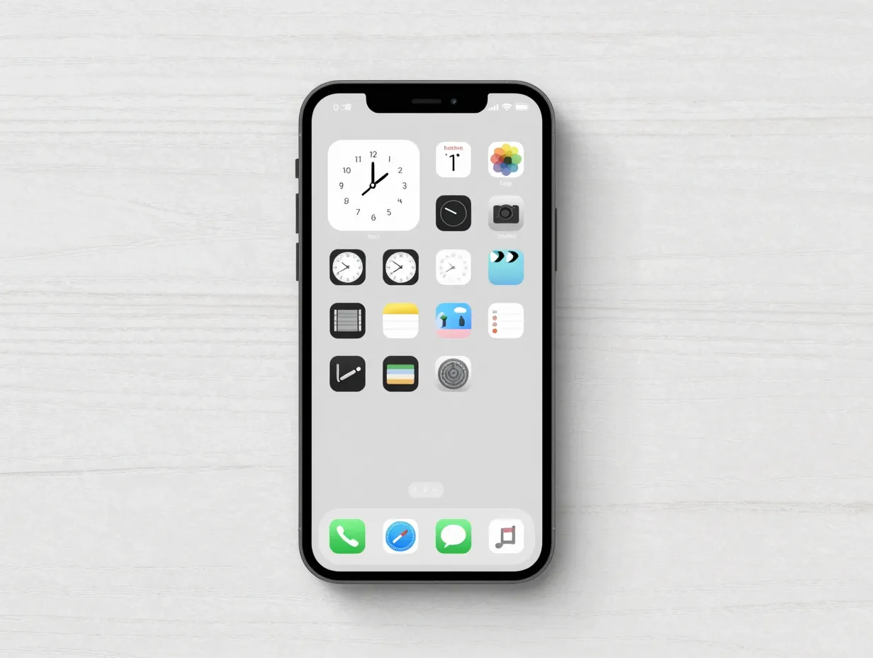
For users who want maximum focus with minimum distraction, the minimal grayscale screen strips everything back to black, white, and mid-gray [6]. One to three widgets appear on an otherwise empty canvas, and all app icons are converted to grayscale using a custom icon pack or iOS 26’s Tinted mode set to a neutral gray tone.
This is the most productivity-focused of the nine aesthetics. Studies on digital minimalism consistently link reduced visual noise to improved concentration, and the grayscale palette removes the dopamine-triggering color cues that make social media apps feel urgent.
Organizational logic:
- Keep only eight to ten daily-use apps visible on the main page [4]
- Push all other apps to the App Library
- Use a single Smart Stack widget for clock, weather, and calendar
- Set newly downloaded apps to “App Library Only” by default [4][5]
4. Vibrant Gradient
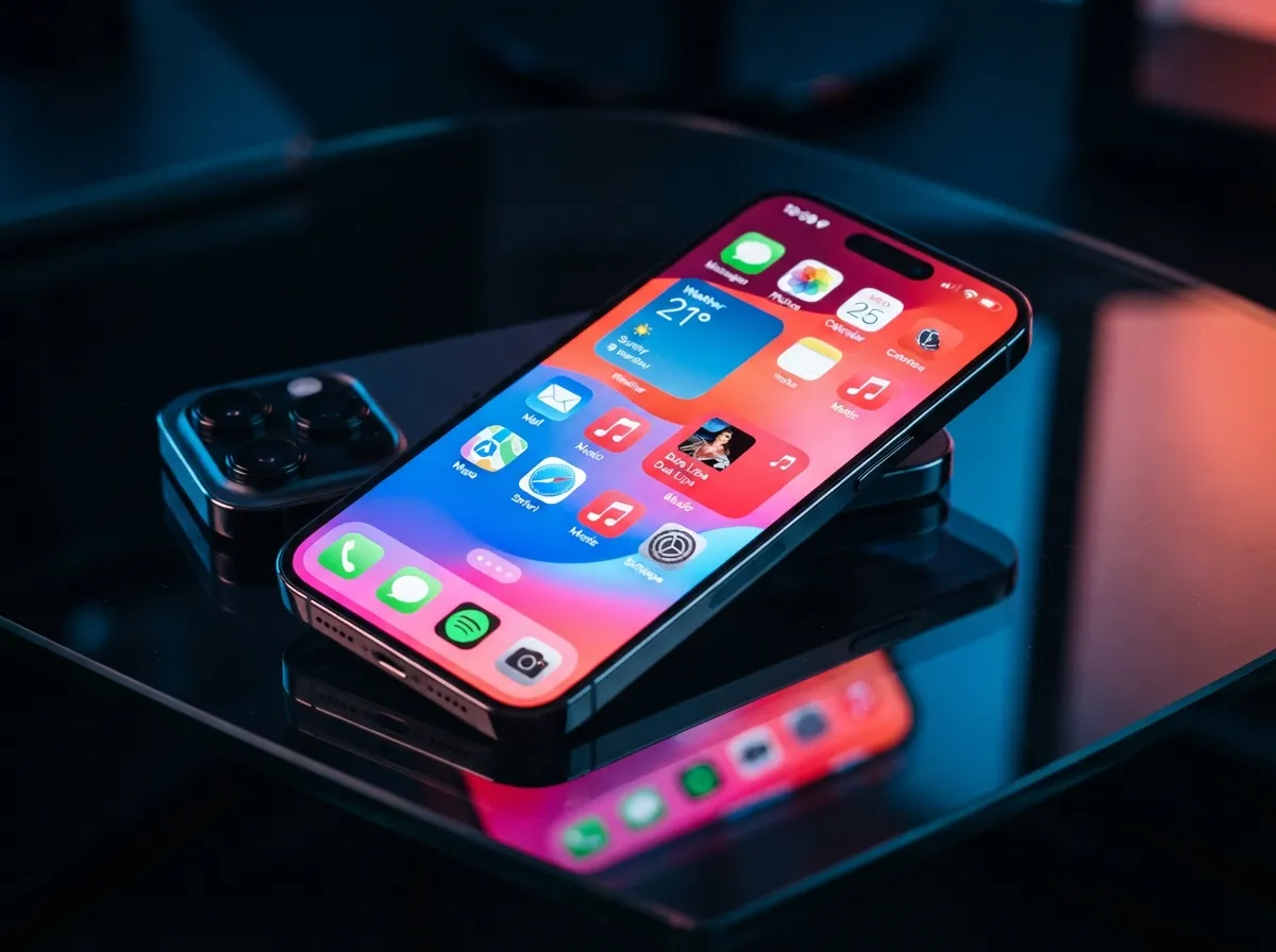
The vibrant gradient aesthetic sits at the opposite end of the spectrum from grayscale. Bold, high-energy wallpapers in electric blue, coral, violet, or neon green anchor a layout designed for users who want their screen to feel alive [6]. Icon packs in white or black provide contrast against the saturated background, and widgets use matching bold accent colors.
This style requires more careful color management than muted aesthetics. The 60/30/10 palette rule is especially important here, without it, a vibrant gradient screen quickly becomes overwhelming [2][5]. The dominant gradient should occupy the wallpaper, the secondary color should appear in widget frames, and the accent should be reserved for a single highlight element such as the dock background.
5. Dark Mode Botanical
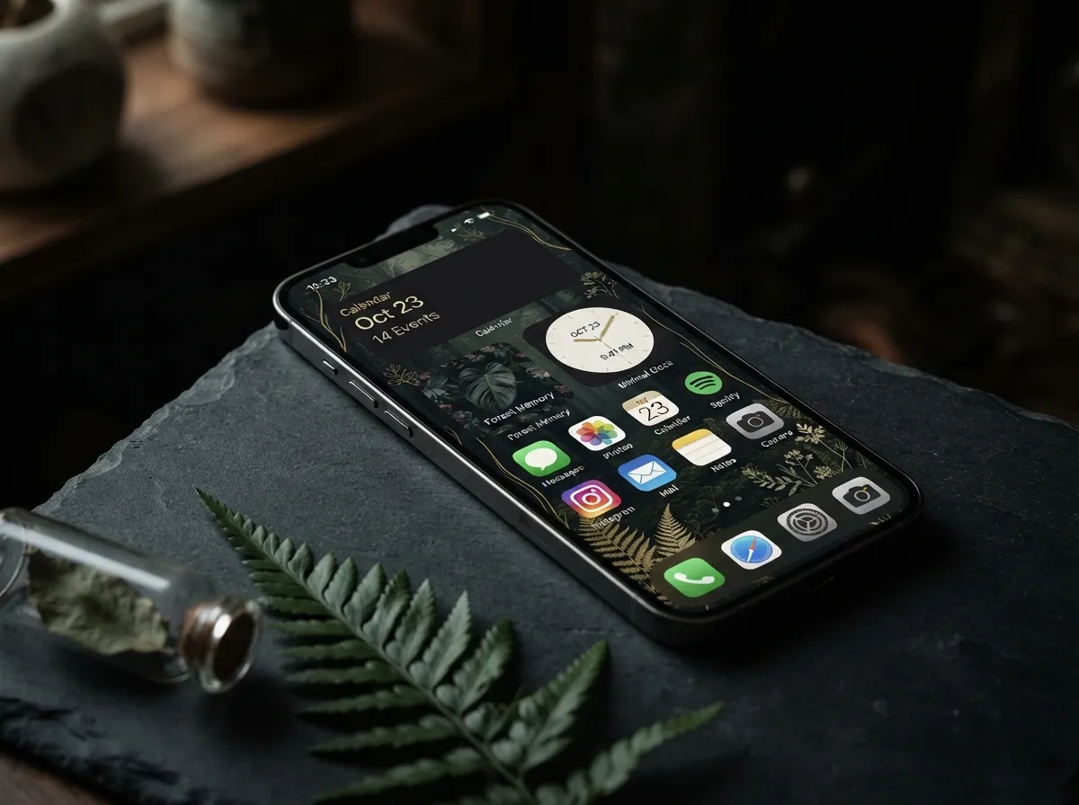
Dark mode botanical combines the richness of deep, near-black backgrounds with illustrated or photographic plant and nature motifs. The result is a screen that feels editorial and sophisticated. Icon packs in muted green, gold, or ivory sit against a dark forest or black marble wallpaper, and widgets use low-opacity dark frames to stay visible without breaking the mood.
This aesthetic has strong overlap with the warm earth-tone style but leans cooler and more dramatic. It suits users who prefer dark mode for battery conservation and eye comfort but still want a layered, textured look rather than a plain black screen.
Recommended widget set:
- A botanical-frame photo widget showing a rotating gallery
- A dark-themed calendar widget
- A minimal clock widget in ivory or gold
6. Pastel Soft Focus
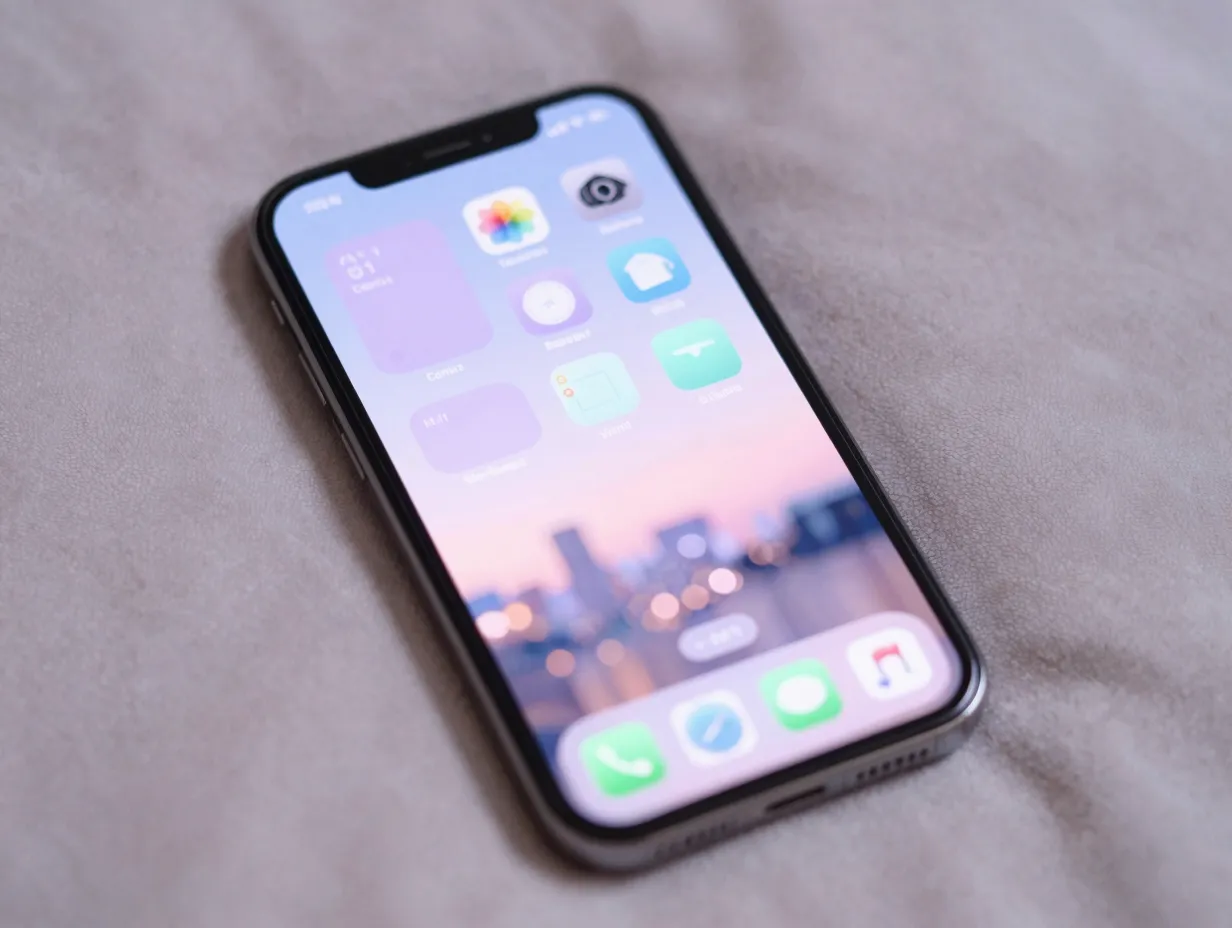
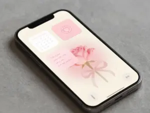
The pastel soft-focus screen uses blurred or out-of-focus photography as a wallpaper base, often a soft bokeh of flowers, city lights, or abstract shapes, layered with icon packs in lavender, mint, baby blue, or blush pink. Widgets adopt the same pastel tones, creating a dreamy, low-contrast layout that feels gentle and personal.
This is a popular choice for users who want a highly personalized screen without the complexity of a bold color scheme. The blurred wallpaper naturally reduces visual competition with icons and widgets, making the layout feel organized even at higher icon densities.
Organization tip: Pastel setups benefit from grouping similar-function apps by color rather than by category. A row of lavender-tinted communication apps followed by a row of mint-tinted productivity apps creates visual rhythm without rigid folder structures.
7. Retro Y2K
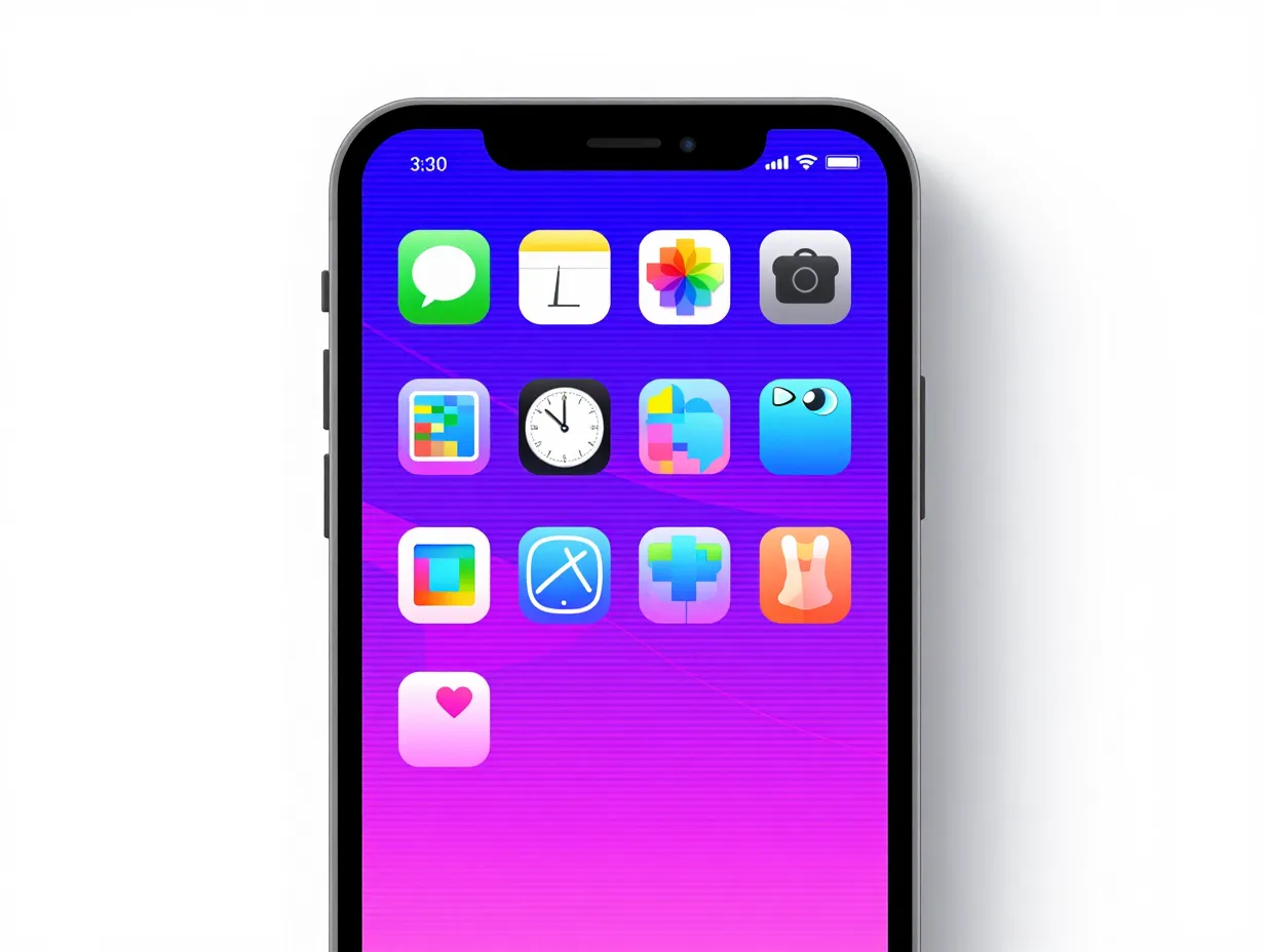
The retro Y2K aesthetic draws from early-2000s digital culture: chrome gradients, pixel art elements, hot pink and electric blue palettes, and glossy icon styles. Wallpapers reference old operating system interfaces, retro game screens, or early internet graphics. Icon packs mimic the rounded, glossy style of early iOS or Windows XP.
While this style is more niche than warm earth tones or Liquid Glass, it has a dedicated following among creators and younger users who want a screen that makes a strong visual statement [7][9]. Organization within this aesthetic typically follows a strict grid, four icons per row, no widget stacks, to honor the retro grid-based layout it references.
Creator workflow for Y2K icons:
- Download a retro icon pack or build custom icons using the Shortcuts app
- Create a Shortcut for each app and assign the custom icon [7]
- Use a chrome or holographic wallpaper as the base
- Keep the dock empty or use a single transparent dock image for a clean retro look
8. Neutral Productivity
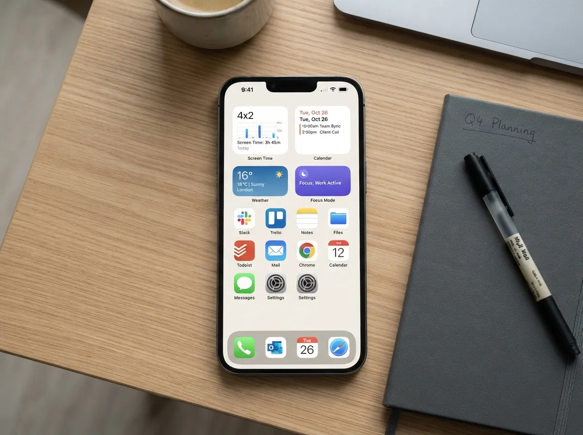
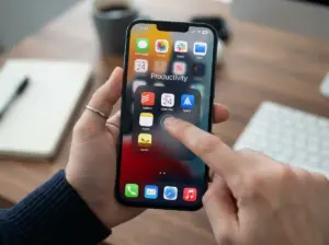
The neutral productivity screen is the most function-first aesthetic on this list. It uses a single muted wallpaper, often a solid warm white, light gray, or soft beige, paired with a curated set of four to six widgets that display genuinely useful real-time information: Screen Time stats, calendar events, weather, and a focus mode indicator.
Usage-based organization is the core principle here. Guides recommend checking Screen Time data to identify the most-used apps and giving those apps prime widget real estate rather than placing favorite-but-rarely-opened apps in prominent positions [8]. The dock holds three to four core communication and productivity apps, with anything opened less than twice per week removed entirely [12].
Dock rule for neutral productivity:
- Slot 1: Phone or primary communication app
- Slot 2: Email or messaging app
- Slot 3: Calendar or task manager
- Slot 4: Browser
This setup sacrifices visual drama for clarity and speed, making it the preferred choice for professionals who need their phone to support focused work rather than inspire scrolling.
9. Monochrome Accent
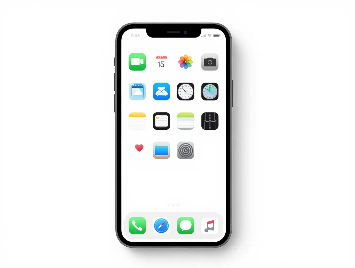
The monochrome accent screen uses a near-black or near-white base with a single bold accent color, typically a saturated red, cobalt blue, or forest green, applied to one widget, one icon row, or the dock background. Every other element remains neutral, which makes the accent color feel intentional and powerful.
This aesthetic is the easiest to maintain long-term because it requires the fewest decisions. When a new app is installed, it goes to the App Library by default [4][5]. When a new widget is added, it adopts the neutral frame. The accent color is reserved for the single most important element on the screen, often the calendar or productivity widget, drawing the eye immediately to the most actionable information.
How to Build Any of These 9 Aesthetic iPhone Organization Screens For A Visually Pleasing Setup in Under 30 Minutes
Knowing which aesthetic to pursue is only half the challenge. The other half is execution. Step-by-step workflows published in 2026 show that a fully aesthetic, organized Home Screen can be built in approximately 20 to 30 minutes by time-boxing each task [2][6].
The 30-minute build sequence:
- Choose an aesthetic category from the nine styles above and save three to five reference screenshots
- Lock in a three-color palette (dominant, secondary, accent) using the 60/30/10 rule [2][5]
- Select and set the wallpaper, access the picker directly from the Home Screen in iOS 26 without going into Settings [9]
- Long-press the Home Screen, tap Edit, then Customize to enable the Tinted icon mode and match icon colors to the palette [1][3]
- Add three to four essential widgets, clock, weather, calendar, and one personal widget such as photos or a focus mode indicator [6][8]
- Move all non-daily apps to the App Library and configure new downloads to go “App Library Only” [4][5]
- Take a screenshot and review spacing, color balance, and widget alignment, make minor adjustments until the layout feels polished [6][12]
Organizing Secondary Pages and the App Library
A single beautiful Home Screen is only sustainable if the rest of the phone is equally organized. Influencer and creator content from 2026 consistently shows a two-page structure: the first page holds only daily-use apps (eight to twelve icons maximum) and one or two matching widgets, while the second page is reserved for one or two key content widgets, such as the Apple Sports widget, plus social apps [11].
The App Library handles everything else. Custom folders within the App Library, organized by category (Finance, Health, Travel, Creative), keep secondary apps accessible without cluttering the aesthetic canvas [7][14]. This structure means the main Home Screen never needs to change as new apps are installed, preserving the visual setup indefinitely.
App Library folder categories to consider:
- Daily Tools: calculator, notes, reminders, timer
- Communication: all messaging and social apps
- Finance: banking, budgeting, payment apps
- Creative: photo editing, design, music production
- Reference: maps, translate, weather alternatives
Choosing the Right Aesthetic for Your Lifestyle
With over 30 documented layout ideas in major template libraries and some collections advertising more than 500 aesthetic setups [9][10], the choice can feel overwhelming. The most practical filter is lifestyle alignment:
| Aesthetic Style | Best For | Widget Density |
|---|---|---|
| Warm Earth Tones | Wellness, lifestyle, creative users | Medium (4-6 widgets) |
| Liquid Glass | Tech-forward, modern professionals | Low (2-3 widgets) |
| Minimal Grayscale | Focus-driven, digital minimalists | Very low (1-3 widgets) |
| Vibrant Gradient | Creatives, social media users | Medium (3-5 widgets) |
| Neutral Productivity | Professionals, students, executives | Medium-high (4-6 widgets) |
| Monochrome Accent | Minimalists who want one bold statement | Low (2-3 widgets) |
| Retro Y2K | Creators, younger users, nostalgia fans | Low (0-2 widgets) |
| Dark Mode Botanical | Evening users, dark mode fans | Low-medium (2-4 widgets) |
| Pastel Soft Focus | Personal, expressive, lifestyle users | Medium (3-5 widgets) |
Conclusion
The 9 Aesthetic iPhone Organization Screens For A Visually Pleasing Setup covered in this guide represent a complete spectrum of visual styles, from the calming warmth of earth tones to the sharp focus of minimal grayscale and the futuristic depth of Liquid Glass. Each one is built on the same structural principles: a defined color palette, a curated icon set, a disciplined widget count, and a clear separation between daily-use apps and everything else.
Actionable next steps:
- Open Screen Time on the iPhone right now and identify the five most-used apps, these will anchor the main page layout regardless of which aesthetic is chosen
- Pick one of the nine styles above and save three reference screenshots to a dedicated album
- Set aside 30 minutes, follow the build sequence in the section above, and use iOS 26’s native Tinted mode and wallpaper picker to execute the setup [1][3][9]
- Screenshot the result, live with it for one week, then make small refinements to spacing and color balance [6][12]
- Configure all newly downloaded apps to go “App Library Only” to protect the aesthetic layout from future clutter [4][5]
A well-organized, visually pleasing iPhone screen is not a one-time project, it is a system. Once the right aesthetic framework is in place, maintaining it requires almost no effort, and the daily benefit of a calm, coherent interface compounds over time.
References
[1] Ios 26 Has New Home Screen Setting For App Icons Heres How To Use It – https://9to5mac.com/2026/04/14/ios-26-has-new-home-screen-setting-for-app-icons-heres-how-to-use-it/
[2] Aesthetic Iphone Homescreen – https://www.iscreenapp.com/blog/aesthetic-iphone-homescreen
[3] How To Customize Your Iphone Home Screen With Ios 26 130000798 – https://www.engadget.com/mobile/smartphones/how-to-customize-your-iphone-home-screen-with-ios-26-130000798.html
[4] How To Make Iphone Home Screen Aesthetic – https://gifpaper.com/guide/how-to-make-iphone-home-screen-aesthetic/
[5] Aesthetic Phone Setup – https://arctools.dev/wallpics/aesthetic-phone-setup
[6] Aesthetic Iphone Widgets Wallpapers 2026 – https://click2.app/blog/aesthetic-iphone-widgets-wallpapers-2026/
[7] Watch – https://www.youtube.com/watch?v=cixUxCCyehs
[8] Iphone Home Screen Guide 2026 Liquid Glass, Widgets Minimalism – https://electronics.alibaba.com/buyingguides/iphone-home-screen-guide-2026-liquid-glass,-widgets-minimalism
[9] Iphone Home Screen Layout Ideas – https://www.iscreenapp.com/blog/iphone-home-screen-layout-ideas
[10] Home Screen Ideas – https://www.iscreenapp.com/home-screen-ideas