6 Smart Watch Face Design Principles For A Perfect User Experience
The average smartwatch user checks their wrist more than 150 times per day, yet each glance lasts fewer than two seconds [7]. That single statistic reframes everything about watch face design. Every pixel, every data point, and every color choice either earns that two-second window or wastes it. Applying the 6 Smart Watch Face Design Principles For A Perfect User Experience is not a stylistic exercise; it is the difference between a wearable that people rely on and one they abandon in a drawer.
Disclosure: This post contains affiliate links. As an Amazon Associate, we earn from qualifying purchases, and at no extra cost to you.
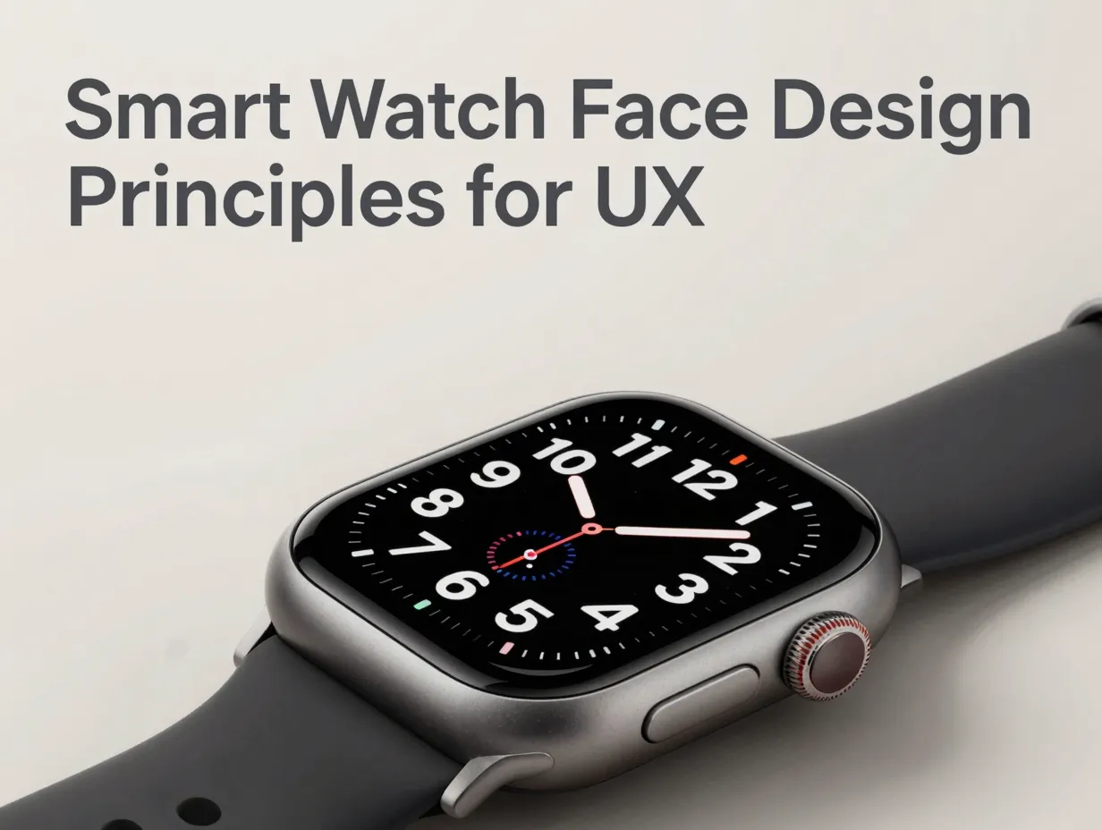
This guide breaks down each principle with practical guidance, expert consensus, and real-world context so designers, developers, and product teams can build watch faces that genuinely serve users.
Key Takeaways
- Smartwatch users glance at their wrists more than 150 times daily, making instant readability the single most critical design requirement.
- Every interaction on a watch face must be completable in one to two seconds, complexity is the enemy of wearable UX.
- Information density should be ruthlessly limited; one primary metric per view prevents cognitive overload.
- High-contrast typography and accessibility-first choices expand usability across all lighting conditions and user abilities.
- Battery optimization and smooth ambient-to-interactive transitions are non-negotiable for a watch face that users trust daily.
Why Watch Face Design Demands Its Own Rules
Smartphone UX principles do not transfer cleanly to the wrist. The screen is smaller, the context is radically different, and the interaction model is built around momentary attention rather than sustained engagement [7]. A watch face is not an app, it is a persistent ambient surface that must communicate value passively and respond instantly when touched [6].
The physical constraints reinforce this. A typical smartwatch display measures between 40 mm and 45 mm in diameter, with a round or square face that clips usable screen real estate at the edges [9]. Designers must account for wrist curvature, glove use, outdoor sunlight, and the fact that the device is often checked with one hand while the user is in motion [4].
Platforms like Wear OS 6 have responded by introducing richer complication APIs, improved ambient mode rendering, and tighter ecosystem integration between watch faces, tiles, and companion apps [1]. Yet the underlying UX principles remain consistent across platforms. Expert analysis and user research converge on six recurring themes that define what a “perfect” watch face experience actually means [8].
The 6 Smart Watch Face Design Principles For A Perfect User Experience
1. Make Time and Key Information Instantly Glanceable
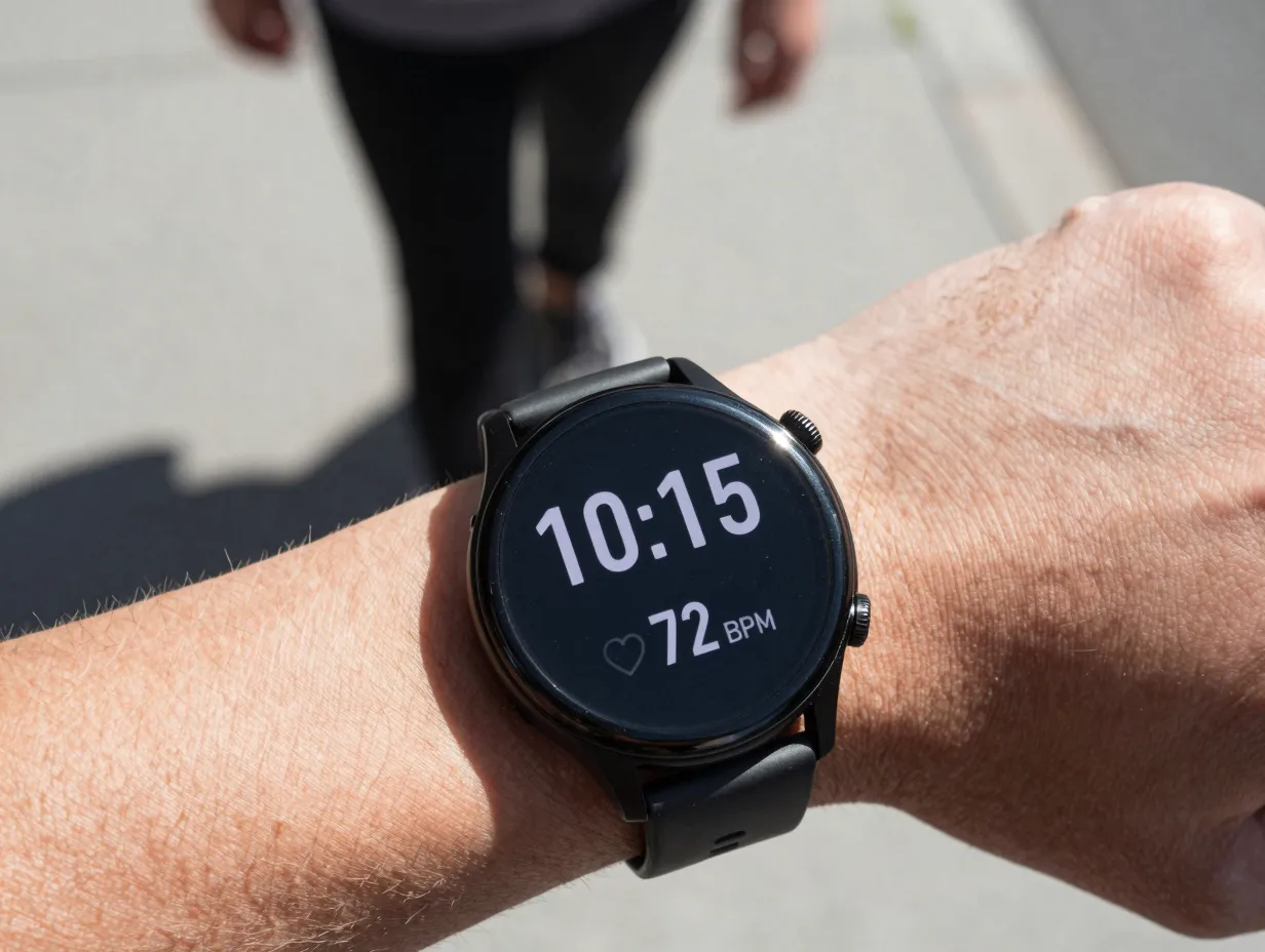
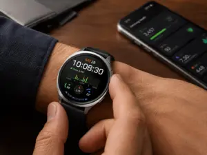
The primary job of any watch face is to tell the time. That sounds obvious, but it is violated more often than designers admit. Decorative elements, busy backgrounds, and low-contrast color pairings routinely obscure the single most important piece of information on the screen [3].
Glanceability means the user can extract the time and one supporting data point, steps, heart rate, weather, without pausing, squinting, or tapping. Research confirms that users check their smartwatch more than 150 times per day, and the majority of those checks are purely time-oriented [7]. Every design decision should be evaluated against this benchmark: can a user read it in under two seconds while walking?
Practical guidelines for glanceability:
- Place the time display in the optical center or upper-center of the face where the eye naturally lands first.
- Use a font size that fills at least 40 percent of the vertical screen height for the hour and minute digits.
- Avoid placing critical information near the edges where screen curvature or bezel hardware reduces legibility [9].
- Test the face in direct sunlight simulation, not just in a dark studio environment.
“The watch face is the most-seen UI surface on any wearable device. If the time is not immediately readable, the design has already failed its primary function.” [6]
Platforms now provide design tokens and layout grids specifically calibrated for round and square watch faces to support glanceable hierarchy [3]. Using these system resources rather than building from scratch reduces the risk of spatial errors that undermine readability.
2. Design for Micro-Interactions: Complete Tasks in 1 to 2 Seconds
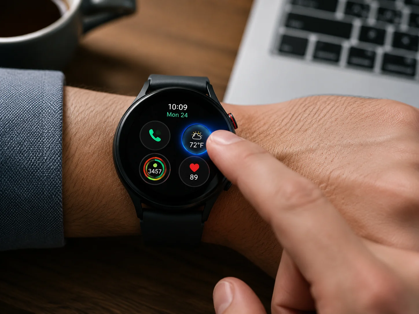
A smartwatch interaction that takes more than two seconds feels broken. Users are not sitting at a desk with sustained attention, they are mid-conversation, mid-run, or mid-commute [8]. The entire interaction model must be built around what the IxDF calls “micro-interactions”: single-purpose, single-gesture moments that deliver immediate value [8].
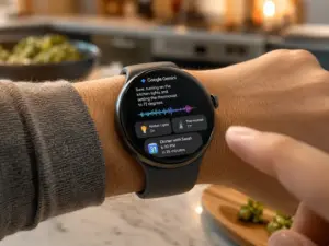
This principle shapes everything from complication tap targets to notification dismissal. A complication that launches a full app journey when tapped violates the micro-interaction model. Instead, a tap should surface the most relevant detail, current temperature, next calendar event, remaining battery, without requiring navigation [6].
Design checklist for micro-interactions:
- Every tappable element must have a minimum touch target of 48 x 48 dp to accommodate finger contact on a small screen [3].
- Feedback (haptic, visual, or both) must occur within 100 milliseconds of the user’s tap to feel responsive.
- Secondary information should be accessible in one swipe or one tap, never buried two levels deep.
- Avoid modal dialogs or confirmation screens for simple actions; they break the sub-two-second budget.
The Wear OS platform architecture supports this through a layered surface model: the watch face handles ambient display and glanceable data, tiles handle quick-action workflows, and full apps handle longer sessions [1]. Respecting this hierarchy prevents designers from overloading the watch face with functionality that belongs in a tile.
3. Limit Information Density and Focus on One Key Metric Per View
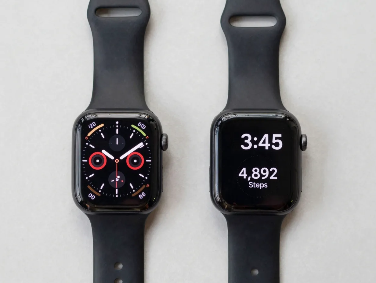
More data is not better data on a 1.4-inch screen. Cognitive load research consistently shows that presenting too many simultaneous data points forces the brain into a sorting task rather than a reading task, and on a wrist, there is no time for sorting [4].
The principle of one key metric per view is not about minimalism for aesthetic reasons. It is about respecting the attentional budget of a user who has given the watch face less than two seconds of focus. A watch face that shows time, heart rate, steps, UV index, battery, and a calendar event simultaneously may technically display all that information, but it communicates none of it effectively [9].
Recommended complication limits by watch face type:
| Watch Face Style | Maximum Complications | Primary Use Case |
|---|---|---|
| Sport / Fitness | 2 to 3 | Heart rate, steps, pace |
| Business / Daily | 3 to 4 | Calendar, weather, battery |
| Minimal / Fashion | 1 to 2 | Time, one personal metric |
| Data / Utility | 4 to 5 | Power users, dashboard view |
Complications should be grouped by functional category and placed in consistent screen zones so users develop spatial memory [3]. When users know that health data always appears at the bottom and calendar data always appears at the top, they extract information faster without conscious effort.
4. Prioritize Legibility, Accessibility, and High-Contrast Typography
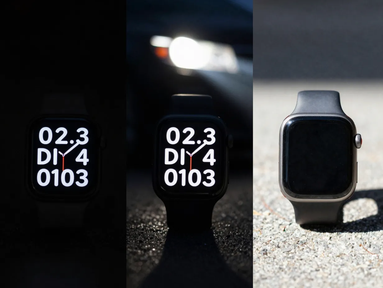
A watch face that is beautiful in a product photo but unreadable in a parking lot has failed. Legibility under real-world conditions, bright sunlight, low indoor light, motion blur, requires deliberate typography and contrast choices that go beyond aesthetic preference [9].
WCAG contrast guidelines recommend a minimum contrast ratio of 4.5:1 for normal text and 3:1 for large text. On AMOLED displays common in smartwatches, true black backgrounds with white or bright-colored text achieve ratios well above this threshold while also conserving battery [3]. This is not a coincidence, accessibility-first design and performance optimization point toward the same solution.
Typography principles for watch faces:
- Use a sans-serif typeface with high x-height and open apertures for maximum legibility at small sizes.
- Avoid thin font weights (100 to 300) for primary time display; medium to bold weights (500 to 700) perform significantly better under motion and glare.
- Never use pure decorative scripts for time display, regardless of the watch face theme.
- Ensure that color-coded complications (red for heart rate, green for steps) also carry a non-color differentiator such as shape or label for users with color vision deficiencies [4].
Accessibility on wearables extends beyond vision. Users with motor impairments benefit from larger tap targets and reduced reliance on precise gestures. Users with cognitive differences benefit from consistent layouts that do not change between ambient and interactive modes [9]. Wear OS 6 includes updated accessibility APIs that allow watch faces to declare their layout semantics, enabling screen reader support directly on the device [1].
A recent clinical study examining wearable health monitoring found that display legibility directly affected how reliably users acted on health alerts, reinforcing that accessibility is not just a compliance issue but a safety one [2].
5. Use Complications and Personalization to Match Context and Intent
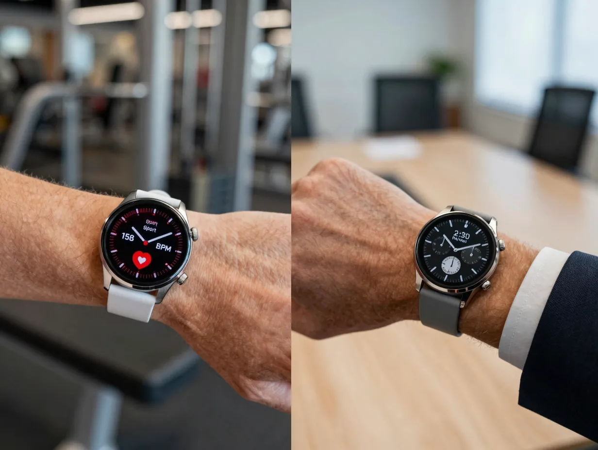
A watch face worn during a marathon should look and behave differently from the same watch face worn in a board meeting. Context-aware design means the watch face adapts its complication set, color palette, and information hierarchy to match what the user is actually doing [6].
Modern smartwatch platforms support this through complication slots that users can fill with data from any installed app, and through watch face variants that switch automatically based on detected activity, time of day, or connected location [1]. Platforms like Facer demonstrate the market appetite for personalization, their community has created millions of watch face designs precisely because users want faces that reflect their identity and priorities [5].
Personalization dimensions to design for:
- Activity context, fitness metrics during workouts, productivity metrics during work hours, minimal display during sleep tracking.
- Time of day, bright high-contrast faces for daytime, dimmed warm-palette faces for evening to reduce blue light exposure.
- User role, a healthcare professional may prioritize a heart rate complication; a frequent traveler may prioritize a dual time zone display.
- Aesthetic preference, color themes, dial styles, and complication icon sets that reflect personal taste without sacrificing legibility.
The key design discipline here is ensuring that personalization options do not introduce legibility regressions. A user who selects a dark-text-on-dark-background color theme should be warned or prevented from saving a combination that falls below contrast thresholds [3]. Personalization within guardrails is the goal.
“The best watch face is not the most beautiful one, it is the one that shows the right information at the right moment without the user having to think about it.” [10]
Complication APIs on both Wear OS and watchOS now support rich data types including progress arcs, gauge fills, and ranked lists, giving designers tools to encode more meaning in less visual space [1]. Using these native complication types also ensures that third-party app data renders consistently with system-level design language, reducing the visual fragmentation that occurs when every app ships its own bespoke complication renderer.
6. Optimize for Battery, Performance, and Ambient-to-Interactive Transitions
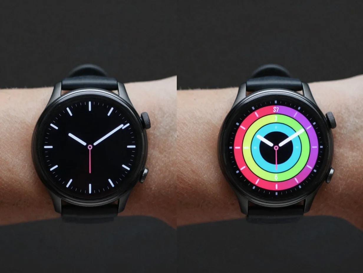
A watch face that drains the battery by noon or stutters during the transition from ambient to active mode destroys user trust faster than any design flaw. Performance is a UX feature, not an engineering afterthought [6].
Smartwatches spend the majority of their active time in ambient mode, a low-power state where the display shows a simplified version of the watch face using minimal pixels. The transition from ambient to interactive mode when the user raises their wrist or taps the screen must be instantaneous and visually coherent [3]. A jarring layout shift between the two states breaks the illusion of a persistent, always-on surface.
Battery and performance optimization principles:
- In ambient mode, use only black pixels and a small number of lit pixels to minimize OLED power draw; target less than 15 percent pixel illumination [3].
- Avoid continuous animations in ambient mode; use static or slowly-updating displays instead.
- Limit complication refresh rates to what the data actually requires, weather does not need to update every second.
- Use hardware-accelerated rendering paths provided by the platform rather than custom canvas drawing loops, which are significantly more power-intensive [1].
- Profile the watch face on real hardware under both ambient and interactive conditions before release; emulator performance does not reflect device battery impact.
The ambient-to-interactive transition should maintain spatial consistency: elements that appear in ambient mode should be in the same position in interactive mode, even if they gain color, animation, or additional detail. Users who have developed spatial memory for the ambient layout should not have to reorient when the face activates [9].
Wear OS 6 introduced significant rendering pipeline improvements that reduce the CPU cost of watch face updates, directly benefiting battery life for faces that use the updated APIs [1]. Designers working on the Android platform should treat platform API adoption as a design decision, not just a technical one, newer APIs encode years of performance optimization that custom implementations cannot easily replicate.
Applying the 6 Smart Watch Face Design Principles For A Perfect User Experience Together
The six principles are interdependent. A watch face that nails glanceability but ignores battery optimization will be turned off by users who need all-day wear. A face that achieves perfect accessibility but overloads information density will frustrate users who cannot process the data in two seconds. Treating the principles as a checklist to complete in isolation misses the point.
The strongest watch face designs emerge from a process that treats these principles as a unified framework:
- Start with the glanceability test, can the time and primary metric be read in under two seconds?
- Map every interaction to a micro-interaction budget, does every tap resolve in one to two seconds?
- Audit information density, remove any complication that cannot be justified as the user’s top-priority data point.
- Run contrast and legibility checks under simulated real-world lighting conditions.
- Build personalization options that stay within legibility guardrails.
- Profile battery and transition performance on physical hardware before shipping.
Ecosystem alignment matters here too. A watch face that looks beautiful in isolation but conflicts with the system tile design language or breaks when a third-party complication injects data creates a fragmented experience [1]. Designing within the platform’s component library and complication framework ensures that the watch face behaves predictably as the user’s app ecosystem grows.
Conclusion
The 6 Smart Watch Face Design Principles For A Perfect User Experience, glanceability, micro-interaction design, information density control, legibility and accessibility, context-aware personalization, and battery and performance optimization, form a complete framework for building watch faces that earn a permanent place on users’ wrists.
Actionable next steps for designers and developers in 2026:
- Audit an existing watch face against each of the six principles using real-device testing, not emulator previews.
- Run a contrast ratio check on every color combination used in both ambient and interactive modes.
- Reduce the complication count by one and measure whether the remaining complications become more readable.
- Adopt the latest platform APIs (Wear OS 6 or equivalent) to access built-in performance and accessibility improvements.
- Recruit users who represent diverse accessibility needs, including older adults and users with motor impairments, for watch face usability testing.
The wrist is the most intimate screen in a user’s life. Designing for it well is not about following trends, it is about respecting the two seconds a person gives you, 150 times a day.
References
[1] Whats New In Wear Os 6 – https://android-developers.googleblog.com/2025/05/whats-new-in-wear-os-6.html
[2] Pmc12221094 – https://pmc.ncbi.nlm.nih.gov/articles/PMC12221094/
[3] Watch Faces – https://developer.android.com/design/ui/wear/guides/m2-5/surfaces/watch-faces
[4] Smart Watch Design Heuristics – https://www.akendi.com/blog/smart-watch-design-heuristics/
[5] facer – https://www.facer.io/
[6] Ultimate Guide To Smartwatch Ux – https://www.protopie.io/blog/ultimate-guide-to-smartwatch-ux
[7] Smartwatch – https://www.nngroup.com/articles/smartwatch/
[8] Learn 6 Fundamental Ux Smartwatch Lessons That Apple Learned The Hard Way – https://ixdf.org/literature/article/learn-6-fundamental-ux-smartwatch-lessons-that-apple-learned-the-hard-way
[9] Your Guide To Smartwatch Interface Design Designing For All 1a588a6a1181 – https://uxdesign.cc/your-guide-to-smartwatch-interface-design-designing-for-all-1a588a6a1181
[10] Wearables Ux Smartwatch Ui Design Development – https://think.design/blog/wearables-ux-smartwatch-ui-design-development/