8 Ways To Customize Your iPhone App Icons For A Unique Aesthetic
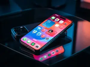
The average iPhone user spends over four hours per day staring at their device screen, yet most of those screens look nearly identical, with the same default blue-and-white grid Apple ships out of the box. That sameness is entirely optional. With iOS 18 and the forward-looking changes arriving in iOS 26, Apple has handed users more Home Screen control than ever before, and the 8 ways to customize your iPhone app icons for a unique aesthetic covered in this guide will help anyone transform a generic grid into a genuinely personal visual experience.
Disclosure: This post contains affiliate links. As an Amazon Associate, we earn from qualifying purchases, and at no extra cost to you.
Whether the goal is a clean minimalist layout, a bold dark-mode palette, or a cohesive “magazine-style” spread that rivals professional design work, the tools are already built into the iPhone. No jailbreak, no third-party app store, and no advanced technical skill is required.
Key Takeaways
- iOS 18 and iOS 26 introduce native icon tinting, translucency, size controls, and free-placement grids that make deep customization accessible to every user.
- The Shortcuts app remains the most powerful tool for assigning fully custom artwork to any app icon.
- Removing icon labels and switching to small icon size creates an immediate minimalist effect with zero extra apps needed.
- Coordinating icons with widgets and wallpaper colors produces a cohesive “magazine-style” Home Screen that feels intentional rather than accidental.
- Consistent icon packs and color themes across multiple Home Screen pages multiply the visual impact of any single customization choice.
Understanding the Foundation: What iOS 18 and iOS 26 Unlock
Before diving into the 8 ways to customize your iPhone app icons for a unique aesthetic, it helps to understand what Apple’s recent software updates actually make possible. iOS 18 was the first major release to give users genuine freedom over icon appearance at the system level, including color modes, tinting, size options, and free grid placement [1]. The subsequent iOS 26 update, Apple’s most ambitious Home Screen redesign in years, builds on that foundation with deeper translucency effects, refined adaptive color logic, and a visual language that blends native controls with a distinctly modern, glass-influenced aesthetic [9].
These changes matter because they shift the customization conversation away from workarounds and toward native, stable features. Earlier approaches, such as using profile configuration files or relying on third-party launchers, often broke with software updates or introduced battery and performance penalties. The native tools available in 2026 are both more capable and more reliable than anything that came before them [2].
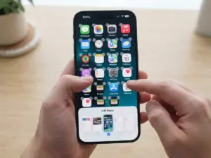
The entry point for nearly all of these features is the same: long-press any empty space on the Home Screen to enter “jiggle mode,” then tap the “Edit” button that appears in the top-left corner. From there, the full suite of customization options becomes accessible [3].
The 8 Ways To Customize Your iPhone App Icons For A Unique Aesthetic
1. Adjust Icon Size and Remove Labels for a Minimalist Grid
The single fastest way to change the feel of a Home Screen is to switch icon sizes. iOS 18 introduced a native toggle between the standard (large) icon size and a smaller alternative that fits more icons on screen while creating a lighter, less cluttered visual impression [1]. To access this, enter jiggle mode, tap “Customize,” and select either “Small” or “Large” from the icon size options at the bottom of the screen.
Pairing the small icon size with the label-removal option takes the minimalist effect further. When app names are hidden, the Home Screen reads as a grid of pure imagery rather than a labeled directory. The result is a cleaner, more intentional layout that lets wallpaper art breathe around the icons [6].
Best for: Users who prefer a Zen-inspired or ultra-minimal aesthetic, or anyone whose wallpaper is the visual centerpiece of their Home Screen.
| Setting | Effect | Access Point |
|---|---|---|
| Large icons | Default grid, labels visible | Customize menu |
| Small icons | More breathing room, lighter feel | Customize menu |
| Labels hidden | Pure icon imagery, no text clutter | Customize menu |
2. Use Light, Dark, and Auto Color Modes to Match Time of Day
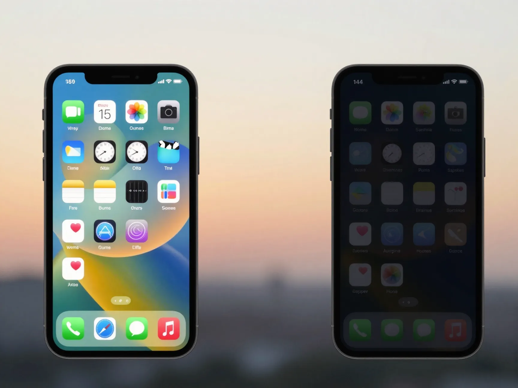
iOS 18 introduced three distinct icon appearance modes: Light, Dark, and Automatic [3]. Light mode keeps icons in their standard, bright appearance. Dark mode shifts all compatible icons to darker, muted versions of themselves, a dramatic change that pairs especially well with dark wallpapers. Automatic mode switches between the two based on the iPhone’s system-wide Light/Dark setting, which itself can be scheduled to change at sunrise and sunset.
“The Automatic mode is the sleeper feature of iOS 18 icon customization, it means your Home Screen literally changes personality twice a day without any manual input.”
This three-way toggle is found inside the same “Customize” panel accessed from jiggle mode [7]. Not every app has a dedicated dark-mode icon, but Apple’s own apps and most major third-party apps from 2023 onward support the feature. For apps that do not have a native dark icon, iOS applies an intelligent inversion or darkening effect that maintains legibility.
Pro tip: Schedule Dark Mode to activate at 9 PM via Settings > Display & Brightness > Automatic to get the full benefit of the Auto icon mode without any manual switching.
3. Apply Tinted Icons and Sample Colors Directly from the Wallpaper
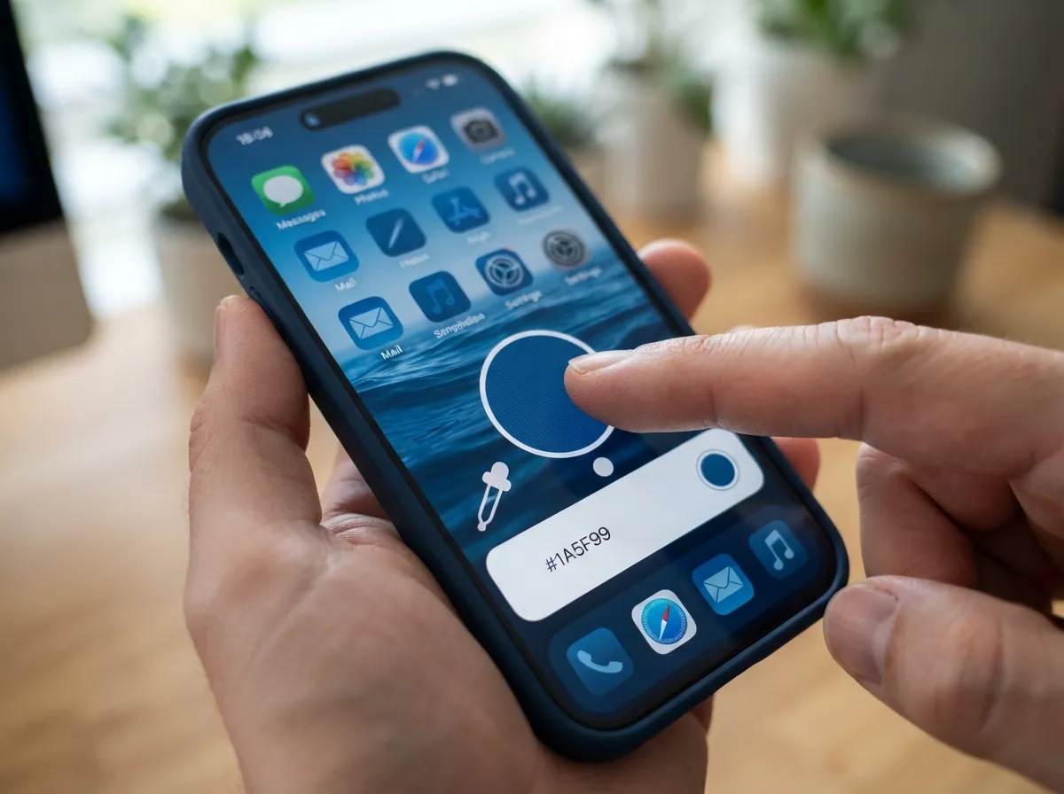
The tinted icon feature, introduced in iOS 18, allows users to apply a single color wash across all Home Screen icons simultaneously [2]. The effect is cohesive and deliberate, every icon takes on a shared hue, creating a monochromatic or analogous color scheme that feels designed rather than assembled.
The most powerful aspect of this feature is the eyedropper tool built into the tint color picker. Rather than choosing a color from a generic wheel, users can sample a color directly from their current wallpaper. This means the icon tint can echo the dominant tone of a landscape photo, a gradient, or any custom artwork set as the background [4].
Steps to apply tinted icons:
- Long-press an empty Home Screen area to enter jiggle mode.
- Tap “Customize” at the bottom of the screen.
- Select “Tinted” from the appearance options.
- Use the color slider or tap the eyedropper to sample a wallpaper color.
- Adjust the intensity slider to control how strong the tint appears.
This approach works best when the wallpaper itself has a strong, distinct color identity, think deep ocean blues, forest greens, or warm terracotta tones.
4. Switch to Clear or Translucent Icons for a Modern Glass Aesthetic
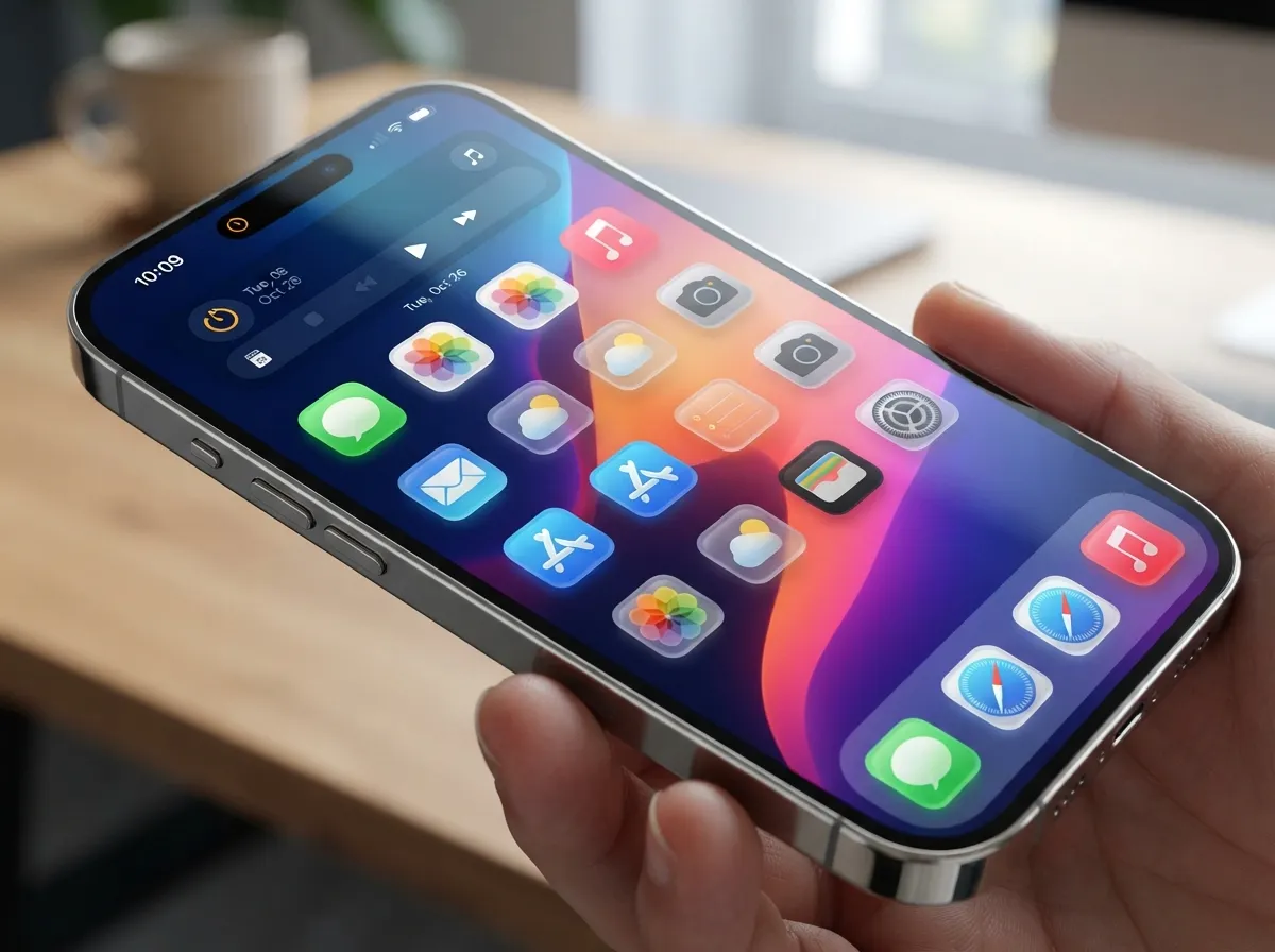
iOS 26 brings a refined translucency option that gives icons a frosted-glass appearance, allowing the wallpaper to subtly show through each icon’s background [9]. This “liquid glass” design language, visible throughout iOS 26’s interface, creates a layered, depth-rich Home Screen that looks markedly different from the flat, opaque icons of earlier iOS versions.
To enable translucent or clear icon styles where available, access the “Customize” panel and look for the clear/glass appearance option. The effect is most striking when paired with a high-quality, colorful wallpaper, since the icon backgrounds take on a blurred version of whatever sits behind them [8].
Visual impact checklist:
- Use a wallpaper with gradients or soft color transitions for the smoothest glass effect.
- Avoid busy, high-contrast wallpapers, which can make translucent icons harder to read.
- Combine with the small icon size for a particularly airy, modern result.
- Test in both Light and Dark modes, the glass effect behaves differently in each.
5. Create Fully Custom Icon Images Per App Using Shortcuts
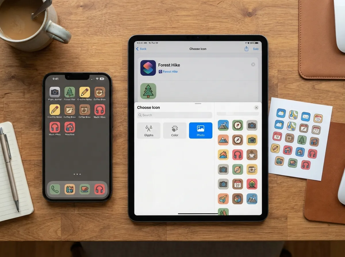
The Shortcuts app is the most flexible tool available for icon customization on iPhone. It allows users to assign any image, a photograph, a downloaded icon pack image, or original artwork, to any app, effectively replacing the default icon with a completely custom visual [5].
The process works by creating a new Shortcut that opens the target app, then setting a custom image as that Shortcut’s Home Screen icon. The result appears on the Home Screen exactly like a regular app icon but displays the chosen artwork instead of the default.
Step-by-step process:
- Open the Shortcuts app and tap the “+” button to create a new shortcut.
- Tap “Add Action” and search for “Open App,” then select the desired app.
- Tap the shortcut name at the top, then select “Choose Icon.”
- Tap “Photo” to select any image from the camera roll.
- Tap “Add to Home Screen” and position the new icon.
- Move the original app icon to the App Library to keep the Home Screen clean.
The trade-off is a brief one-second delay when opening apps via Shortcuts, since the Shortcuts app must launch first before handing off to the target app [5]. For most users, this is an acceptable compromise for the visual result.
6. Design Consistent Icon Themes and Packs Across Home Screen Pages
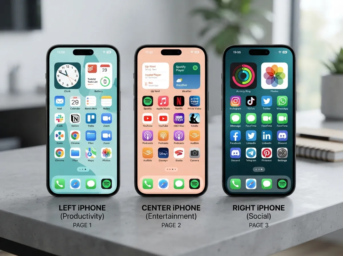
Individual icon changes create local improvements, but a cohesive icon pack applied consistently across all Home Screen pages creates a fundamentally different experience, one that feels like a deliberate design system rather than a collection of tweaks [4].
Icon packs are sets of custom images that share a unified visual style: the same stroke weight, color palette, corner radius, and background treatment applied to every app. Hundreds of free and paid icon packs are available through platforms such as Etsy, Gumroad, and dedicated iOS design communities. Once downloaded, each image in the pack is applied to its corresponding app via the Shortcuts method described above.
What makes an icon pack cohesive:
- Consistent background shape: All icons use the same rounded square, circle, or other base shape.
- Unified color palette: A set of 2-4 colors used across all icons in the pack.
- Matching line weight: Icon artwork uses strokes of the same thickness throughout.
- Shared illustration style: Whether flat, outlined, gradient, or 3D, the style never mixes.
Organizing Home Screen pages by theme, one page for productivity tools, one for entertainment, one for social apps, and applying a slightly varied color accent to each page while keeping the overall pack style consistent creates a multi-page experience that rewards exploration.
7. Re-Arrange Icons Freely Without the Forced Top-Left Grid
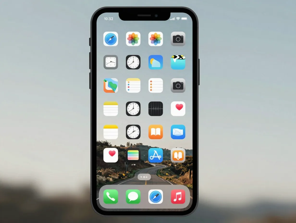
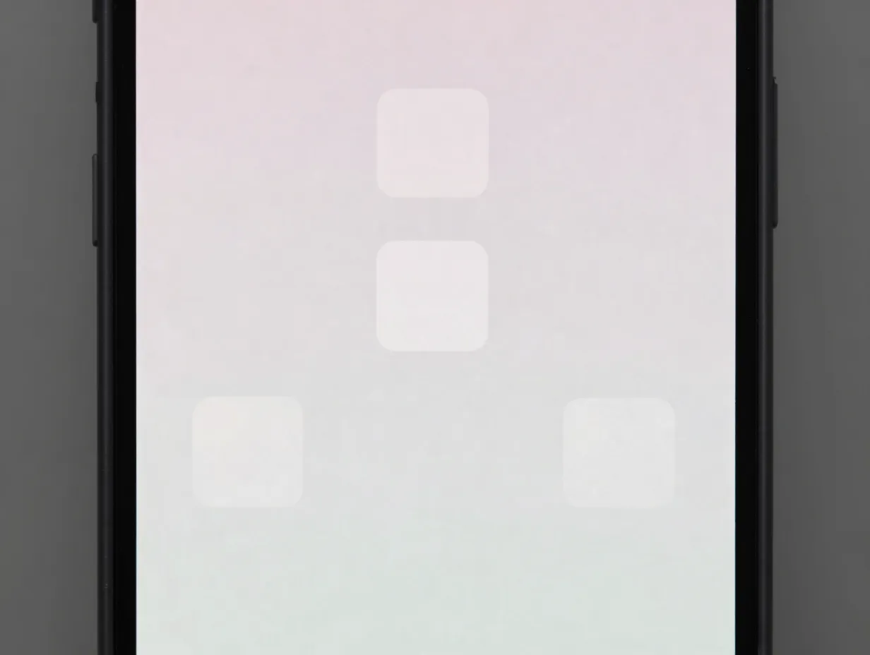
One of the most underused features introduced in iOS 18 is free icon placement, the ability to position icons anywhere on the Home Screen grid, including leaving empty spaces between them [1]. Before this change, iOS always pushed icons to fill from the top-left corner, which made creative layouts impossible without workarounds.
With free placement enabled, icons can be grouped in the center of the screen, arranged in diagonal lines, clustered in the lower third to frame a wallpaper subject, or spread asymmetrically for an editorial magazine feel [7].
Creative layout ideas:
- Place all icons in a single column on the right side, leaving the left half as pure wallpaper.
- Create a “floating cluster” of four icons centered on the screen with empty space surrounding them.
- Arrange icons in an arc or curve that follows a visual element in the wallpaper.
- Group icons by color in separate quadrants of the screen for a color-blocked effect.
To use free placement, simply drag any icon to any position during jiggle mode. iOS will no longer auto-fill empty spaces, the icon stays exactly where it is placed [3].
8. Coordinate Icons with Widgets for a Cohesive Magazine-Style Home Screen
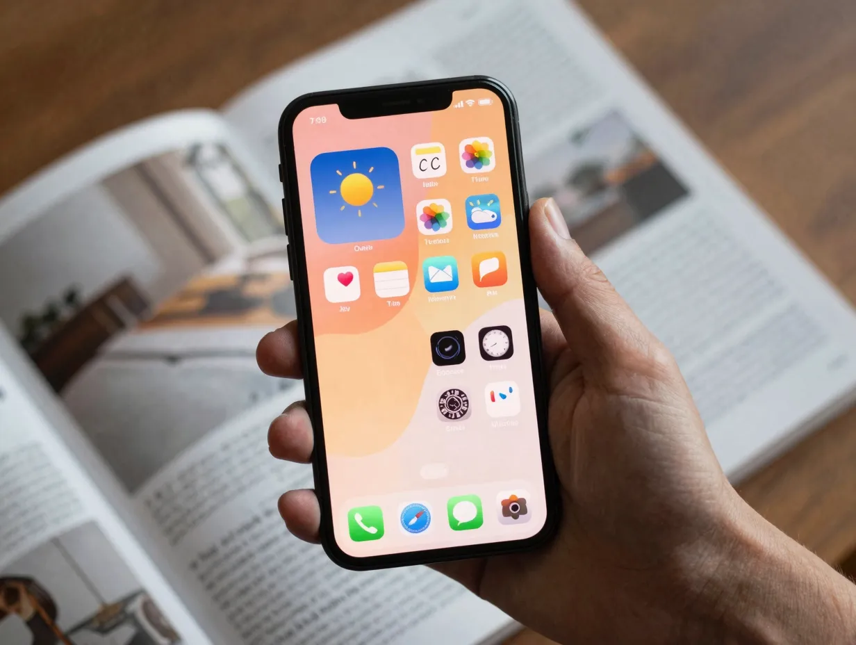
The final and arguably most visually impactful of the 8 ways to customize your iPhone app icons for a unique aesthetic is the deliberate coordination of icon styles with widget designs. Widgets, particularly the large and medium-sized varieties, occupy significant visual real estate on the Home Screen, and when their color schemes, typography, and visual weight clash with surrounding icons, the result feels unfinished [2].
The goal is to treat the entire Home Screen as a single designed surface rather than a collection of independent elements. This means:
- Matching widget background colors to the dominant tint applied to icons.
- Choosing widget styles (minimal, photo-based, data-heavy) that share the same visual register as the icon pack in use.
- Positioning widgets to create visual balance with icon clusters, for example, a large widget on the left balanced by a column of small icons on the right.
- Using the same wallpaper color as the basis for both icon tinting and widget color selection, creating a three-way harmony between wallpaper, icons, and widgets [6].
Several third-party widget apps, including Widgetsmith, Color Widgets, and BeWidgets, allow full color and font customization, making it straightforward to match widget appearance to any icon pack or tint color. The end result is a Home Screen that looks like it was designed as a whole, not assembled piece by piece.
Advanced Techniques: Background Shading, Contrast, and Future-Ready Aesthetics
Beyond the core eight methods, a handful of additional controls can refine the final result. iOS 18’s background shading option, accessible through the Customize panel, adds a subtle gradient or color overlay behind the icon grid, a technique that improves icon visibility against complex wallpapers without obscuring the wallpaper entirely [4].
Contrast controls within the Accessibility settings (Settings > Accessibility > Display & Text Size) offer another layer of refinement. Increasing contrast makes icon artwork pop more sharply against backgrounds, while reducing transparency in the same menu creates a more opaque, grounded feel for users who find the glass aesthetic too busy.
Looking ahead, iOS 26’s design language, with its emphasis on adaptive color, translucency, and fluid motion, points toward Home Screens that respond dynamically to content, time, and context [9]. Users who build their customization approach on native iOS tools rather than third-party workarounds will be best positioned to benefit from these evolving capabilities as Apple continues to expand them.
Common Mistakes to Avoid
Even with the right tools in hand, certain patterns consistently produce results that look less polished than intended.
Mixing too many icon styles: Using three different icon packs on the same screen creates visual noise rather than variety. Commit to one pack per page, or one pack across all pages.
Ignoring wallpaper-icon contrast: A dark icon pack on a dark wallpaper makes icons nearly invisible. Always test readability in both Light and Dark modes before finalizing a layout.
Overloading with widgets: More widgets do not mean more personality. Two or three well-chosen, well-styled widgets create more impact than a screen crowded with information panels.
Forgetting the App Library: When replacing default icons with Shortcuts-based custom icons, the original app icon remains on the Home Screen unless manually moved to the App Library. Leaving both versions visible defeats the purpose of the customization [5].
Neglecting consistency across pages: A beautifully designed first page that gives way to a default-looking second page breaks the immersive quality of the overall design. Apply the same logic, if not the same exact icons, to every visible page.
Conclusion
The 8 ways to customize your iPhone app icons for a unique aesthetic covered in this guide range from single-tap changes, like switching to small icons or hiding labels, to more involved workflows like building Shortcuts-based custom icon sets and coordinating full widget suites. None of them require technical expertise, and all of them work within Apple’s native iOS framework, which means they will remain stable and functional as iOS continues to evolve.
Actionable next steps to take today:
- Enter jiggle mode and open the Customize panel to explore icon size, color mode, and tinting options, these take under two minutes and produce an immediate visual change.
- Download one free icon pack from a platform like Etsy or Gumroad and apply it to five or six of the most-used apps via Shortcuts to test the workflow before committing to a full redesign.
- Choose a single wallpaper as the color anchor for the entire Home Screen, then use the eyedropper tool to sample its dominant hue for icon tinting.
- Experiment with free icon placement to break away from the default top-left grid and create a layout that reflects a personal visual sensibility.
- Revisit the design after one week, what works well and what creates friction in daily use will become clear with real usage data.
A thoughtfully customized iPhone Home Screen is not a superficial exercise. It is a daily interaction surface, and designing it intentionally makes every unlock feel like opening something that belongs to the person holding it.
References
[1] support.apple – https://support.apple.com/guide/iphone/customize-apps-and-widgets-on-the-home-screen-iph385473442/ios
[2] How To Customize Home Screen Apps Widgets Ios 18 – https://www.wired.com/story/how-to-customize-home-screen-apps-widgets-ios-18/
[3] How To Customize Your Iphones Home Screen In Ios 18 120100872 – https://www.engadget.com/mobile/smartphones/how-to-customize-your-iphones-home-screen-in-ios-18-120100872.html
[4] Ios 18 Home Screen Customization Guide 2025 – https://applemagazine.com/ios-18-home-screen-customization-guide-2025/
[5] Iphone Customize Ios Home Screen Lock Screen Buttons Shortcuts – https://www.macworld.com/article/2409375/iphone-customize-ios-home-screen-lock-screen-buttons-shortcuts.html
[6] How To Customize Iphone Home Screen Ios 18 – https://www.laptopmag.com/phones/iphone/how-to-customize-iphone-home-screen-ios-18
[7] How To Customize Your Iphones Home Screen In Ios 18 – https://www.techradar.com/phones/ios/how-to-customize-your-iphones-home-screen-in-ios-18
[8] Watch – https://www.youtube.com/watch?v=Xs_quMOws6U
[9] Ios 26 Home Screen – https://www.macrumors.com/guide/ios-26-home-screen/
[10] Watch – https://www.youtube.com/watch?v=7QdBZ4HL_3U