6 Tips for Building the Ultimate Smart Home Dashboard
By 2026, the average connected home runs more than 15 smart devices simultaneously, yet most homeowners still fumble through a maze of disconnected apps to turn off a single light. A well-built smart home dashboard solves that problem in one screen. These 6 tips for building the ultimate smart home dashboard cut through the noise and give you a clear, actionable path from a cluttered interface to a control center that every member of your household can actually use.
Disclosure: This post contains affiliate links. As an Amazon Associate, we earn from qualifying purchases, and at no extra cost to you.
Key Takeaways
- Define a clear purpose for your dashboard before choosing a single widget or card
- Place critical controls, locks, alarms, and HVAC, within two taps at all times
- Use a grid-based layout grouped by room or activity to reduce visual overload
- Optimize load speed and responsiveness so the dashboard works on any device in the home
- Test with real household members and iterate based on their feedback, not just your own preferences
1. Define the Dashboard’s Purpose Before You Build Anything
The single most common mistake in smart home dashboard design is jumping straight into adding cards, graphs, and automations before answering one foundational question: what is this dashboard actually for?
A dashboard built for a “family status board” looks completely different from one designed as a “security overview” or a “lighting scene controller.” Without a defined purpose, the interface quickly becomes a dumping ground for every connected device in the house, impressive to look at, but frustrating to use under real conditions [1].
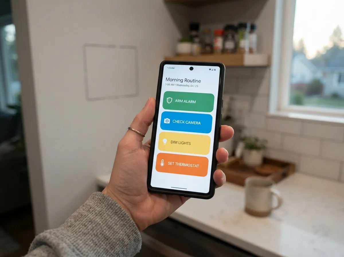
Start by mapping out the household routines the dashboard needs to support. Think about busy school mornings when someone needs to arm the alarm and check the front door camera in under ten seconds. Think about evening wind-down routines where dimming the living room lights and setting the thermostat should happen in one tap. Think about weekend guests who have never seen your setup and need to adjust the temperature without calling for help [2].
Practical steps to define your purpose:
- Write down the top five tasks people perform daily in the space where the dashboard will live
- Identify who uses the space, adults, children, elderly relatives, frequent guests
- Decide whether the dashboard is the primary control point or a supplementary one alongside voice assistants and physical switches
- Choose a single “north star” use case (e.g., “morning routine control”) and design around it first [10]
“Design for the place where the dashboard will live, and for the people who will use it every day, not just the person who built it.” [2]
Designing for physical context matters just as much as designing for use cases. A dashboard mounted in a kitchen needs larger tap targets and higher contrast than one viewed on a desktop monitor. A dashboard on a phone needs to work with one hand, often while distracted [4].
2. Prioritize Critical States and Keep Them Within Two Taps
Once the purpose is clear, the next step in these 6 tips for building the ultimate smart home dashboard is ruthless prioritization. Not every device deserves equal real estate on the screen.
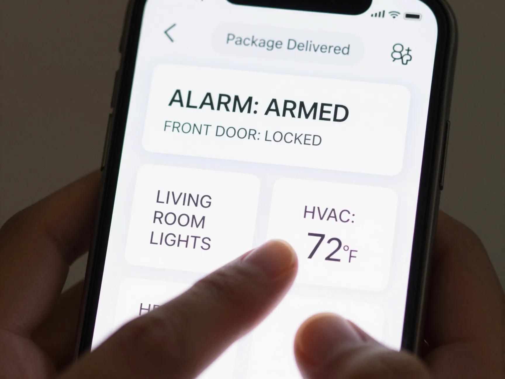
A well-structured visual hierarchy ensures that the most important information is seen first and acted on fastest. Security status and alarm controls belong in the top-left corner, where the eye naturally lands first in a Z-pattern or F-pattern reading flow. Frequently used lighting and climate controls come next. Low-priority information, energy history, firmware update notifications, weather forecasts, gets pushed into secondary views or collapsible panels [4].
The two-tap rule is non-negotiable for critical controls. Any action related to the alarm system, main door locks, primary lighting, or HVAC mode must be reachable in at most two taps from the home screen, especially on a phone [2]. If a household member has to navigate through three menus to lock the front door, the dashboard has failed its most basic job.
Alert management deserves special attention here. Alerts should be triaged into three categories:
- Critical alerts, smoke detectors, intrusion alarms, water leak sensors. These should temporarily take over the UI and require a deliberate manual dismissal before the user can do anything else.
- Informational alerts, a door left open, a package delivery notification. These appear as a persistent but non-blocking banner.
- Background items, firmware updates, energy usage summaries, device offline notices. These belong in a log or a small notification area that users check on their own schedule [4].
This triage system prevents alert fatigue, which is one of the leading reasons people stop engaging with their smart home dashboards altogether.
| Priority Level | Examples | Placement |
|---|---|---|
| Critical | Alarm, door locks, smoke alerts | Top-left, always visible |
| High | Lighting scenes, HVAC, cameras | Primary view, prominent cards |
| Medium | Package alerts, open windows | Notification banner |
| Low | Firmware updates, energy logs | Secondary view or log |
3. Use a Grid-Based Layout Grouped by Room or Activity
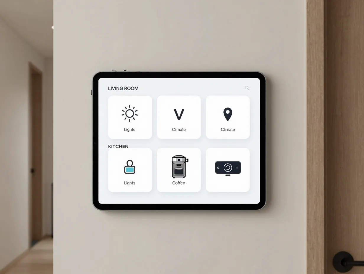
Visual chaos is the enemy of a usable dashboard. When cards are different sizes, scattered without logic, and grouped by device type rather than context, users have to think too hard to find what they need. A grid-based layout eliminates that friction [7].
The most effective organizational approach in 2026 is grouping controls by room or activity, not by device brand or integration type. Grouping by room mirrors how people actually think about their home. When someone walks into the bedroom, they think “bedroom lights” and “bedroom temperature”, not “Philips Hue” and “Ecobee” [9].
Layout principles that work in practice:
- Use a consistent grid with uniform card sizes where possible, reserving larger cards only for high-priority controls or camera feeds
- Limit each view or tab to a maximum of 8 to 10 cards to prevent cognitive overload
- Create separate views for different contexts: a “Morning” view, an “Away” view, a “Night” view, and a “Guest” view
- Use section headers within each view to create visual groupings without requiring additional navigation [1]
Platforms like Home Assistant support both section-based and grid-based layouts natively, and the 2026 guidance from multiple dashboard design resources consistently recommends starting with a grid and adding complexity only when a clear use case demands it [9][7].
What to avoid:
- Mixing card sizes randomly without a visual reason
- Placing rarely used controls (like pool pump timers) on the main view
- Using more than three levels of navigation depth
- Relying on color alone to convey status, always pair color with a text label or icon for accessibility [4]
4. Optimize for Speed and Cross-Device Responsiveness
A dashboard that takes four seconds to load is a dashboard that gets abandoned. Speed is not just a technical concern, it is a core UX requirement for any interface that people use under time pressure, like checking whether the garage door is closed before leaving for work [5].
Several performance factors affect dashboard responsiveness:
Hardware and hosting: Running a local Home Assistant instance on a dedicated device (such as a Home Assistant Green or a small NUC-style mini PC) dramatically reduces latency compared to cloud-dependent setups. Local processing means controls respond in milliseconds rather than waiting for a round trip to a remote server [3].
Card and integration efficiency: Every card on a dashboard creates a data polling request. Dashboards loaded with dozens of live-updating cards, especially those pulling external API data like weather or traffic, will slow down on older tablets and phones. Audit each card and ask whether it needs to update in real time or whether a refresh every few minutes is sufficient [7].
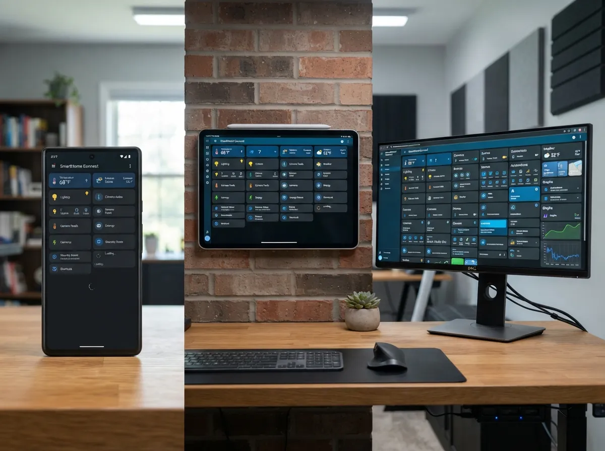
Responsive design for multiple screen sizes: A dashboard designed only for a wall-mounted 10-inch tablet will look broken on a phone and overwhelming on a desktop browser. Use responsive grid settings that reflow cards based on screen width. Home Assistant’s dashboard editor supports breakpoint-based column counts, which makes this straightforward to configure [2].
Practical speed optimization checklist:
- Host the dashboard locally whenever possible
- Limit live-updating cards to critical states only
- Use static or low-frequency refresh for informational widgets
- Compress and cache any custom images or background graphics
- Test load time on the slowest device in the household, not the fastest [5]
“The dashboard should feel as fast as flipping a light switch, any noticeable delay breaks the mental model of direct control.” [4]
5. Make the Interface Intuitive and Accessible for Every User
The fifth of these 6 tips for building the ultimate smart home dashboard addresses the gap between a dashboard that impresses technically and one that actually gets used by everyone in the home. Accessibility and intuitive design are not optional extras, they are the difference between a dashboard that sticks and one that only the person who built it ever touches.
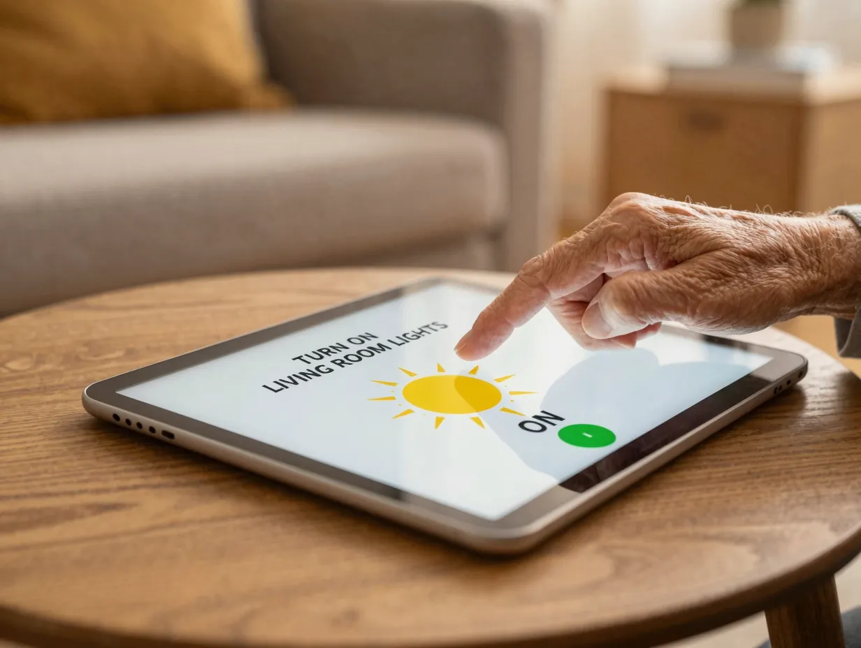
Design for the least technical user in the household. If a 70-year-old parent visiting for the weekend cannot figure out how to adjust the thermostat without help, the dashboard needs work. This means using plain language labels (“Turn on living room lights” rather than “entity: light.living_room_main”), using large enough tap targets for touchscreens (at least 44×44 pixels per accessibility guidelines), and avoiding jargon from the underlying platform [10].
Color and contrast matter more than most builders realize. Status indicators that rely solely on a small colored dot, green for on, red for off, are invisible to users with color vision deficiencies, which affect roughly 8% of men. Always pair color with a text label, an icon, or a shape change [4].
Consistency builds trust. When the same action (e.g., tapping a light card) always produces the same result, users build confidence quickly. Inconsistency, where some cards toggle on tap and others open a detail panel, creates hesitation and errors [1].
Accessibility improvements to implement immediately:
- Replace technical entity names with plain-language labels throughout
- Increase card and button sizes for touchscreen-primary deployments
- Add text labels alongside all color-coded status indicators
- Create a simplified “Guest Mode” view with only the controls visitors need
- Test the dashboard with every household member present, including children and elderly relatives [10][2]
6. Test, Gather Household Feedback, and Iterate Continuously
The final tip is the one most builders skip: treating the dashboard as a living product that improves over time, not a one-time project to be finished and forgotten.
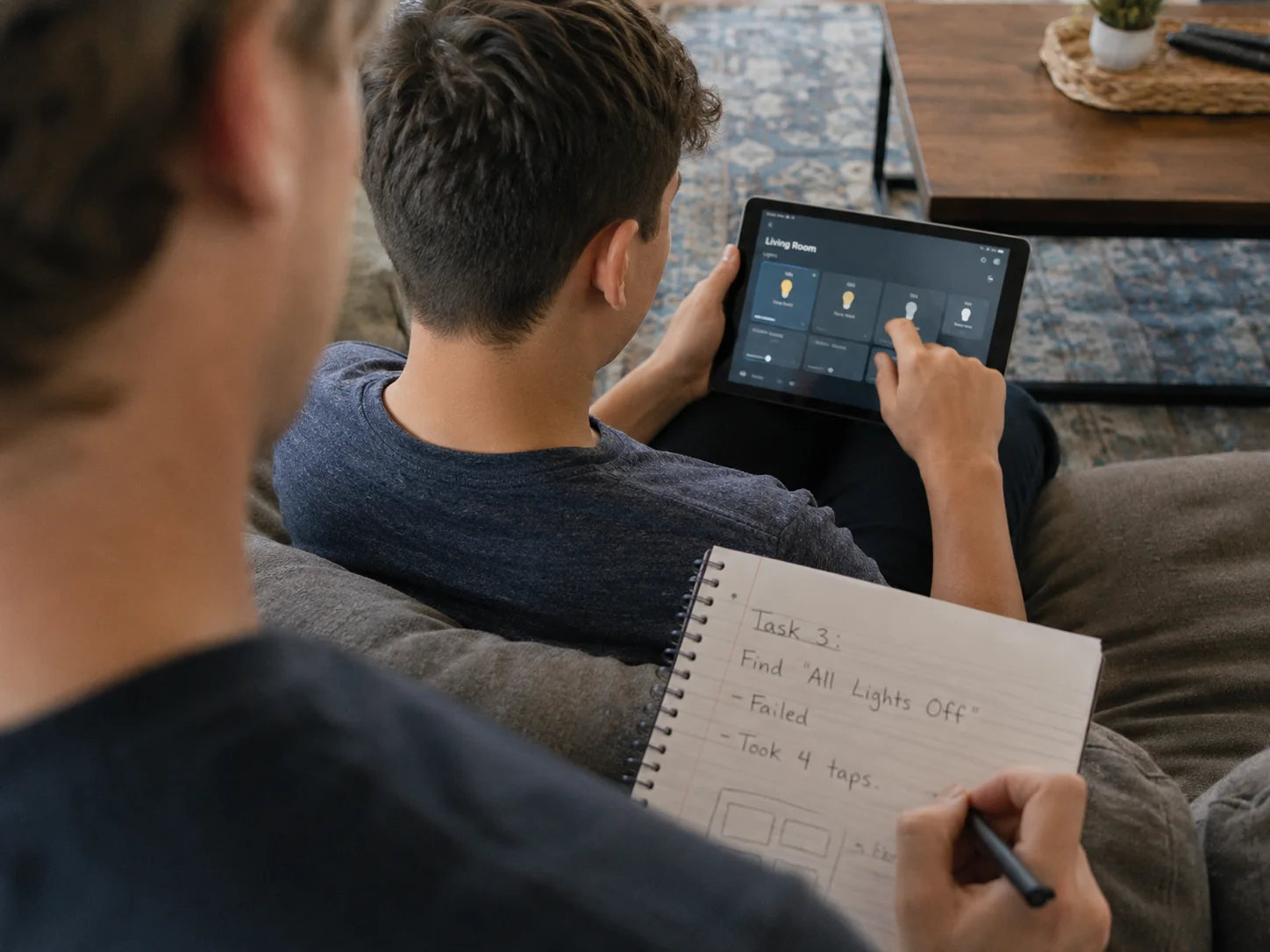
The most polished dashboard in the world is built on assumptions. Real households use their dashboards in ways that no single builder can fully predict. A teenager might consistently try to access the music system from a card that is buried three taps deep. A partner might ignore the energy monitoring section entirely while constantly looking for a shortcut to the “all lights off” scene. Only structured observation and honest feedback surfaces these patterns [10].
A practical testing and iteration process:
- Conduct a first-use test. Ask a household member who was not involved in building the dashboard to complete five common tasks (lock the front door, set the thermostat, turn off all lights, check the camera feed, activate the “Away” mode) without any guidance. Observe where they hesitate or make wrong taps.
- Collect feedback after two weeks of daily use. By this point, initial novelty has worn off and real friction points become clear. Ask: “What do you find yourself doing most often?” and “Is there anything you avoid using because it’s too complicated?”
- Review automation logs monthly. Home Assistant and similar platforms log which automations fire, which entities are most frequently controlled, and which are rarely touched. Use this data to promote frequently used controls to more prominent positions and archive rarely used ones [3].
- Iterate in small, focused changes. Avoid redesigning the entire dashboard at once. Change one section, test it for a week, and assess whether the change improved usability before moving to the next section [7].
- Stay current with platform updates. Home Assistant releases major updates regularly, and new card types, layout options, and integrations become available that can simplify previously complex workarounds [9].
Metrics worth tracking over time:
| Metric | What It Reveals |
|---|---|
| Time to complete a critical task | Whether priority controls are truly accessible |
| Number of taps per common action | Whether navigation depth is appropriate |
| Frequency of card interaction | Which controls deserve prime real estate |
| Household member adoption rate | Whether the UI is intuitive enough for all users |
| Dashboard load time | Whether performance optimization is needed |
Iteration is not a sign that the initial build failed. It is the mechanism by which a good dashboard becomes a great one [1][10].
Conclusion
Building the ultimate smart home dashboard is not a technology challenge, it is a design challenge. The hardware and software to connect dozens of devices already exist. The harder work is creating an interface that serves every person in the household, responds instantly under pressure, and improves over time.
The 6 tips for building the ultimate smart home dashboard covered here, defining purpose, prioritizing critical controls, using a grid-based layout, optimizing for speed, designing for accessibility, and iterating with real feedback, form a complete framework that applies whether you are starting from scratch or overhauling an existing setup in 2026.
Actionable next steps to take this week:
- Write down the top five daily tasks your dashboard must support before opening any editor
- Audit your current layout for the two-tap rule, if critical controls take more than two taps, fix that first
- Reorganize cards by room or activity rather than by device type or integration
- Time your dashboard load on the oldest device in your home and address any delays above two seconds
- Schedule a 30-minute session with another household member to watch them use the dashboard without guidance
A smart home dashboard that works for humans, not just for the person who built it, is one of the highest-leverage improvements any connected home can make in 2026.
References
[1] 2025 02 05 Dashboards – https://www.donglejungle.com/blogs/reviews-tutorials/2025-02-05-dashboards
[2] Home Assistant Dashboard Guide – https://www.antlatt.com/blog/home-assistant-dashboard-guide/
[3] Home Assistant Ultimate Guide – https://www.leios.consulting/guides/home-assistant-ultimate-guide/
[4] Smart Home Dashboard Ux Design – https://developex.com/blog/smart-home-dashboard-ux-design/
[5] Home Assistant Dashboard – https://techdailyai.com/blog/home-assistant-dashboard
[7] Home Assistant Dashboard Design – https://www.smarthomeautomate.com/learn/home-assistant-dashboard-design
[9] Create Home Assistant Dashboard 2026 – https://averagetechblog.com/home-automation/how-to/create-home-assistant-dashboard-2026/
[10] How I Designed A Smart Home Dashboard That Works For Humans – https://anotherhome.blog/how-i-designed-a-smart-home-dashboard-that-works-for-humans/