6 Inspiring Ideas for a Cohesive Phone Aesthetic Layout
A smartphone home screen is checked, on average, over 96 times per day, yet most people spend zero minutes intentionally designing it. The result is a cluttered grid of mismatched icons that adds low-level visual stress every single time the screen lights up. The good news: a thoughtfully built layout takes less than 30 minutes to create and can transform the daily experience of using a phone. These 6 inspiring ideas for a cohesive phone aesthetic layout give anyone, from a casual user to a design-obsessed planner, a clear, actionable framework to follow.
Disclosure: This post contains affiliate links. As an Amazon Associate, we earn from qualifying purchases, and at no extra cost to you.
Key Takeaways
- Limiting the home screen to 8-12 apps and leaving generous empty space is the single fastest way to create a clean, cohesive look
- Choosing one style family (minimal, dark, beige, color-pop, etc.) and applying it consistently across icons, widgets, and wallpaper is the foundation of any great aesthetic
- A large “anchor” widget at the top of the screen creates a visual hierarchy that makes the whole layout feel intentional
- The dock should hold only the four most-used apps and should never break the color scheme
- A single aesthetic per page, with at least one blank row or column, preserves visual cohesion across every style family
What Makes a Phone Layout Feel Cohesive
Before exploring the 6 inspiring ideas for a cohesive phone aesthetic layout, it helps to understand what “cohesion” actually means in this context. A cohesive layout is not just pretty, it is visually consistent. Every element on the screen, from the wallpaper to the icon shapes to the widget colors, feels like it belongs to the same family.
Three principles drive cohesion:
- Color consistency: Icons, widgets, and wallpaper share the same palette or at least complementary tones
- Visual breathing room: Empty space is intentional, not accidental, it lets the wallpaper and key elements stand out
- Hierarchy: The eye knows where to look first, usually a large widget or the wallpaper itself, and then travels naturally downward to the apps
Design guides consistently recommend maintaining a single aesthetic per page and leaving at least one blank row or column to preserve that sense of openness [10]. Breaking any of these three principles, even once, is usually what makes a layout feel “off.”
The 6 Inspiring Ideas for a Cohesive Phone Aesthetic Layout
The following six ideas are organized by visual style family rather than by random examples. Each one is a complete system, not just a single tip. Pick the one that matches the way the phone is actually used, then follow the guidelines to build it out.
1. The Minimal Single-Page Layout
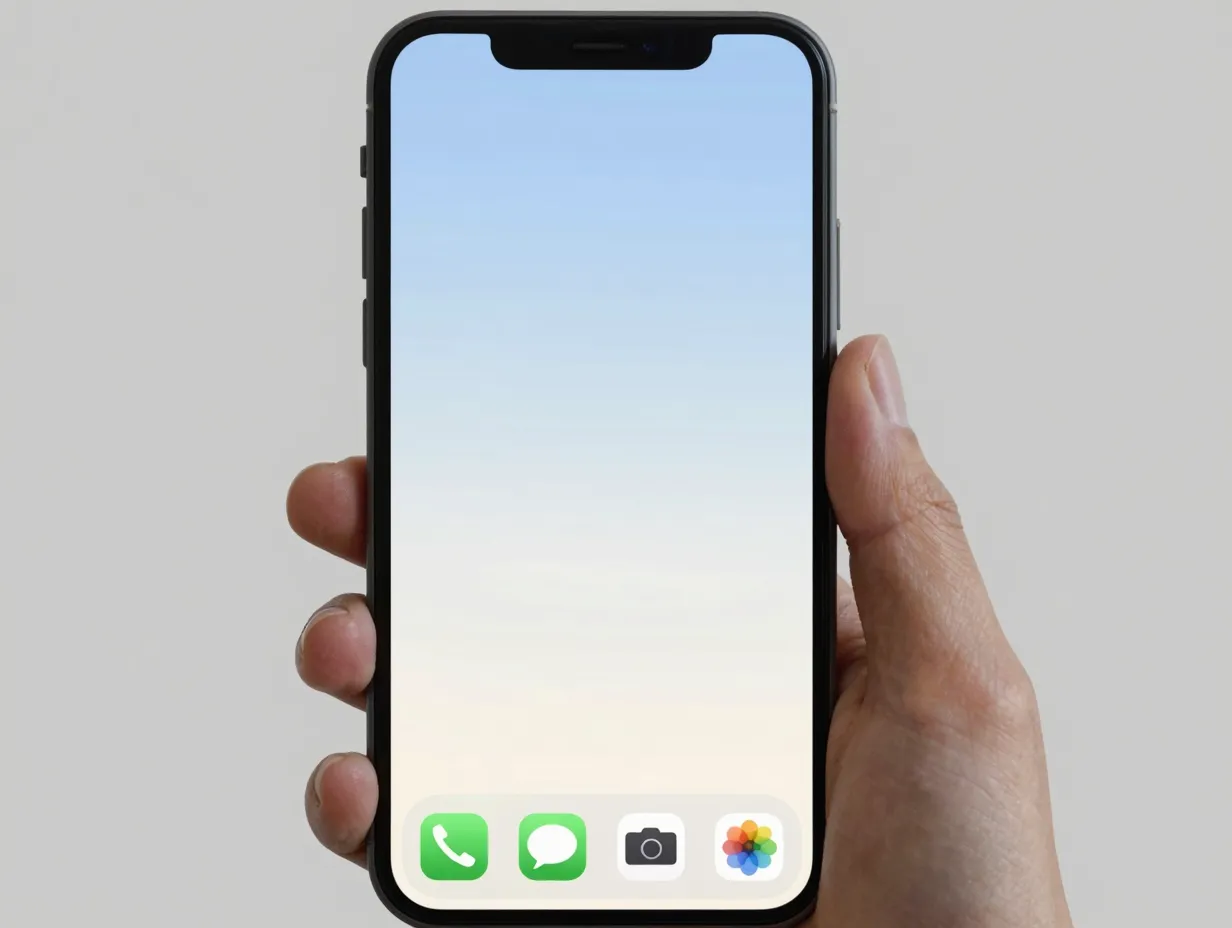
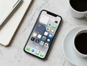
The minimal layout is the most widely recommended starting point for anyone who wants a clean, calm home screen. The core rule is simple: keep only the apps used every single day, typically between 8 and 12, on the main page [1].
The spatial logic of this layout is equally specific. Apps live only in the bottom two rows of the grid. The top two-thirds of the screen stays completely empty, allowing the wallpaper to breathe and become the visual centerpiece [1]. The dock holds the four most-used apps, commonly Phone, Messages, Camera, and a browser, and nothing else.
Why it works: The brain processes visual clutter as a low-level stressor. Removing non-essential icons reduces that noise immediately. A YouTube creator who documented their minimal setup noted that stripping the screen down to a slim column of most-used apps and hiding everything else was the single change that made the phone feel calming rather than demanding [9].
Recommended wallpaper style: Plain gradient, soft texture, or a single-subject photograph with a clean background. Avoid busy patterns that compete with the empty space.
Quick setup checklist:
- Move all apps not used daily to the App Library
- Place remaining 8-12 apps in the bottom two rows only
- Add one small widget (clock or date) if desired, keep it subtle
- Set a wallpaper with a clear, uncluttered upper half
- Fill the dock with exactly four apps
This layout suits users who want their phone to feel like a tool, not a to-do list.
2. The Widget-Centric Dashboard Layout
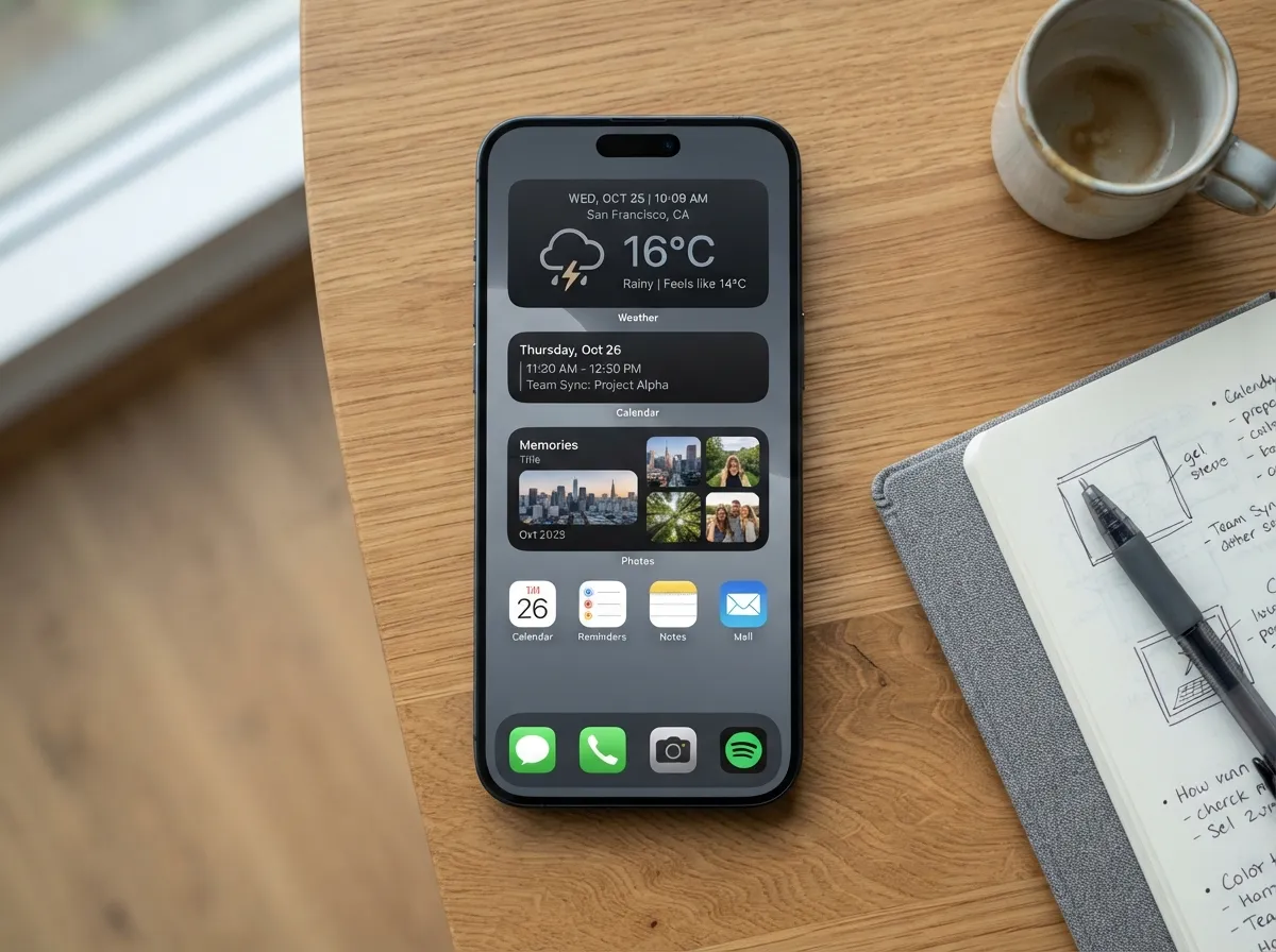
For users who rely on their phone for planning, tracking, and quick information checks, the widget-centric dashboard layout is a powerful alternative. Instead of letting apps dominate the screen, this approach uses one large widget at the top as a focal anchor, commonly a Weather, Calendar, or Photos widget, with medium-sized widgets stacked in the middle and a single row of frequently used apps sitting just above the dock [1].
This “dashboard” structure surfaces overview information at a glance. Before opening a single app, the user already knows the weather, the next calendar event, and a recent photo memory. The apps below serve as quick-launch shortcuts rather than the primary visual element [6].
A practical workflow for building this layout involves selecting four essential widgets, clock, weather, calendar, and photos, and placing them either in a Smart Stack or a tight two-by-two grouping. Apps are added afterward, in a 30-minute session, once the widget layer is locked in [11].
Key layout rules for the dashboard style:
- The top widget should be large (full-width or two-column)
- Middle widgets should be medium-sized and no more than two per row
- App row above the dock: maximum one row, four to six apps
- Dock: four apps only, matching the widget color palette
- Widget colors must share at least one tone with the wallpaper
“The dashboard layout turns the home screen into a control panel, everything the user needs to see is visible before a single tap.”
This layout works best with a wallpaper that has a darker or muted upper half so the widgets stand out clearly without competing for attention.
3. The Monochrome Icon System
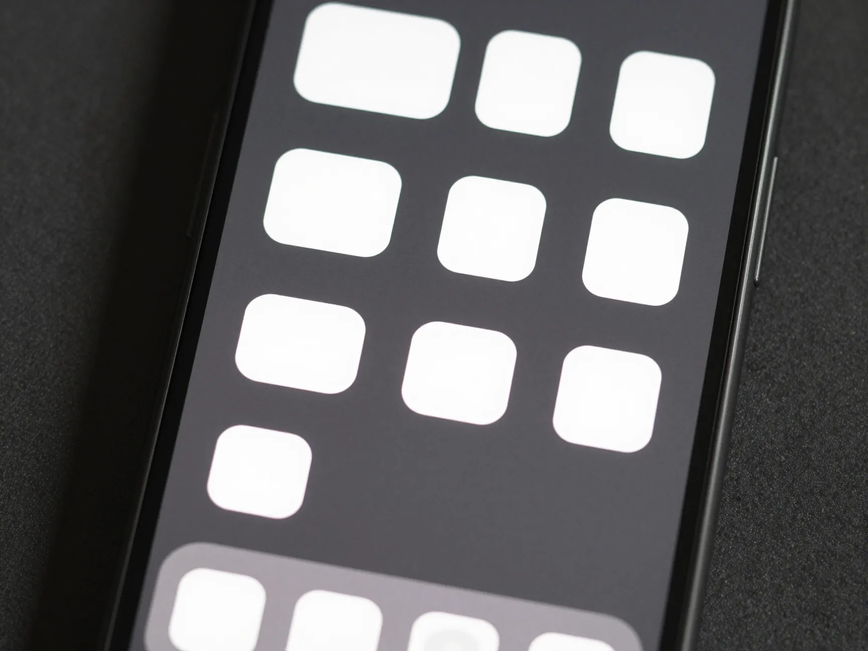
The monochrome icon system is one of the most visually striking styles in the 6 inspiring ideas for a cohesive phone aesthetic layout collection. It works by replacing the default colorful app icons with custom icons in a single color family, most commonly white, black, gray, or a single muted tone like beige or sage green [6].
The effect is immediate and dramatic. A grid of icons that all share the same tone reads as a designed object rather than a random collection of brand logos. The wallpaper, freed from competing with 20 different brand colors, becomes far more expressive.
How to execute the monochrome system:
- Choose one base color (white, black, beige, or a single muted hue)
- Download or create custom icons in that color using a shortcut app
- Select a wallpaper that contains that same base color prominently
- Apply the same color to widget backgrounds if the platform allows
- Keep the dock icon style consistent with the main grid
A June 2026 design guide that categorizes aesthetic styles notes that the minimal monochrome approach uses plain gray or white wallpaper, zero to one widgets, and thin monochrome icons, the restraint is the point [6]. Adding even one colorful icon breaks the spell.
Best for: Users who want a high-fashion, editorial look and are willing to spend time on icon customization.
Avoid: Mixing icon styles (flat icons with 3D icons, for example) or using a busy wallpaper that clashes with the uniform icon tone.
4. The Warm Neutral (Beige and Brown) Aesthetic
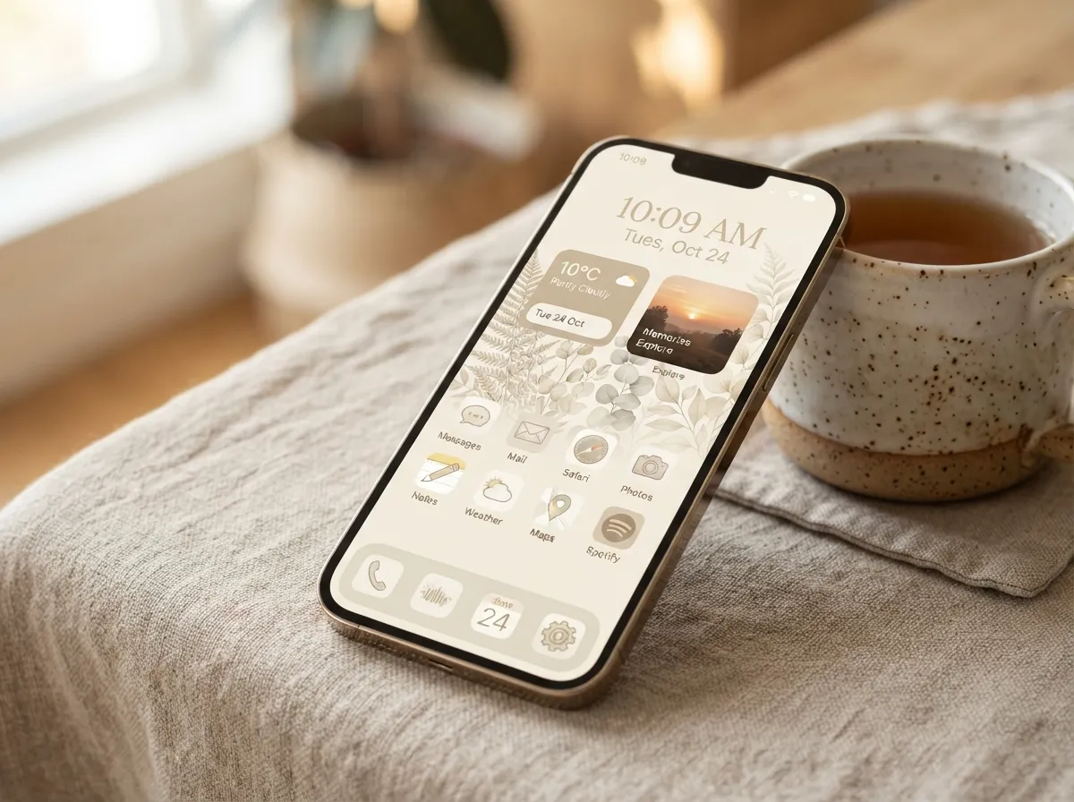
The warm neutral aesthetic has become one of the most popular style families for phone home screens, and for good reason. It is forgiving, versatile, and feels immediately cozy without requiring complex customization [10].
The palette centers on beige, cream, warm white, tan, and soft brown tones. Wallpapers in this style often feature botanical illustrations, linen textures, coffee-toned gradients, or warm-toned photography. Icons are either custom-made in matching neutral tones or left as default if the platform’s default icons are already subdued.
Layout structure for warm neutral:
- Wallpaper: warm-toned texture or botanical illustration, light background
- Icons: custom beige or cream icons, or default icons with a warm-toned background
- Widgets: use widget apps that allow background color customization, set to cream or warm white
- App count: 8-12 apps, clustered in the bottom half of the screen
- Dock: match the dock background (if customizable) to the wallpaper’s dominant tone
A May 2026 article that organizes home screen ideas into six style families identifies the beige and brown aesthetic as one of the most consistently executed styles because its color rules are clear and the palette is naturally harmonious [8]. There is little risk of clashing when every element draws from the same warm, muted range.
Pro tip: Use a photos widget set to display warm-toned photos only. Curate a dedicated album of warm-toned images to feed the widget so it never breaks the color scheme with a jarring blue-sky photo.
5. The Dark Mode Cinematic Layout
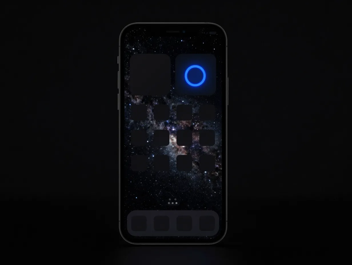
The dark mode cinematic layout takes the opposite approach from the warm neutral aesthetic. It leans into deep blacks, dark grays, cool blues, and high-contrast accent colors, often electric blue, neon green, or deep purple, to create a dramatic, immersive home screen [6].
This layout pairs naturally with OLED screens, where true black pixels are fully off, making the screen appear to have infinite depth. The result is a home screen that feels like a movie interface rather than a productivity tool.
Core design rules for the dark cinematic style:
- Wallpaper: deep space photography, abstract dark gradients, or dark architectural photography
- Icons: dark-background custom icons or default icons that already have dark branding (Spotify, YouTube, Apple Music)
- Widgets: dark-background widgets with light text; avoid any white or light-colored widget backgrounds
- Accent color: choose one accent color (electric blue, deep purple, or neon green) and use it only for the most important widget or icon group
- App count: keep it lean, 8-10 apps maximum, so the dark wallpaper dominates
The dark mode aesthetic is one of eight broad style families described in a comprehensive home screen design guide, which recommends zero to two widgets for this style to keep the dramatic wallpaper as the hero element [6].
Who it suits best: Users who use their phone heavily at night, gamers, and anyone who wants their home screen to feel bold and intentional rather than soft and decorative.
Common mistake: Using too many accent colors. One accent color creates drama. Three accent colors create chaos.
6. The Color-Pop Accent Layout
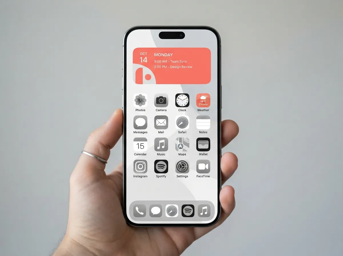
The sixth idea in these 6 inspiring ideas for a cohesive phone aesthetic layout is the most expressive: the color-pop accent layout. Unlike the monochrome or neutral styles, this approach embraces a single bold color as the hero, think coral, cobalt blue, forest green, or warm terracotta, and builds the entire layout around it.
The key to making this work without descending into chaos is the 60-30-10 rule borrowed from interior design:
- 60% of the screen’s visual space uses a neutral base (white, light gray, or cream)
- 30% uses a secondary tone that complements the hero color (soft blush for coral, navy for cobalt)
- 10% uses the bold accent color itself, applied to the most important widget, a small cluster of icons, or the wallpaper’s focal point
Executing the color-pop layout:
- Choose one bold accent color
- Select a wallpaper that features that color as a focal point against a neutral background
- Apply the accent color to one large widget only
- Keep all other icons and widgets in neutral or complementary tones
- Use the dock as a neutral anchor, no accent color in the dock
A 2026 home screen ideas guide notes that layouts organized around a single bold color consistently rank among the most visually satisfying because they give the eye a clear focal point while maintaining overall balance [6]. The discipline of using the accent color sparingly is what makes it pop.
Seasonal variation: This layout is easy to refresh by simply swapping the accent color and wallpaper every season, coral for summer, deep amber for autumn, icy blue for winter, while keeping the structural layout identical.
Comparing the Six Layout Styles at a Glance
The table below summarizes the key parameters of each layout style to make it easier to choose the right one.
| Layout Style | App Count | Widget Count | Wallpaper Type | Best For |
|---|---|---|---|---|
| 1. Minimal Single-Page | 8-12 | 0-1 | Soft gradient or texture | Calm, distraction-free use |
| 2. Widget Dashboard | 4-6 | 3-5 | Muted, dark upper half | Planners and information trackers |
| 3. Monochrome Icons | 8-16 | 0-1 | Plain or single-tone | Editorial, high-fashion look |
| 4. Warm Neutral | 8-12 | 1-3 | Botanical, linen, warm texture | Cozy, versatile everyday use |
| 5. Dark Cinematic | 8-10 | 0-2 | Deep space, dark gradient | Night users, bold statement |
| 6. Color-Pop Accent | 8-12 | 1-2 | Neutral base, bold focal point | Expressive, seasonal refreshes |
Universal Rules That Apply to All Six Layouts
Regardless of which of the 6 inspiring ideas for a cohesive phone aesthetic layout is chosen, several universal rules apply across every style family.
Keep the dock sacred. The dock is the most-viewed strip of the home screen. It should hold exactly four apps, the four most-used ones, and their icons must match the overall color scheme. A mismatched dock icon breaks the cohesion of even the most carefully designed layout [1][10].
Use blank space deliberately. At least one blank row or column should remain empty on every home screen page. This is not wasted space, it is the visual equivalent of a pause, giving the eye a place to rest and making the populated areas feel more intentional [10].
Limit the number of pages. A cohesive aesthetic is nearly impossible to maintain across six or seven home screen pages. The App Library handles storage; the home screen handles daily access. One to two pages maximum is the standard recommendation for any of these six styles [5].
Test the layout in real lighting. A home screen that looks perfect in a dark room may look washed out in bright sunlight. Check the layout in multiple lighting conditions before finalizing it, especially for dark cinematic and monochrome styles.
Audit every 30 days. Apps accumulate. A layout that was clean in January can feel cluttered by March. A monthly five-minute audit, removing apps that have not been used and checking that the color rules still hold, keeps the aesthetic fresh without requiring a full redesign [5].
Tools and Resources for Building These Layouts
Building any of these layouts is more accessible than ever in 2026. Several dedicated apps and platforms make icon customization, widget creation, and wallpaper sourcing straightforward.
For custom icons: Shortcut-based icon replacement (available natively on iOS) and dedicated icon pack apps allow full control over icon appearance without requiring developer access. Many icon packs are organized by the same style families described above [4].
For widgets: Widget customization apps allow users to set background colors, font styles, and data sources for clock, weather, calendar, and photo widgets, making it possible to match widgets precisely to any of the six layout styles [4][7].
For wallpapers: Curated wallpaper apps and communities organize wallpapers by aesthetic style, making it easy to find options that match a chosen layout without scrolling through thousands of unrelated images [3][7].
For inspiration: Dedicated home screen setup communities share real examples of all six layout styles, often with detailed breakdowns of the apps, icon packs, and widgets used, making it easy to reverse-engineer a look that resonates [2][8].
Conclusion
A cohesive phone aesthetic is not a luxury, it is a small but meaningful act of intentional design that affects how the phone feels to use dozens of times every day. The 6 inspiring ideas for a cohesive phone aesthetic layout covered here, minimal single-page, widget-centric dashboard, monochrome icon system, warm neutral, dark cinematic, and color-pop accent, each offer a complete visual system rather than a collection of isolated tips.
Actionable next steps:
- Audit the current home screen and count how many apps are actually used daily, this single step clarifies which layout style fits best
- Choose one style family from the six described above and commit to its color rules before touching a single icon
- Start with the wallpaper and the dock, then build outward, these two elements anchor every other decision
- Use the 30-minute widget-first workflow for the dashboard style, or the bottom-two-rows rule for the minimal style, depending on the chosen approach
- Schedule a 30-day review to remove apps that have drifted back in and check that the color rules still hold
The phone is checked nearly 100 times a day. Making those 100 moments feel calm, intentional, and visually satisfying is worth 30 minutes of setup.
References
[1] Aesthetic Phone Setup – https://arctools.dev/wallpics/aesthetic-phone-setup
[2] Setups – https://www.one4studio.com/setups
[3] Homescreen Layout – https://www.pinterest.com/baileyyy_22/homescreen-layout/
[4] Templates – https://widget-club.com/templates
[5] Aesthetic Phone Home Screen Setup 2026 – https://www.one4studio.com/blog/aesthetic-phone-home-screen-setup-2026
[6] Home Screen Ideas – https://www.iscreenapp.com/blog/home-screen-ideas
[7] Home Screen Ideas – https://www.iscreenapp.com/home-screen-ideas
[8] Iphone Home Screen Layout Ideas – https://www.iscreenapp.com/blog/iphone-home-screen-layout-ideas
[9] Watch – https://www.youtube.com/watch?v=xf0J55zNkAE
[10] Aesthetic Iphone Homescreen – https://www.iscreenapp.com/blog/aesthetic-iphone-homescreen