8 iPhone Home Screen Organization Hacks For A Perfectly Tidy Layout
The average smartphone user unlocks their phone 96 times a day, yet most people spend those moments hunting through a wall of disorganized icons rather than acting on what they actually need. A chaotic Home Screen is not just an aesthetic problem; it creates micro-friction that adds up to real wasted time and mental clutter. Applying the right 8 iPhone Home Screen Organization Hacks For A Perfectly Tidy Layout can transform that experience entirely, turning your most-used device into a focused, distraction-free tool that works with your habits instead of against them. This guide covers every major strategy, from basic structural cleanup to advanced Focus mode automation, so any iPhone user can build and maintain a layout that stays tidy long after setup day.
Disclosure: This post contains affiliate links. As an Amazon Associate, we earn from qualifying purchases, and at no extra cost to you.
Key Takeaways
- A minimal one-page Home Screen supported by the App Library is the gold standard for a tidy, distraction-free layout in 2026.
- The dock and first row are prime real estate, reserve them exclusively for the apps you open before 9am.
- Widgets and widget stacks replace the need for multiple app rows while surfacing more useful information at a glance.
- Focus modes tied to specific Home Screen pages automatically show only the apps relevant to your current context.
- Setting new apps to go directly to the App Library prevents future clutter from undoing your carefully organized layout.
Why Most iPhone Home Screens Stay Messy, And How To Fix That
Before diving into the specific hacks, it helps to understand why the default iPhone setup almost guarantees clutter. Every new app download drops an icon directly onto the Home Screen, pages multiply without any prompting, and most users never revisit the layout after initial setup. The result is a sprawling multi-page grid where finding anything requires scrolling, squinting, or guessing.
The solution is not just tidying up once, it is building a system that resists future disorder. The 8 iPhone Home Screen Organization Hacks For A Perfectly Tidy Layout covered in this guide address both the initial cleanup and the long-term maintenance habits that keep things clean.
The 8 iPhone Home Screen Organization Hacks For A Perfectly Tidy Layout
1. Start With Structural Cleanup in Jiggle Mode
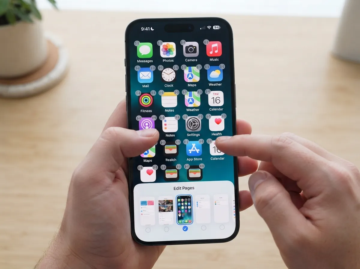
Every effective Home Screen reorganization begins with the same foundational step: entering jiggle mode and doing a thorough audit. Press and hold any empty area on the Home Screen until the icons start wiggling. From this view, you can delete apps you no longer use, drag apps to new positions, and, critically, manage your pages.
Tap the row of dots at the bottom of the screen while in jiggle mode to see a thumbnail view of all your Home Screen pages. From here, you can hide entire pages by unchecking them, or delete pages you no longer need entirely. Apple’s official support documentation walks through exactly this process, recommending it as the foundation for any organized layout [5].
Practical steps for structural cleanup:
- Delete apps you have not opened in 30 days
- Hide pages that serve no regular purpose
- Reorder pages so the most important layout appears first
- Leave only the pages you genuinely use checked in the page-dot view
This single step alone can reduce a six-page mess to one or two clean pages before any further organization begins.
2. Commit to a One-Page (or Near One-Page) Home Screen
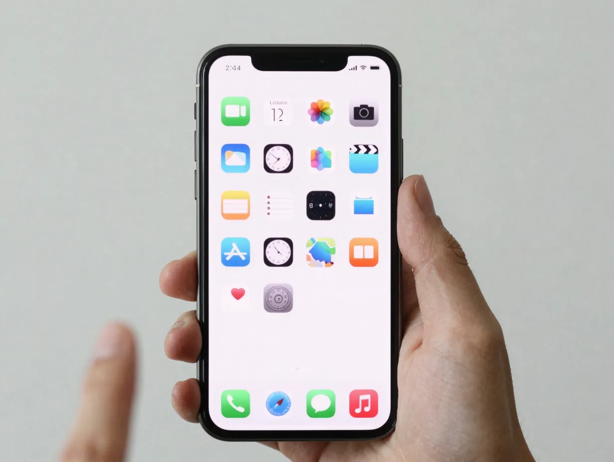
The single most impactful shift in modern iPhone organization is the move to a minimal one-page layout. Rather than spreading apps across five or six pages, the goal is to keep everything you need on a single screen, or at most two, and let the App Library handle everything else.
A 2026 layout guide describes the ideal setup as “one clean Home Screen page with daily-use apps and a couple of widgets, App Library for everything else,” calling this the best general-purpose configuration available [9]. The App Library, accessible by swiping left past all Home Screen pages, automatically categorizes every installed app into smart folders. It is always there; it just does not need to be front and center.
“The tidy layout is intentionally limited, if an app is not on the first page, it belongs in the App Library, not on page three.” [4]
This mental shift, from “where did I put that app” to “if it is not on my one page, I search for it”, is what makes the one-page system sustainable rather than a temporary fix.
3. Treat the Dock and First Row as Prime Real Estate
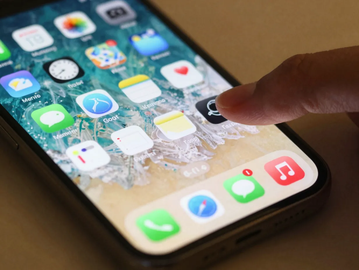
Not all screen space is equal. The dock at the bottom of the screen is visible on every page and is the first thing your thumb reaches. The first row of icons directly above the dock is the next most accessible zone. These two areas deserve ruthless curation.
A 2026 Home Screen system recommends placing the four apps you touch before 9am in the dock, and keeping the rest of the first page to a maximum of 12 critical apps overall [4]. Dock-organization tutorials updated in 2026 walk through long-pressing to drag apps out of the dock and replacing them with function-based choices, for example, one app each for communication, navigation, tasks, and health, to keep that row laser-focused [13].
Dock selection criteria:
- Used at least once every single day
- Opened within the first hour of waking up
- Serves a distinct function not covered by another dock app
- Would be genuinely missed if it required an extra swipe to find
Anything that does not meet those criteria belongs on the main page at best, or in the App Library at minimum.
4. Build Widget Stacks to Replace App Rows
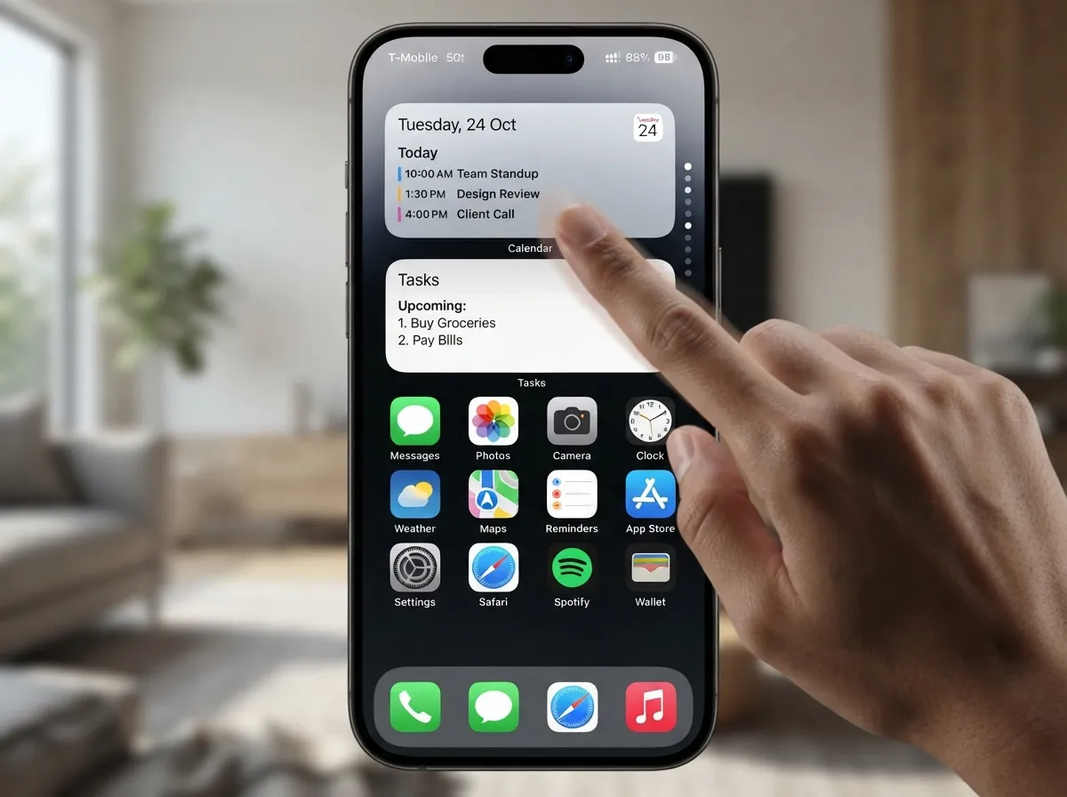
Widgets are no longer optional decoration, they are a core structural element of a tidy layout. Several 2025-2026 guides show layouts where the top half of the screen is occupied by large widgets and stacks, with only a small grid of actual app icons below [1][3][4][7].
A widget stack is a vertical stack of multiple widgets in the same space, swiped through like a card deck. Instead of showing three separate calendar, weather, and tasks widgets (which would consume three rows of space), a single stack occupies one widget slot and cycles through all three pieces of information.
A 2026 Home Screen method advises spending a significant portion of the setup session specifically on adding two to three widgets that surface key information, calendar, tasks, and weather, so that extra apps for those functions do not need to sit on the screen at all [4]. Video-based setup guides for current-generation devices break the screen into explicit sections: large widgets on top, four core apps on the bottom left, a small widget stack on the right [11].
How to create a widget stack:
- Long-press an existing widget until the context menu appears
- Select “Edit Stack” or drag a second widget directly onto the first
- Enable “Smart Rotate” to let iOS surface the most relevant widget automatically
- Add up to 10 widgets per stack, though three to five is the practical sweet spot
5. Use Folders Strategically, But Only for Genuinely Grouped Apps
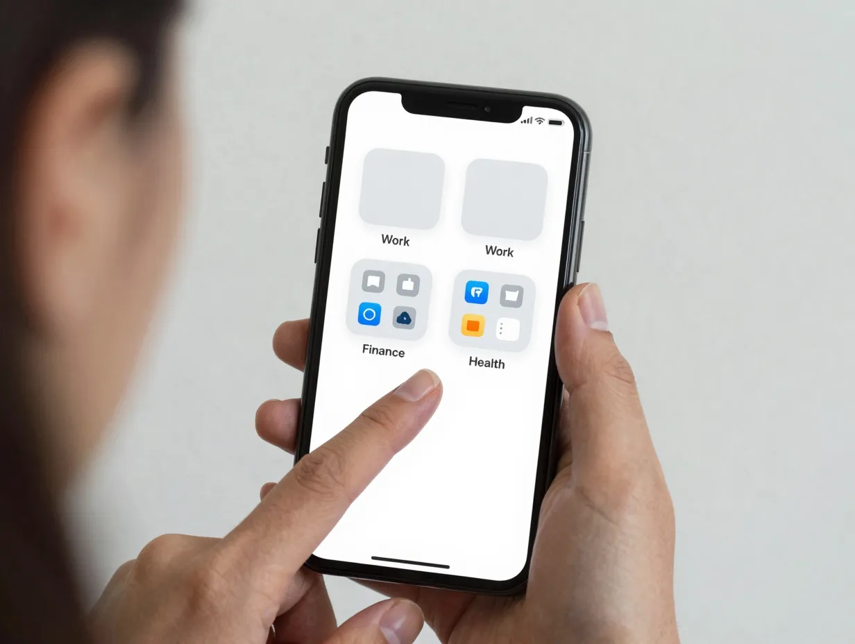
Folders remain a valid organizational tool, but only when used with discipline. The common mistake is creating too many folders, or putting rarely used apps in folders on the Home Screen when they should simply live in the App Library.
Recent how-to content reiterates that dragging one app onto another to create function-based folders, “Work,” “Finance,” “Health,” and similar categories, is still a recommended pattern [2][6][13]. The key rule: avoid duplicating rarely used apps on the Home Screen at all. If an app is opened less than once a week, it belongs in the App Library only, not in a folder on the main page [6].
| Folder Type | What Goes In It | Max Apps |
|---|---|---|
| Work | Email, calendar, project tools, docs | 6-9 |
| Health | Fitness, sleep, nutrition, meditation | 4-6 |
| Finance | Banking, budgeting, investing apps | 3-5 |
| Social | Messaging, social media (if needed) | 3-5 |
A simplified approach for less technical users: remove or hide unused apps, group the rest into three or four clear folders, then hide extra pages to produce a single tidy layout [7]. That three-step flow is enough to achieve a dramatically cleaner result without needing any advanced configuration.
6. Link Focus Modes to Specific Home Screen Pages
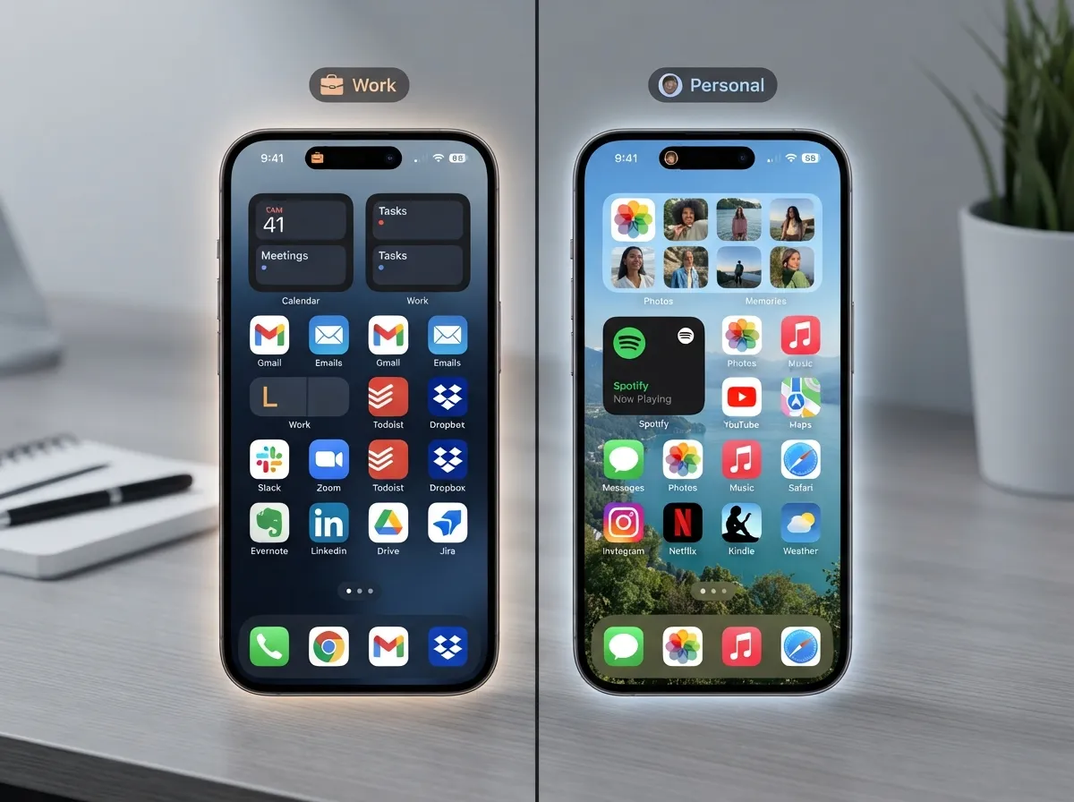
This is one of the most powerful, and most underused, organization hacks available in 2026. Focus modes allow the iPhone to display entirely different Home Screen layouts depending on context, without deleting or hiding any apps permanently.
A 2026 guide describes a “Page 2: Work” setup, then shows how to navigate to Settings, then Focus, then Work, then Customize Screens, and choose which Home Screen pages are visible during that Focus mode [4]. The recommendation is to configure at least two Focus setups, Work and Personal, with automation triggers. For example, Work Focus activates automatically on weekdays between 9am and 6pm, so the Work page appears during those hours without any manual switching [4].
Why this matters for a tidy layout:
At any given moment, only the apps relevant to the current context are visible. A Work Focus might show email, calendar, Slack, and a notes app. A Personal Focus might show messaging, podcasts, and a reading app. Neither layout is cluttered with the other’s tools. The apps are all still installed and accessible via the App Library or search, they simply do not appear on screen when they are not needed.
This approach dramatically reduces on-screen clutter without requiring users to uninstall tools they genuinely need at different times of day [4].
7. Block New Apps From Landing on the Home Screen
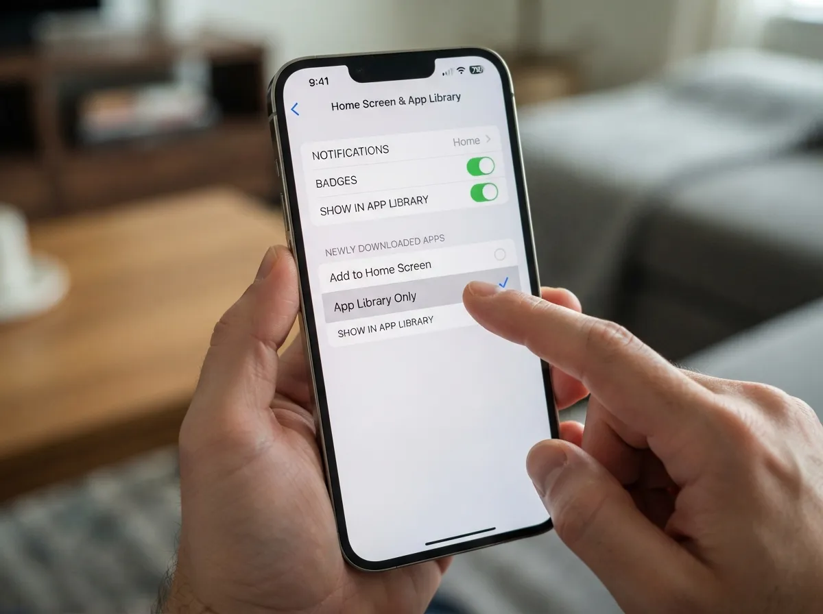
A meticulously organized Home Screen can be undone within minutes if every new app download automatically places an icon on the main page. Preventing this is one of the simplest and most overlooked long-term maintenance hacks.
Navigate to Settings, then Home Screen and App Library, and change the “Newly Downloaded Apps” setting from “Add to Home Screen” to “App Library Only.” From that point forward, installing any new app sends it directly to the App Library without touching the Home Screen layout [5][6].
A 2026 article on actually organizing the Home Screen walks through this exact setting, framing it as the step that makes all other organization efforts permanent rather than temporary [6]. Apple’s support documentation also explains this behavior and how to manage it [5].
“Downloading something should never automatically throw an extra icon onto a carefully curated main page.” [6]
This one setting change takes under 30 seconds and protects every hour spent on the rest of these hacks.
8. Use Screen Time Data and Spotlight Search to Validate Your Layout
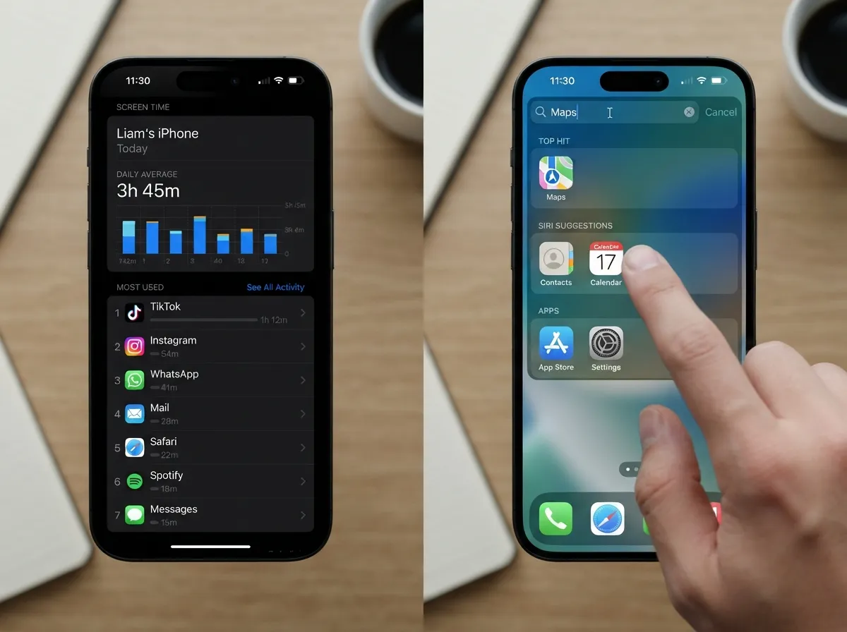
The final hack ties everything together with data. Rather than organizing the Home Screen based on guesswork about which apps matter most, use Screen Time to see exactly what gets opened and how often.
Open Settings, then Screen Time, then See All Activity to view a ranked list of apps by usage over the past week or month. Several 2026 workflows explicitly tell users to open Screen Time, identify what they actually used recently, and then design the dock and first page around those apps only, leaving everything else off-screen and relying on the App Library or search [4][8][9].
The complementary habit is embracing Spotlight Search (swipe down from the middle of any Home Screen page) as the primary way to open any app not on the main page. Power users and community setups frequently describe using a single page where the top is widgets and the bottom is a small set of icons, relying on swipe-down search for everything else, which keeps the visual layout extremely clean [4][8][11].
Using Screen Time to validate your dock choices:
- Open Screen Time weekly for the first month after reorganizing
- Confirm that dock apps consistently appear in the top four to six most-used apps
- Move any dock app that rarely appears in the top tier back to the main page or App Library
- Promote any frequently used app that is buried in a folder up to the dock or first row
This data-driven feedback loop ensures the layout reflects actual behavior rather than aspirational habits.
Bonus: What Is Coming Next for iPhone Home Screen Organization
The 8 iPhone Home Screen Organization Hacks For A Perfectly Tidy Layout described above work with current iOS capabilities, but the landscape continues to evolve. Reports indicate that iOS 18 and beyond are making tidy-but-flexible layouts significantly easier by loosening the grid system and enabling icon color changes [10].
Widely reported features include the ability to place icons more freely on an invisible grid, creating blank spaces and breathing room between app clusters [10]. Additional reporting notes that iOS 18 is expected to let users recolor app icons as a first-party feature, enabling monochrome or color-coded layouts, for example, grouping all work apps in one accent color, which could become a powerful organizational and habit cue once widely available [10].
A newer 2026 trend pairs a minimal single-page layout with a widget-based app launcher, keeping the Home Screen visually sparse while still making most-used apps accessible in one tap [9]. The same approach suggests adding a few Lock Screen widgets for the three to four apps opened most frequently, further reducing the need to show many icons on the Home Screen itself [9].
Conclusion
A tidy iPhone Home Screen is not a one-time project, it is a system built from deliberate choices about what deserves visible space and what does not. The 8 iPhone Home Screen Organization Hacks For A Perfectly Tidy Layout covered in this guide form a complete, layered approach: start with structural cleanup in jiggle mode, commit to a one-page philosophy, protect prime dock real estate, build widget stacks that replace app rows, use folders only where they genuinely help, automate context-switching with Focus modes, block new apps from cluttering the layout, and validate every decision with Screen Time data.
Actionable next steps to take today:
- Set a 30-minute block and work through hacks 1 and 2 first, structural cleanup and page reduction deliver the biggest immediate visual payoff.
- Change the “Newly Downloaded Apps” setting to “App Library Only” before doing anything else, so new downloads cannot undo the work.
- Check Screen Time to identify the four apps that genuinely belong in the dock based on real usage data.
- Build one widget stack combining calendar, tasks, and weather to replace three separate app rows.
- Set up at least one Focus mode (Work or Personal) and link it to a dedicated Home Screen page.
The goal is not a perfect-looking screenshot, it is a layout that reduces friction, surfaces the right information at the right time, and stays organized without constant maintenance.
References
[1] Watch – https://www.youtube.com/watch?v=Ywy90LOoTe8
[2] Iphone Home Screen Layout – https://www.simplymac.com/iphone/iphone-home-screen-layout
[3] Ios Home Screen Ideas – https://zapier.com/blog/ios-home-screen-ideas/
[4] Iphone Home Screen Organization Guide 2026 – https://apppicked.com/en/blog/iphone-home-screen-organization-guide-2026
[5] support.apple – https://support.apple.com/en-us/108324
[6] How To Actually Organize Your Iphone Home Screen – https://swappa.com/blog/how-to-actually-organize-your-iphone-home-screen/
[7] Watch – https://www.youtube.com/watch?v=HV7agycsuDA
[8] Homescreen Organization Best Way – https://www.reddit.com/r/iOSsetups/comments/1bbd0ev/homescreen_organization_best_way/
[9] Organize Iphone Home Screen 2026 – https://mucahitk.com/blog/organize-iphone-home-screen-2026
[10] Apple Iphone Home Screen Changes In Ios 18 – https://lifehacker.com/tech/apple-iphone-home-screen-changes-in-ios-18