6 Steps to Create the Perfect Aesthetic Phone Tour
Roughly 68% of smartphone users change their home screen layout at least once a year, yet most never share the result in a way that earns lasting attention. The 6 Steps to Create the Perfect Aesthetic Phone Tour framework changes that. Whether the goal is a viral video, a polished portfolio post, or simply a deeply satisfying personal setup, following a structured process separates forgettable screen recordings from genuinely compelling content that people save and revisit.
Disclosure: This post contains affiliate links. As an Amazon Associate, we earn from qualifying purchases, and at no extra cost to you.
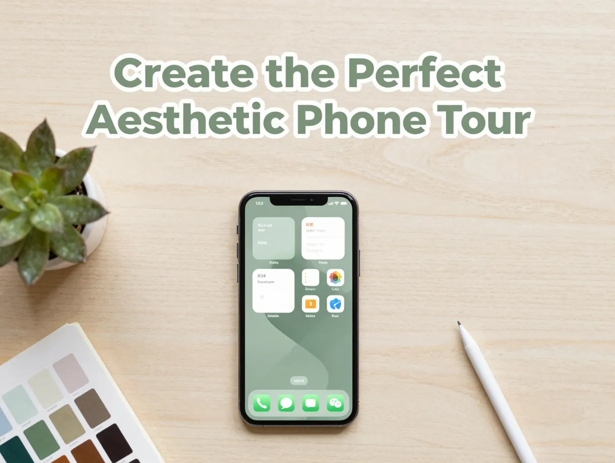
The aesthetic phone tour is now a mature content genre across iOS and Android communities [4]. Creators who stand out in 2026 are not just showing pretty wallpapers, they are presenting a cohesive visual system with narrative, intentional color choices, and a clear filming structure. This guide walks through every stage, from the first creative decision to the final recorded frame.
Key Takeaways
- Define a theme and color system before making any visual changes to the device.
- Wallpaper, widget layout, and app icon choices must all serve the same visual language.
- Lock screen and Dynamic Island details are increasingly central to a polished aesthetic setup in 2026.
- A well-structured phone tour video follows a narrative sequence, not just a screen recording.
- The entire process, from concept to filmed tour, can be completed in roughly 30 to 60 minutes with the right preparation.
Why the Aesthetic Phone Tour Format Has Become a Content Staple
The aesthetic phone tour did not emerge overnight. It evolved from early “what’s on my iPhone” videos into a refined genre with its own conventions, audience expectations, and quality benchmarks [1]. In 2026, the format sits at the intersection of two dominant trends: expressive personalization and digital minimalism. Audiences want to see beautiful setups, but they also want to see clean, intentional ones, not screens cluttered with every possible widget and shortcut.
This tension between expressiveness and restraint is what makes the format interesting. A phone tour that nails both earns comments, saves, and shares. One that leans too far in either direction, too sparse or too chaotic, loses the viewer quickly.
Why does structure matter so much?
Because the viewer’s eye needs somewhere to land. A phone tour is a visual argument: “This is a coherent, beautiful system.” Every element on screen either supports or undermines that argument. The 6 steps outlined below are designed to build that argument layer by layer, so that by the time the camera rolls, the setup is already complete and the narrative is already clear.
The 2026 Aesthetic Landscape
The dominant aesthetic directions in 2026 include:
- Clean minimalism, monochrome or two-tone palettes, hidden app labels, blank widget frames
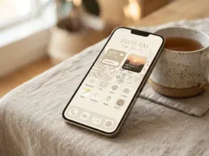
- Soft naturalism, earthy tones, botanical wallpapers, warm amber accents
- Dark editorial, deep navy or charcoal backgrounds, sharp typography, high-contrast icons
- Pastel maximalism, layered widgets, illustrated icons, soft gradients [2]
Understanding where a setup fits within this landscape helps creators attract the right audience and set expectations before the first frame of the tour appears.
1. Define Your Theme and Color System
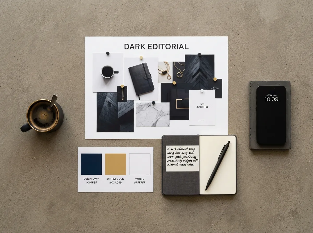
Every strong aesthetic phone tour starts with a decision made before touching the home screen: what is the visual theme, and what is the color system that will hold it together?
This step is the most overlooked and the most important. Creators who skip it often end up with a setup that looks good in individual screenshots but feels inconsistent in motion. A phone tour is experienced as a sequence, not a single image, so coherence across all screens matters far more than any single beautiful element.
How to Build a Color System
A functional color system for a phone setup typically includes:
| Role | Description | Example |
|---|---|---|
| Primary background | Dominant tone across all screens | Soft cream, deep navy, warm charcoal |
| Accent color | Used in widgets, icons, and highlights | Dusty rose, sage green, electric blue |
| Text/icon contrast | Ensures readability over the background | White, off-black, warm gray |
| Secondary accent | Optional third tone for depth | Muted gold, pale lavender |
The rule of thumb used by experienced creators in 2026: no more than three colors in active use at any one time [4]. A fourth color can appear in photography or wallpaper art, but it should not be repeated in UI elements.
Choosing a Theme Direction
A theme is broader than a color palette. It includes:
- Mood, calm, energetic, moody, playful
- Era or aesthetic reference, Y2K, cottagecore, brutalist, Scandinavian
- Functional priority, productivity-first, creativity-first, entertainment-first
Writing down the theme in one sentence before opening any customization app forces clarity. For example: “A dark editorial setup using deep navy and warm gold, prioritizing productivity widgets with minimal visual noise.” That sentence becomes the filter for every decision that follows.
2. Choose Wallpapers That Anchor the Entire Setup
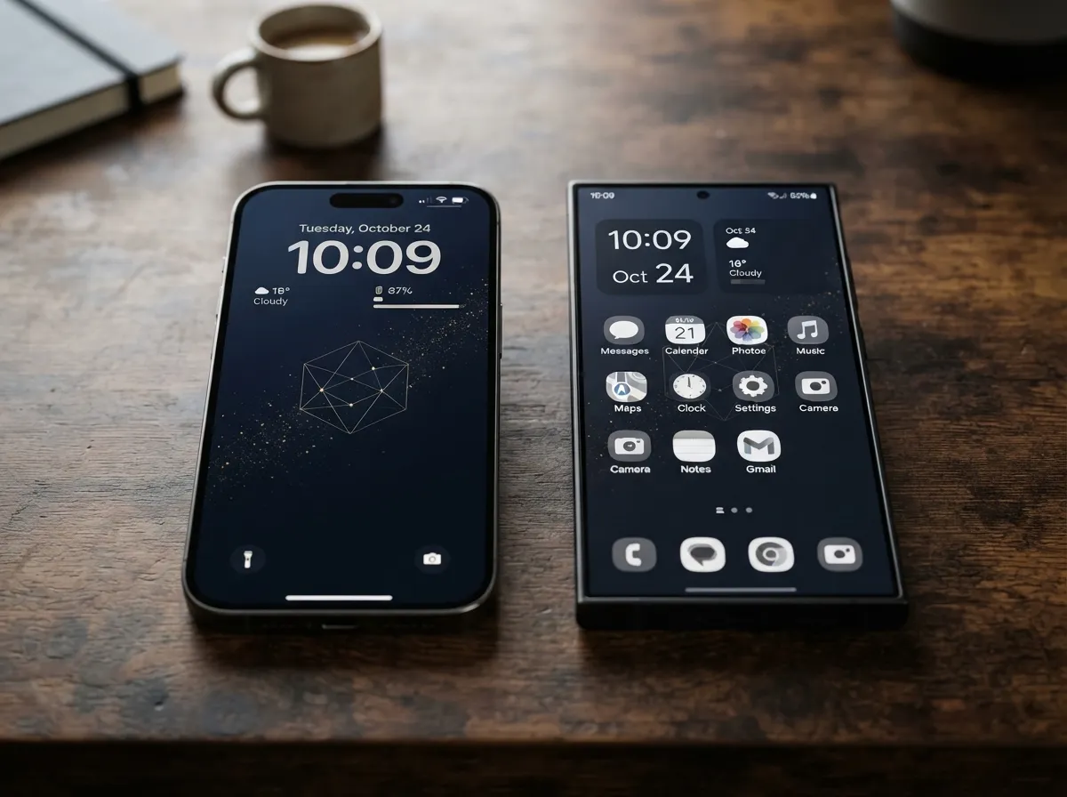
Wallpaper selection is not decoration, it is the foundation on which every other visual element rests. A wallpaper that fights with widgets, obscures text, or mismatches the chosen color system will undermine the entire setup regardless of how well everything else is executed [2].
Lock Screen vs. Home Screen Wallpapers
These two screens serve different functions and should be treated differently:
Lock screen wallpaper is seen first and most often. It needs to:
- Work with the time, date, and notification text overlaid on it
- Have a clear focal point that does not compete with lock screen widgets
- Reflect the theme at its most polished and complete
Home screen wallpaper is the backdrop for widgets and app icons. It needs to:
- Provide enough contrast for text and icon readability
- Avoid busy patterns in the areas where widgets will sit
- Be slightly more subdued than the lock screen to let UI elements breathe
Resolution and Format Considerations
In 2026, most flagship devices use displays with resolutions above 2400 x 1080 pixels. Using low-resolution wallpapers on these screens is one of the most common mistakes in aesthetic setups, the compression artifacts become visible in video recordings and undermine the polished look the creator is aiming for [4].
“The wallpaper is the only element that touches every corner of the screen. If it is not right, nothing else can save the setup.”
Sources for high-quality wallpapers that match current aesthetic trends include dedicated communities, curated apps, and creator-published packs specifically designed to pair with widget layouts [2].
3. Build a Consistent Widget Layout
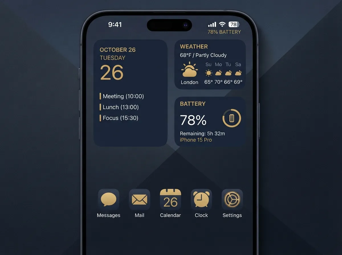
Widgets are the element that most visibly defines the character of a modern aesthetic phone setup. They are also the element most likely to create visual chaos if placed without a system [3].
The Principle of Widget Economy
The most effective aesthetic setups in 2026 use three to five widgets maximum on the primary home screen. Each widget should serve one of three functions:
- Utility, clock, calendar, battery, weather
- Motivation, quote, habit tracker, progress ring
- Aesthetic anchor, a widget that exists primarily to fill a visual role, such as a photo widget or a blank-frame spacer
Widgets that serve none of these functions should be removed, regardless of how useful the underlying app might be.
Layout Grids and Visual Balance
Most iOS and Android launchers use a grid system. Common effective configurations include:
- 2×2 grid with a single large widget, creates visual weight and hierarchy
- Stacked small widgets on one side, app icons on the other, balances utility and access
- Full-screen widget with minimal app icons, maximalist aesthetic, minimal function
The key principle is visual balance: the layout should not feel heavier on one side than the other. Experienced creators test this by taking a screenshot and squinting at it, if the eye immediately jumps to one corner, the balance is off [7].
Cross-Platform Widget Tools
The same 6-step logic applies across platforms, but the tools differ:
- iOS: Widgetsmith, BLLOC, Widgy, Locket
- Android: KWGT, Kustom Widget Maker, Zedge
- Samsung One UI: Good Lock, Theme Park
Each platform has its own constraints and strengths, but the design principles, color consistency, economy of elements, visual hierarchy, remain constant [5].
4. Customize App Icons and Organize for Visual Hierarchy
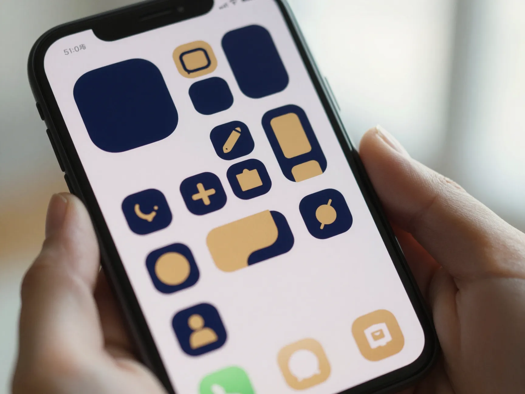
App icon customization is the step that takes a good aesthetic setup to a great one. It is also the step most likely to be overdone. The goal is not to replace every icon, it is to create visual consistency across the icons that are visible on the home screen [6].
Which Icons to Customize
A practical approach:
- Prioritize visible icons, only customize apps that appear on the home screen, not the app library
- Match the color system, icons should use the primary or accent color from Step 1
- Maintain recognizability, icons that are too abstract slow down daily use and frustrate the creator within days
In 2026, the most popular icon packs follow a flat, minimal design language with soft shadows and consistent stroke weights. Icon packs that include seasonal or theme-specific variants have become particularly popular for creators who refresh their setup regularly [4].
Organizing Apps for Visual Hierarchy
Visual hierarchy in app organization means that the most-used apps are in the most visually prominent positions, and the arrangement of icons creates a path for the eye to follow.
Effective strategies include:
- Grouping by color, apps with similar icon colors placed together create natural visual clusters
- Grouping by function, productivity apps in one row, creative apps in another
- The “floating” arrangement, apps placed in a deliberate pattern with empty spaces between them, creating a sense of lightness and intention
Hiding app labels (available on most modern launchers and iOS) is a common choice in 2026 aesthetic setups because it removes visual noise and lets the icons speak for themselves [8].
5. Refine Lock Screen, Dynamic Island, and Cover Screen Details
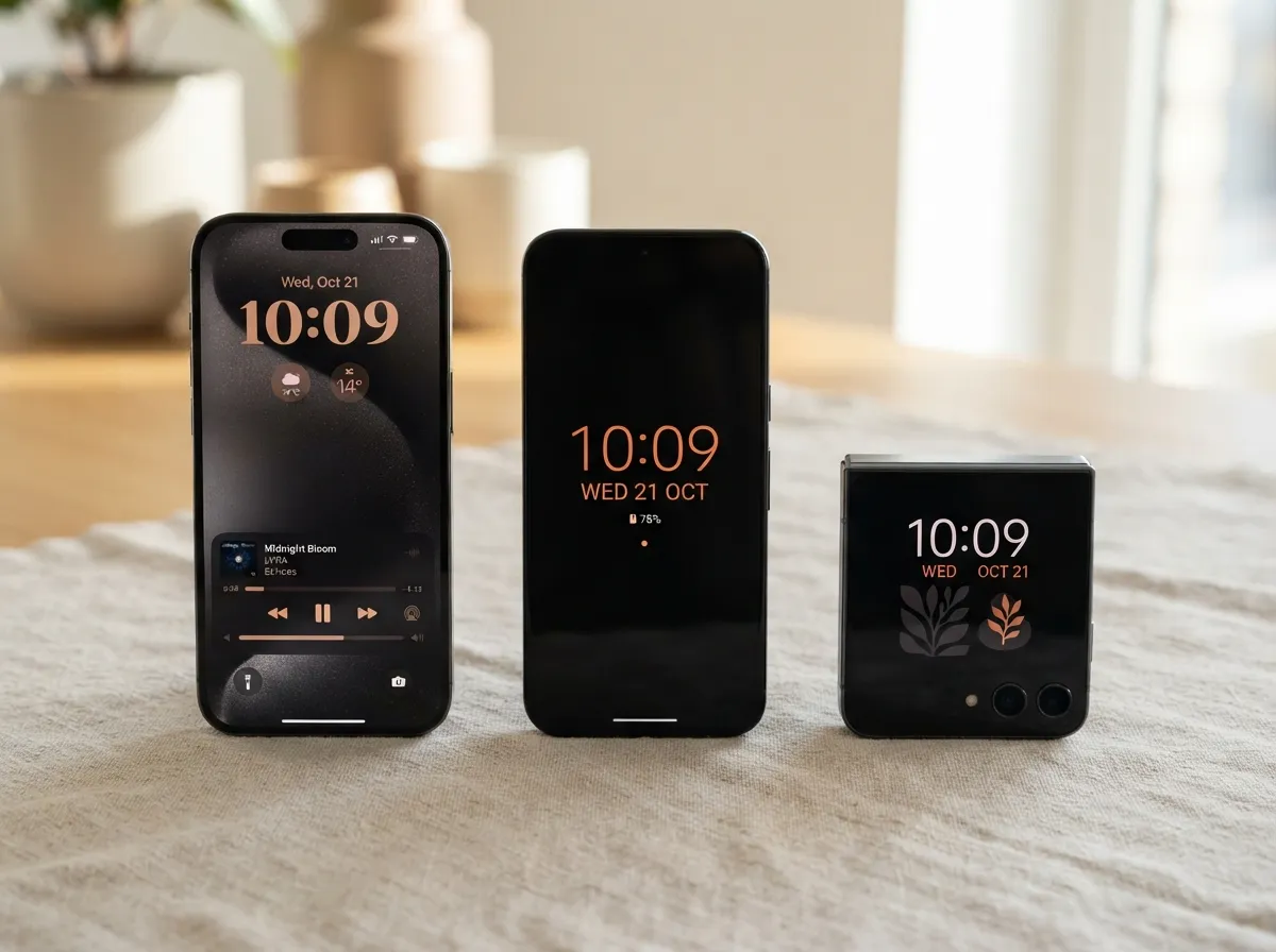
This step addresses the details that separate a thorough aesthetic phone tour from a surface-level one. In 2026, modern devices offer more customization surface area than ever before, and audiences notice when a creator has paid attention to these finer points [9].
Lock Screen Refinements
Beyond wallpaper, the lock screen offers several customizable elements:
- Lock screen widgets (iOS 16 and later, various Android implementations), small utility widgets below the clock or in the notification area
- Clock font and color, matching the clock style to the overall aesthetic is a small but high-impact detail
- Notification style, choosing between count, stack, or list view affects how the lock screen looks in the tour video
Dynamic Island and Always-On Display
For iPhone 14 Pro and later models, the Dynamic Island is a visible design element that creators increasingly incorporate into their aesthetic narrative. Choosing which apps use the Dynamic Island, and how they display, is a subtle but visible customization layer [9].
For Android devices with Always-On Display (AOD) capabilities, the AOD design, clock style, ambient information, and background color, is often the first thing shown in a phone tour and sets the tone for everything that follows.
Cover Screen (Foldables)
For foldable devices, the cover screen is its own design canvas. In 2026, foldable ownership has grown significantly, and cover screen aesthetics have become a distinct sub-genre within phone tour content. The same color system and theme from Step 1 should extend to the cover screen for full visual coherence.
6. Structure and Film the Phone Tour with Narrative Clarity
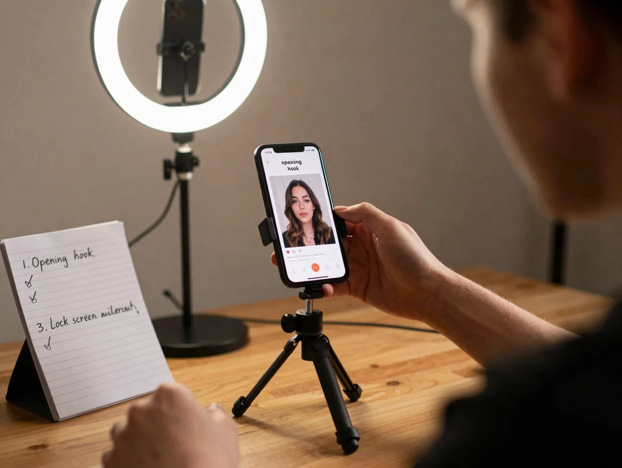
The final step is where the aesthetic setup becomes a phone tour. This is where the 6 Steps to Create the Perfect Aesthetic Phone Tour process moves from design into content creation, and where many creators underinvest their effort [10].
Planning the Narrative Sequence
A phone tour is not a screen recording. It is a guided experience. The most effective tours follow a narrative arc:
- Opening hook, the always-on display or lock screen, shown briefly to establish the aesthetic
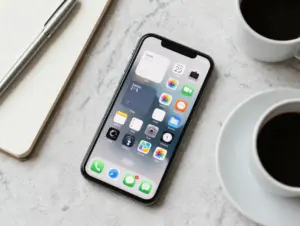
- Theme reveal, a wider shot showing the physical device in context (on a desk, held in hand)
- Lock screen walkthrough, wallpaper, clock style, widgets, notification setup
- Home screen walkthrough, wallpaper, widget layout, icon arrangement
- Detail moments, close-ups of specific widgets, icon packs, or app arrangements
- Closing shot, return to the lock screen or a satisfying ambient shot
This sequence mirrors the structure used in the most-viewed aesthetic phone tour content across platforms [1] [6].
Filming Techniques for a Polished Result
Equipment considerations:
- A secondary device for filming (another smartphone or a camera) is strongly preferred over screen recording alone
- A small ring light or window light eliminates screen glare and adds warmth
- A phone stand or mini tripod ensures stable shots during the walkthrough segments
Screen recording vs. physical filming:
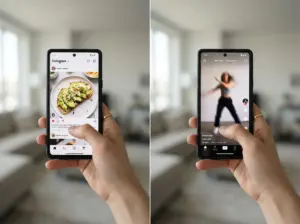
Many creators use both. Screen recording captures widget interactions and smooth transitions, while physical filming captures the device as an object and adds a tactile, real-world quality that screen recordings cannot replicate. Cutting between the two in editing creates a more dynamic and engaging tour [3].
Pacing and Voiceover
The pacing of a phone tour should match its aesthetic. A calm, minimalist setup benefits from slow cuts and a quiet voiceover. A bold, maximalist setup can sustain faster editing and more energetic narration.
Voiceover tips:
- Script the key points for each section before filming
- Keep explanations brief, viewers want to see the setup, not hear a lecture
- Mention the tools and apps used, as this is consistently one of the most-searched pieces of information in phone tour comments [8]
Time Investment Benchmark
A polished aesthetic home screen can be built in approximately 30 minutes once the theme and assets are prepared [4]. The filming and editing process adds another 30 to 60 minutes for a creator with basic video skills. Total investment for a complete, publishable phone tour: roughly 90 minutes from concept to upload.
Applying the 6 Steps to Create the Perfect Aesthetic Phone Tour Across Platforms
The 6 Steps to Create the Perfect Aesthetic Phone Tour framework is platform-agnostic. The specific tools change between iOS and Android, but the logic, theme first, wallpaper second, widgets third, icons fourth, details fifth, filming sixth, applies equally to both ecosystems.
Platform-Specific Considerations
iOS in 2026:
- Shortcuts app remains central to icon customization
- Focus Modes allow different home screen configurations for different times of day, a feature increasingly showcased in phone tours
- StandBy mode (introduced in iOS 17, refined through 2025-2026) adds a landscape display mode that some creators include in their tours
Android in 2026:
- Launcher replacement (Nova, Niagara, Lawnchair) offers deeper customization than stock Android
- KWGT and Kustom provide near-unlimited widget design flexibility
- Pixel devices offer Material You theming that automatically adapts the system UI to the wallpaper’s color palette, a feature that aligns naturally with the color system approach in Step 1
Looking Ahead: Late 2026 and Beyond
Speculative trends suggest that AI-assisted theme generation, where the device proposes a complete color system and widget layout based on a single mood input, will become more widely available before the end of 2026. If this materializes, the creative starting point shifts, but the 6-step structure remains relevant: AI can suggest a theme, but the creator still needs to evaluate, refine, and film it with intention.
The growing intersection of aesthetic setups with digital minimalism, fewer apps, cleaner layouts, intentional notification management, suggests that future phone tours will increasingly double as productivity content, appealing to audiences interested in both design and focus [4].
Conclusion
The 6 Steps to Create the Perfect Aesthetic Phone Tour provide a repeatable, platform-independent process for building setups that are both visually compelling and ready to film. The framework works because it addresses the right problems in the right order: clarity of theme before any visual decisions, structural coherence before filming, and narrative planning before the camera rolls.
Actionable next steps:
- Write down the theme in one sentence before opening any customization app.
- Audit the current wallpaper against the color system, if it does not match, replace it first.
- Remove any widget that does not serve a utility, motivational, or aesthetic anchor function.
- Customize only the app icons visible on the home screen, not the entire library.
- Plan the six-segment narrative sequence before filming a single frame.
- Use both screen recording and physical filming, then cut between them in editing for a more dynamic result.
The most successful phone tour creators in 2026 are not those with the most elaborate setups, they are those who can articulate a clear visual idea and execute it with consistency from the first design decision to the final published frame.
References
[1] Watch – https://www.youtube.com/watch?v=EWu5AngQeqw
[2] Aesthetic Iphone Widgets Wallpapers 2026 – https://click2.app/blog/aesthetic-iphone-widgets-wallpapers-2026/
[3] Watch – https://www.youtube.com/watch?v=G7rotieq_4o
[4] Aesthetic Phone Setup – https://arctools.dev/wallpics/aesthetic-phone-setup
[5] Watch – https://www.youtube.com/watch?v=1xhUaBW8mYI
[6] Watch – https://www.youtube.com/watch?v=Gbt7AB0rcSY
[7] Watch – https://www.youtube.com/watch?v=2pBHzV7OMT8
[8] Watch – https://www.youtube.com/watch?v=lZd8BDQkN2w
[9] Watch – https://www.youtube.com/watch?v=qhDzBCgZ2jA
[10] Watch – https://www.youtube.com/watch?v=nKdAYifzQwc